


pastel headings terrible
minnie_tx
11 years ago
Related Stories
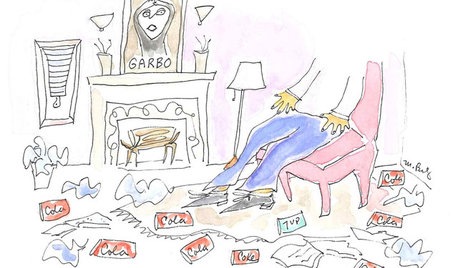
LIFEPortrait of a Terrible Housekeeper
Even in hair-raising tales and harebrained organizing schemes, there's something we can learn
Full Story
LIFEPortrait of a Terribly Good Neighbor
Sometimes the best kind of neighbor isn't the kind you'd expect
Full Story
PRODUCT PICKSGuest Picks: Crisply Modern Pastels for All Over the Home
Pick a posy of pastel furnishings and accessories sans their saccharine skin, courtesy of modern silhouettes and a fresh approach
Full Story
COLOR PALETTESCombine Black and Pastels for a Fresh New Look
Take the sweetness out of sugary shades by adding striking black accents. Here's how to do it and why it works
Full Story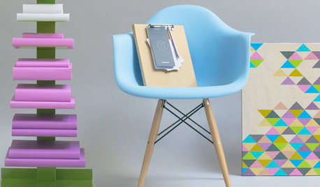
SHOP HOUZZHouzz Products: Pretty in Pastels
Go for a soft rainbow with accessories and furnishings in happy shades
Full Story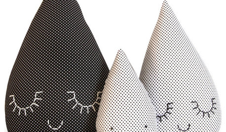
PRODUCT PICKSGuest Picks: Raindrops Keep Falling on My Head
Rain and clouds are filling the skies in the U.K., but the effect can be cheery when you bring them inside
Full Story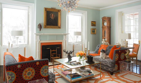
COLORFUL HOMESHouzz Tour: Turning Tradition on Its Head in Vermont
Leopard-spotted stairs, Victoriana paired with Lucite and other daring style moves give a home in a shire a completely new twist
Full Story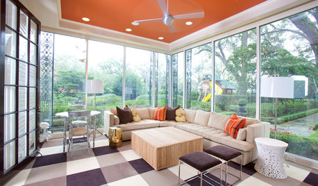
MOST POPULARHeads-Up Hues: 10 Bold Ceiling Colors
Visually raise or lower a ceiling, or just add an eyeful of interest, with paint from splashy to soothing
Full StoryHOUZZ TOURSHouzz Tour: Pros Solve a Head-Scratching Layout in Boulder
A haphazardly planned and built 1905 Colorado home gets a major overhaul to gain more bedrooms, bathrooms and a chef's dream kitchen
Full Story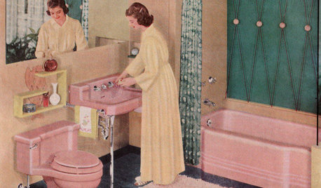
MOST POPULARHomeowners Give the Pink Sink Some Love
When it comes to pastel sinks in a vintage bath, some people love ’em and leave ’em. Would you?
Full Story
susie53_gw
phyllis__mn
Related Discussions
My pastel Easter table
Q
What can cause a sunflower flowerhead to look so terrible?
Q
Best large-headed pastel roses for cutting - scent, vase life etc
Q
Keeping Pastel Clothing Looking Fresh, no graying/fading, what to use?
Q
bigack
nanny98
marilyn_c
enjoyingspring
dedtired
juneroses Z9a Cntrl Fl
Marilyn Sue McClintock
Jodi_SoCal
Jodi_SoCal
Jodi_SoCal
marie_ndcal
kacram
chessey24
User
Jodi_SoCal
ravencajun Zone 8b TX
cynic
dedtired
gardenspice
ruthieg__tx
schoolhouse_gw
sjerin
gadgets
pattico_gw
jemdandy
ravencajun Zone 8b TX
maire_cate
sjerin
jel48
arkansas girl
ravencajun Zone 8b TX
ravencajun Zone 8b TX
ravencajun Zone 8b TX
sjerin
sjerin
minnie_txOriginal Author
joyfulguy