


Wow...it is changed here!
Hellion
11 years ago
Related Stories
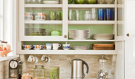
KITCHEN CABINETSChoosing New Cabinets? Here’s What to Know Before You Shop
Get the scoop on kitchen and bathroom cabinet materials and construction methods to understand your options
Full Story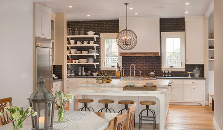
TRANSITIONAL HOMESHouzz Tour: Change of Heart Prompts Change of House
They were set for a New England look, but a weekend in the California wine country changed everything
Full Story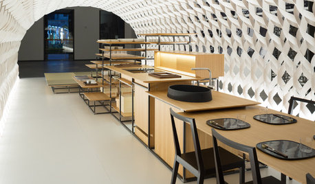
HOMES AROUND THE WORLDThe Kitchen of Tomorrow Is Already Here
A new Houzz survey reveals global kitchen trends with staying power
Full Story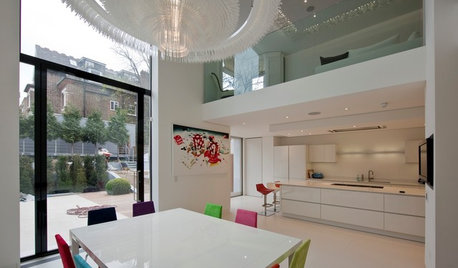
REMODELING GUIDESThe 2013 Best of Houzz Badges Are Here!
Watch for profiles sporting this honor, which goes to professionals with the most popular design work and top ratings
Full Story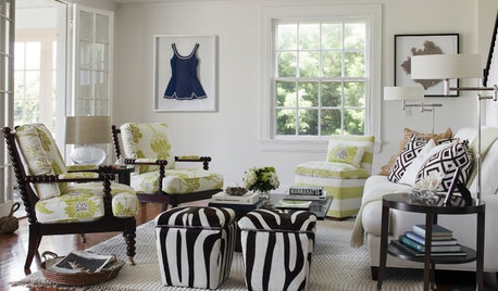
DECORATING GUIDESHere's How to Steer Clear of 10 Top Design Don'ts
Get interiors that look professionally styled even if you're taking the DIY route, by avoiding these common mistakes
Full Story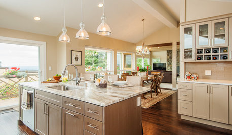
WORKING WITH PROSInside Houzz: An Interior Design Match Made Right Here
See a redesign that started on Houzz — and learn how to find your own designer, architect or other home pro on the site
Full Story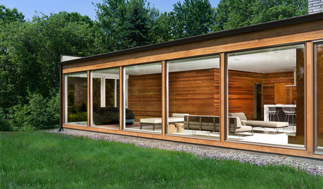
HOUZZ TOURSHouzz Tour: Let's Be Transparent Here
Expansive glass and a new floor plan celebrate a midcentury modern home's openness and connection to nature
Full Story
DECORATING GUIDESHouzz Tour: Happy Days Are Here Again in a Miami Apartment
The colors of Biscayne Bay, an owner’s fond memories and the groovy spirit of the 1970s inspire a bright redesign
Full Story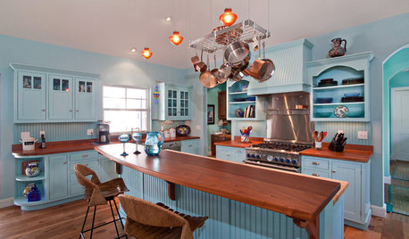
KITCHEN DESIGNHere's Help for Your Next Appliance Shopping Trip
It may be time to think about your appliances in a new way. These guides can help you set up your kitchen for how you like to cook
Full Story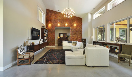
LIGHTINGReady to Install a Chandelier? Here's How to Get It Done
Go for a dramatic look or define a space in an open plan with a light fixture that’s a star
Full Story
enjoyingspring
Jasdip
Related Discussions
Wow! It's been years!
Q
Wow, Its Been Gorgeous / BirdBath Ques.
Q
Wow, its was frustrating trying to buy the tile!
Q
Wow! It's been interesting
Q
ellendi
secsteve
cheryl_ok
Jasdip
azzalea
FlamingO in AR
enjoyingspring
Jasdip
phyllis__mn
alisande
phyllis__mn
Georgysmom
iowagirl2006
minnie_tx
minnie_tx
iowagirl2006
Kathsgrdn
JoAnn_Fla
bryansda
dedtired
Alice_sj
Jasdip
patti43
dee_can1
luckygardnr
Lily316
marry
marry
minnie_tx
themommy1
cheerful1_gw
foggyj
Jasdip
ravencajun Zone 8b TX
patti43
patti43
marie_ndcal
WalnutCreek Zone 7b/8a
ravencajun Zone 8b TX
lefleur1
joyfulguy
joann23456
Jasdip
ravencajun Zone 8b TX
Dash2
dedtired
dianamo_1
fran1523