Shop Products
Houzz Logo Print
thepeppermintleaf

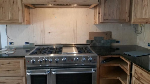
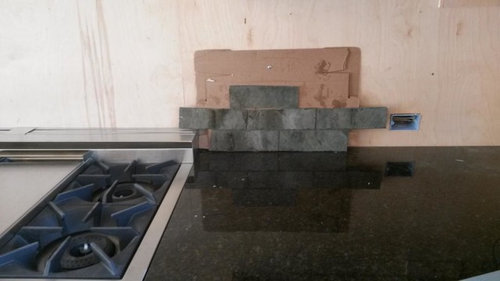
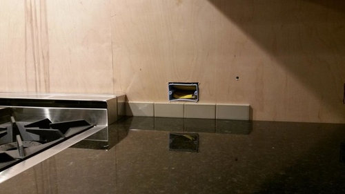
Ideas for Backplash- please weigh in :-)

So far I have 3 possibilities for our backplash (was thinking 3x9 staggered tiles) - Heath Tile Patina, Heath Tile New Ogawa Green, or a handcut slate (we took off an old house). All three are a greenish hue. Also open to other suggestions.

A previous inspiration photo...

The tile options in our kitchen:

Patina, Ogawa, Slate

Slate

Patina glazed

This is heath but a little greener than the new ogawa:

Patina:

I really love photos of Heath tile, but it's so hard to tell from such small samples.... do I really want to spend the $$?

Comments (47)

  • eam44
    9 years ago

    I love the ogawa glaze and it certainly would be consistent with your inspiration image. The only tile that bums me out a little is the slate. It's too dark I think. As for the money, Heath tile is beautiful but you can absolutely get a similar, equally beautiful look for less. What is your budget in $/sf?

  • Ivan I
    9 years ago

    My favorite = the slate, since its variation seems to flow with the variation in your cabinetry wood.

    The ogawa is my #2 favorite because green hues goes so well with that counter and cabinetry colors.

    However, the most important difference between the inspiration pic and your kitchen is the flooring difference. You have slate? vs wood in the inspiration pic.

    After looking at that, I was drifting towards the grey vs the green to flow better with your flooring as my #2.

  • HerrDoktorProfessor
    9 years ago

    I like the patina.

  • romy718
    9 years ago

    I don't care for the slate - too dark & am torn between the two greens. The Patina is cool & the Ogawa is warm? I like the Ogawa better with your cabinets.

  • thepeppermintleaf
    Original Author
    9 years ago

    Thanks everyone! It seems like there are many different opinions :-) The Patina is a very faint green which doesn't come across as well in the photos. I think with an entire wall of it, the 'green' would be more obvious. It does seem to tie in w/ the floor a little better than the others.

    The heath is around $28/sf - I wouldn't want to go much higher than that, but would be willing to get the heath if I decide on a color that I absolutely love...so am open to other similar tiles. I also got some fireclay samples, but liked the heath colors better....

  • Hydragea
    9 years ago

    I like how light the backsplash is in your inspiration pic. Your choices seem quite a bit grayer.

  • kiko_gw
    9 years ago

    I like the patina up close because of the contrast with the countertop, and I like it far away because it looks great with the floor. But it's hard to see how the patina looks with your cabinets in those pics. Are the cabinets done (stain wise and future color changing wise)?

  • Jillius
    9 years ago

    I prefer the inspiration to these options, and I think it is because the inspiration back splash has a bit of yellow in it that relates to the cabinet color. The greens you have are either too grey or too blue.

    I very strongly dislike the slate. Too dark, too cold, too blah.

    You might also consider square tiles rather than rectangular. The kitchen inspiration is so warm and solid, somehow the spirit of that seems more square to me.

  • melle_sacto is hot and dry in CA Zone 9/
    9 years ago

    Although the slate is pretty, it's dark. Too dark for me personally (I light light/bright kitchens). I also think it will be more challenging to keep clean. My preference is for glossy glazed tile that is easy to clean, but I cook a lot and have young children so cleaning off the backsplash is lower priority LOL.

    Your flooring seems cool-tones, with greys and pinkish neutrals. I think the "patina" ties in best with the floor since it's a greyish, neutral slightly-green. Your inspiration kitchen has those warm wood floors, so a warmer green tile works better there than I think it would in your kitchen.

    However, if it were me, I don't think I'd pair a green tile at all in the space. The floor just seems like it's asking for a blue or grey tile, or even white. I like green in a kitchen (my kitchen is painted a warm, greyish-green), but from how the photos look on my computer, I just don't think it connects to your flooring.

    This post was edited by melle_sacto on Wed, Dec 3, 14 at 12:37

  • thepeppermintleaf
    Original Author
    9 years ago

    kiko- The patina does look great w/ countertops and floor, it's hard to tell w/ the cabinets. The cabinets are done...they are dark rustic hickory with a clear coat. My camera broke so sorry for the bad photos- these were taken w/ a tablet...
    Our cabinets are more similar to these...

    [Rustic Kitchen[(https://www.houzz.com/photos/rustic-kitchen-ideas-phbr1-bp~t_709~s_2111) by Elmhurst Interior Designers & Decorators Kristin Petro Interiors, Inc.

    Also here is an overview pic of our kitchen (more in photobucket album)

    (the floor is grayish w/ warm brown swirls)

    The slate would probably be harder to clean, good point!!

    Here are a few other inspiration photos I liked...
    This is heath tile

    [Traditional Kitchen[(https://www.houzz.com/photos/traditional-kitchen-ideas-phbr1-bp~t_709~s_2107) by San Francisco Architects & Building Designers Schwartz and Architecture

    colorful backsplash:

    [Craftsman Kitchen[(https://www.houzz.com/photos/craftsman-kitchen-ideas-phbr1-bp~t_709~s_2116) by Shawnee Architects & Building Designers Orion Design, Inc.
    (I think that's a little too colorful for me though)

    This backsplash is also very pretty- maybe something like this for our kitchen?

    [Craftsman Kitchen[(https://www.houzz.com/photos/craftsman-kitchen-ideas-phbr1-bp~t_709~s_2116) by Howard Lake Cabinets & Cabinetry Dura Supreme Cabinetry

    Smaller squares or bigger squares? or rectangular tile?

  • Hydragea
    9 years ago

    Your floor is grey, it's true, but it is grey with a blue undertone, if I'm not mistaken. I'm not 100% sure it's a good idea to mix the green bs with the blue-ish floor.

    To be on the safe side, I would bring home samples of a bluish subway with the same saturation level and tone variations of the green tiles posted in the third photo down in your latest post. In other words: exactly those tiles, but bluer. I love those tiles but I'm not convinced they match well enough with your floor.

    This is heathceramics, modern basics, blue fog (I know the kitchen is the wrong style):

    [Transitional Kitchen[(https://www.houzz.com/photos/transitional-kitchen-ideas-phbr1-bp~t_709~s_2112) by Portland Architects & Building Designers Howells Architecture + Design, LLC

  • eam44
    9 years ago

    This is Fireclay Tile in Atlantic. In 3" x 6" tile it costs $16.50/sf. It is handmade tile and so will have the slight variations in shape and color you are looking for. It is gorgeous tile.

    They have many greens to choose from, some more expensive than the Heath, but they also have a variety of sizes, and can give you more choices.

    In my heart of hearts I see thin brick in your space. I'll save that for my next post.

    Here is a link that might be useful: Fireclay

  • eam44
    9 years ago

    This is Fireclay's Glazed Thin Brick in Willow. They have more glazes this year including several deeper greens like Moss and Fern. I think the texture of the thin brick would be gorgeous with your extraordinary cabinets. These run $18.50/sf and are really beautiful.

    Here is a link that might be useful: Glazed Thin Brick

  • eam44
    9 years ago

    Sorry, third post, but Fern might be even better for you. The glaze is less uniform and some of the brick shows through. Can you even imagine how beautiful this would be? They have blues as well should you decide to go that route.

  • User
    9 years ago

    Good call by Hydrangea on working with the blue undertones in the floor. The tile she posted is so pretty.

  • eam44
    9 years ago

    Feel free to post your floor tile if you think you might be wrong about the color, but you're there with it in person. If you're telling us it's warm grey and brown, not blue, then that's what it is. Posting images of it could be helpful if you're not sure whether you want blues or greens.

  • thepeppermintleaf
    Original Author
    9 years ago

    Thanks!!! I looked at the floor and it definitely has a bluish gray tone to it- funny what you don't notice until others point it out!! haha. Our countertops are uba tuba gold and have a greenish gold tint. It looks like I may have to order some more samples!
    Can you get a better idea for the floor w/ this photo??

    The new ogawa green definitely has a bluish tint to it too...here is a pic in a white kitchen (it's weird, but the heath samples look nothing like what they look like in photos!) I think I may have accidentally put the pisces green instead of the ogawa in some of the above pictures.

    [Transitional Kitchen[(https://www.houzz.com/photos/transitional-kitchen-ideas-phbr1-bp~t_709~s_2112) by Portland Architects & Building Designers Howells Architecture + Design, LLC

    Sooo.... new samples to get:
    Fireclay - Atlantic Tile, Willow Brick, Fern Brick,
    Heath- Blue Fog, maybe some other grays or blues??

    Thanks for all the suggestions, it's definitely helping me to think through this more!

  • amykath
    9 years ago

    I like the patina. I think the slate (very beautiful) is too dark. The other two are nice as well. I think the patina will give you a nice contrast to your counter and go nicely with your floor.

  • gnancyanne
    9 years ago

    I love the wood in your cabinets, and saw either the same or similar photo, "Craftsman Kitchen by Howard Lake Cabinets", etc., when I was planning my backsplash. I wanted an iridescent white tile but couldn't find one I liked that I could afford. Then I found a DalTile one online that was perfect and reasonable, but before ordering, decided to look at the actual tile--looked nothing like the photo. I love the Heath, but too $$$ for me.

    I agree with the comment about using glazed tiles--easier to clean. I used a satin glazed one with narrow grout joints. Speaking of grout, don't forget that grout, color and joint width, can drastically change the look of the tile, too.

    I like EAM44's suggestions.

  • speaktodeek
    9 years ago

    I agree the slate will suck the light out of the counter/backsplash zone and look like a dark strip.

    I like the color of the patina because it pulls on the grey and blue/green undertones with a slight edge to blue over green WITHOUT pulling your Uba Tuba into forest green. The more green/less blue/less grey color tone tiles will make the forest green in your Uba Tuba pop and bring your kitchen into a forest green zone that will fight with your floors.

    We don't know what you are doing in adjoining rooms and this is an important determinant. If you are using strong colors, then a slightly stronger color tile on the backsplash can be used. If you are using softer colors, then you need a suprisingly soft, almost just a hint, of color in the backsplash.

    It would be VERY advisable to take the extra time and money to get at least 3x3 feet sample of your final choice and mock it up to see how the color plays and your lighting affects it, before final order and install.

    As well as on the backsplash to test, put your 3x3 mockup on your floor tile and go into the next room and view it from that distance, to see if the color undertones are OK. Do this several times during a day in different light situations.

    A tile will emerge when you do this - you will just know!

    This is going to be a gorgeous house! Love your choices so far!

  • eam44
    9 years ago

    Maybe also a sample of Fireclay in Nickel. Or just browse the blue greys.

  • thepeppermintleaf
    Original Author
    9 years ago

    Thanks everyone! We painted all of our walls white, so we really don't have strong colors in the rest of the room yet. Just browns from the wood trim which goes well with the hickory.

    I looked into getting a larger sample from Heath, but anything under 25 square feet is reallly expensive since they have to set up all the equipment for it. But I can look into it again once I have narrowed down to a potential #1 choice and see how much it really costs. I do think it would really help- the Heath samples don't seem to do justice to the heath tile I've seen in photos. If I saw it in a tile shop I'd probably pass it by! lol

    I will order some more blues and grays for samples and then report back. There is also a tile shop an hour away that we will try to go to in the next week or so. This is a huge help to think of the floor as a bluish color- thanks!

  • speaktodeek
    9 years ago

    Have you thought about a soft golden/buff with hint of rust type of palette for the tiles? Maybe a crackle or stoneware tile? I'm really worried that your floor is going to cause problems with green or blue undertones, because it will change in different light, and in some light it's throwing lavender tones or pink tones that will go off with a blue or green based tile, easily. If you pick up the buff tones in your hickory and floor and the taupe facet of your Uba Tuba, you won't have anything to fight.

  • ChristyMcK
    9 years ago

    I don't like the slate. I think it's too busy with the activity going on in your wood cabinets. I think the glazed patina is the most neutral and would probably go with it because of its neutrality. I looked at a lot of Fireclay tiles. We could never find a color from them that worked with our kitchen paint color but their tiles are lovely so I'd check them out. The online colors are different than what you get in person and they will send free samples.

    We ended up with a hand made tile from McIntyre, also made in CA. I'm not a big fan of their website but we found our gray/blue subways tile in person at a local tile store and it was a great fit, so if they have a vendor you might check out their colors.

  • thepeppermintleaf
    Original Author
    9 years ago

    beauty would you be able to link to the sort of tile you mean? I am having trouble picturing it. Thanks!! :-)

  • speaktodeek
    9 years ago

    Example of soft, understated buff crackle tile (just did an image search and pulled this up; I know nothing of the vendor or brand)

    Here is a link that might be useful: soft buff crackle tile example picture

    This post was edited by beautybutdebtfree on Fri, Dec 5, 14 at 17:18

  • speaktodeek
    9 years ago

    Examples of mixed color glazed stoneware tiles.

    Here is a link that might be useful: Terra Firma stoneware tiles glazes

  • speaktodeek
    9 years ago

    Beautiful soft silver crackle tile, scroll down for pic.

    Here is a link that might be useful: scroll down to see silver crackle

  • kitchendetective
    9 years ago

    Does Fireclay have a bluer glaze that also shows some of the brick color, like the Fern does? I think that show-through would be really good with your floor and the Craftsman vibe.

  • eam44
    9 years ago

    Kitchen, on the brick they have two types of glazes, gloss are opaque, and satin are sheer showing brick below. They do have a blue satin called Harbor, and a blue-green satin called Parakeet. I've not seen either in person but they are very pretty in images. Here's Harbor.

  • eam44
    9 years ago

    And this is Parakeet.

  • speaktodeek
    9 years ago

    OK, here is your kitchen shot with the Terra Firma french country glaze stoneware tile. See the buff with rust component, and see how it resonates with your cabinetry hickory, the buff and rust tones in your floor, and the taupe undertone portion of the Uba Tuba.

  • speaktodeek
    9 years ago

    Here is a GW post of marthastoo's kitchen with Encore's silver crackle that would look nice. I like the undertones of the french country but it would probably be too monotonous up against your cabinet wood. The silver crackle would give a nice but neutral contrast against both the Uba Tuba and the Hickory.

    Here is a link that might be useful: marthastoo's kitchen thread with silver crackle tile

  • speaktodeek
    9 years ago

    composite picture

  • speaktodeek
    9 years ago

    Here's an Encore colorway that pulls buff and rust, called "beach"

    Here is a link that might be useful: http://encoreceramics.com/beach/

  • speaktodeek
    9 years ago

    Here's a matte finish by Encore in a colorway that pulls rust, buff, and white. It's called capri.

    Here is a link that might be useful: http://encoreceramics.com/capri-large/

  • eam44
    9 years ago

    So, beauty is in the eye of the beholder, but with all the gorgeous choices you've made thus far, I think it would be sort of tragic if you chose beige tile. That said, I hope you find something you love.

  • kitchendetective
    9 years ago

    Dunis has a 5.25 x 10 inch tile called "brick" or "brick wall." The new Robin's Egg might be a possible glaze. Seems to be a blue-gray with clay showing through.

    Here is a link that might be useful: Dunis Studios

  • kitchendetective
    9 years ago

    Also see the colors at Mercury Mosaics and Tile. Cannot seem to get the link to work via iPad. Some of their glazes look quite Craftsman-compatible.

  • thepeppermintleaf
    Original Author
    9 years ago

    Thanks everyone! I thought I posted something last night but I must have been tired because I don't see it here now lol! I still would love to be able to bring in some color w/ the backsplash if possible- although the tans are pretty too, especially the crackles! Through some of your links I saw that there is a 'The Tile Shop' about an hour from me so I will definitely have to go there too. I'm going to make a list of all the great recommendations and try to locate them in person!

    The fireclay brick is soooo pretty- it's too bad it only comes in one size. I'll have to get a sample anyway though! :-)

    As far as the kitchen style I was originally trying for 'refined natural' but now it is more 'refined rustic' due to the rustic sway of my DH :-). So if the tile choice could sway it towards being more rustic (than it is haha) or craftsman I would like to avoid that. So maybe lean towards the lighter shades of the mentioned tiles for this effect? Thanks everyone :-) Such great great ideas!!

  • eam44
    9 years ago

    You know, you could go for something a little more elegant than subway tile and still bring in some color. Have you considered mosaics? This one is Thassos and Ming Green marble. It's definitely not rustic. It's selling on Alibaba for $6.99/sf

  • thepeppermintleaf
    Original Author
    9 years ago

    I LOVE LOVE LOVE mosaic tile haha, but wasn't thinking about it because I thought it might be too much w/ everything else going on in the cabinets and floor. Do you think it could work without being too busy?

  • Jeannine Fay
    9 years ago

    patina

  • Jeannine Fay
    9 years ago

    Ok I now see you are leaning more blue. Could you take a sample of your floor to a good tile shop. One that has some hand glazed subways in varying hues. I think you'll find your match that way better than ordering samples online. I think the preference for the Patina color told you that you don't need much color just a touch to get the look you want. Stay away from anything dark and busy. I definitely think mosaic would be way too busy with what you got going on in the floor and wood grain already.

  • eam44
    9 years ago

    Absolutely it can work. You could also look at mosaics with less color or patterning if you have that concern, but I think the green flower would be lovely.

  • allisonkbye
    9 years ago

    My favorite is the Patina.

  • kitchendetective
    9 years ago

    How about Winchester tile in Danube?