


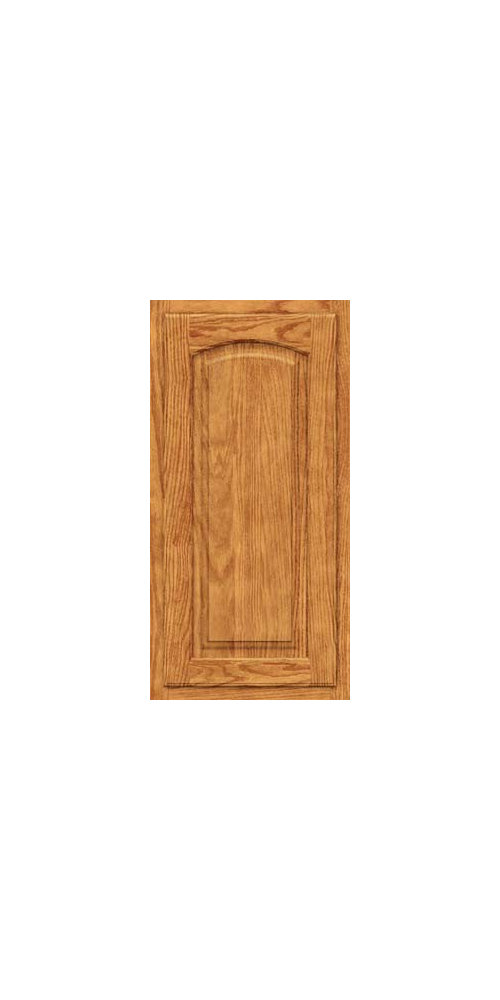
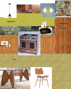
Design Around 9: Keeping the Golden Oak
cawaps
12 years ago

Featured Answer
Sort by:Oldest
Comments (139)

angie_diy
12 years agolast modified: 9 years ago
cawaps
12 years agolast modified: 9 years agoRelated Professionals
Greensboro Kitchen & Bathroom Designers · San Jose Kitchen & Bathroom Designers · Vineyard Kitchen & Bathroom Designers · Forest Hill Kitchen & Bathroom Remodelers · Folsom Kitchen & Bathroom Remodelers · Garden Grove Kitchen & Bathroom Remodelers · Mooresville Kitchen & Bathroom Remodelers · Park Ridge Kitchen & Bathroom Remodelers · Portage Kitchen & Bathroom Remodelers · Sioux Falls Kitchen & Bathroom Remodelers · South Park Township Kitchen & Bathroom Remodelers · Alton Cabinets & Cabinetry · Avocado Heights Cabinets & Cabinetry · Lakeside Cabinets & Cabinetry · Glassmanor Design-Build Firmsmoonspinner7
12 years agolast modified: 9 years ago
live_wire_oak
12 years agolast modified: 9 years agoformerlyflorantha
12 years agolast modified: 9 years agoannachosaknj6b
12 years agolast modified: 9 years agomarcolo
12 years agolast modified: 9 years agoTxMarti
12 years agolast modified: 9 years agoformerlyflorantha
12 years agolast modified: 9 years agoannachosaknj6b
12 years agolast modified: 9 years agomarcolo
12 years agolast modified: 9 years agocawaps
12 years agolast modified: 9 years agoannachosaknj6b
12 years agolast modified: 9 years ago
sochi
12 years agolast modified: 9 years agosochi
12 years agolast modified: 9 years agoannachosaknj6b
12 years agolast modified: 9 years agohonorbiltkit
12 years agolast modified: 9 years agojterrilynn
12 years agolast modified: 9 years agoannachosaknj6b
12 years agolast modified: 9 years agojterrilynn
12 years agolast modified: 9 years agomtnfever (9b AZ/HZ 11)
12 years agolast modified: 9 years agomudhouse_gw
12 years agolast modified: 9 years agocawaps
12 years agolast modified: 9 years agoangie_diy
12 years agolast modified: 9 years agoformerlyflorantha
12 years agolast modified: 9 years agosochi
12 years agolast modified: 9 years agocawaps
12 years agolast modified: 9 years agoSchmeltz
12 years agolast modified: 9 years agocawaps
12 years agolast modified: 9 years ago
queenofmycastle0221
12 years agolast modified: 9 years agoformerlyflorantha
12 years agolast modified: 9 years agocmu204
12 years agolast modified: 9 years agogardenpea_gw
11 years agolast modified: 9 years agoroarah
11 years agolast modified: 9 years agogardenpea_gw
11 years agolast modified: 9 years agosochi
10 years agolast modified: 9 years agocawaps
10 years agolast modified: 9 years agopricklypearcactus
10 years agolast modified: 9 years agodeedles
10 years agolast modified: 9 years agoIvan I
10 years agolast modified: 9 years agonosoccermom
10 years agolast modified: 9 years agocawaps
10 years agolast modified: 9 years agofarmgirlinky
10 years agolast modified: 9 years agopricklypearcactus
10 years agolast modified: 9 years ago
GreenDesigns
10 years agolast modified: 9 years agodonnasophia
10 years agolast modified: 9 years agoCindyR
4 years agocawaps
4 years agosochi
4 years ago


Related Stories
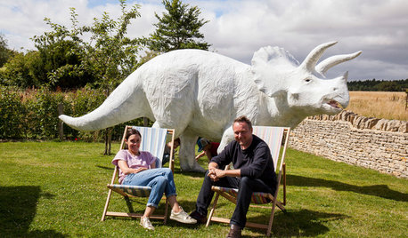
COLLECTIONSWorld of Design: 9 Cool Collectors and What They Keep at Home
Meet the people behind some museum-worthy assemblages — from a house of hats in Los Angeles to dinosaur art near London
Full Story
DECORATING GUIDESWorld of Design: Decorating Ideas From 10 Renters Around the Globe
Even if you don’t own your home, you can live beautifully. Browse these ideas from international tenants who’ve made their spaces special
Full Story
FUN HOUZZGolden Globes: 6 Design Ideas From ‘The Grand Budapest Hotel’
Nominated for a handful of big awards, the film is a visual feast that just might inspire your own adventurous interior
Full Story
CALIFORNIA NATIVE PLANTSGreat Design Plant: Coast Live Oak
The stuff of legends and memories, this California tree is one to build a whole landscape around
Full Story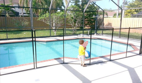
HEALTHY HOMEThese Steps Will Help Keep Kids Safe Around Pools and Spas
Implement several layers of security to prevent life-threatening accidents in and around the pool
Full Story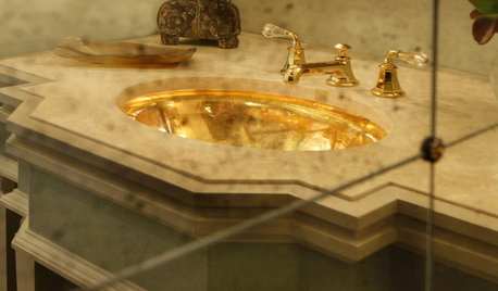
GLAM STYLEWe've Got a Golden Ticket
Make that 9, actually. These winning rooms use glimmers of gold in designs that may make you gasp in delight
Full Story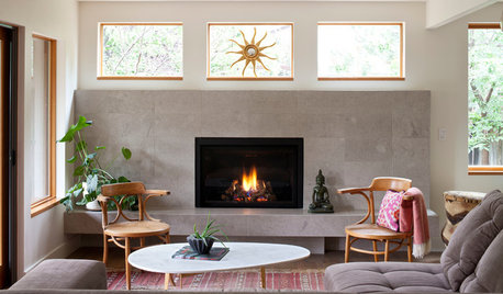
LIVING ROOMSNew This Week: 5 Living Rooms Designed Around the Fireplace
Overcome one of design’s top obstacles with tips and tricks from these living rooms uploaded recently to Houzz
Full Story
KITCHEN DESIGNWorld of Design: Favorite Recipes From Food Lovers Around the Globe
Travel with your tastebuds and experience for yourself these international foodies' favorite dishes
Full StoryDECORATING GUIDESWeekend Project: 9 Ways to Branch Out Around the House
Natural pieces can change the feeling of a room, whether you use them to hang pots or to serve as chandeliers
Full Story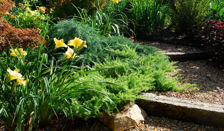
GARDENING GUIDESGreat Design Plant: Juniperus Conferta ‘Golden Pacific’
‘Golden Pacific’ shore juniper shines in sun or partial shade
Full StorySponsored
Columbus Area's Luxury Design Build Firm | 17x Best of Houzz Winner!
More Discussions


pricklypearcactus