Shop Products
Houzz Logo Print
bookworm4321

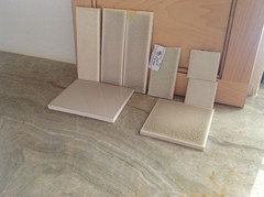
Backsplash: Still on hunt

bookworm4321
10 years ago

I am starting a new thread on this topic. I thought I had the right color in Encore, but when the samples came in (Cameo), all beigey. As one of the wizard of colors, May_flowers, pointed out, any beige makes maple cabinets more fleshy. We compred my smples to the Board, and truly a different color.

So, back to green/gray glass, Ice shade of Encore, an irridescent.

Comments (51)

  • bookworm4321
    Original Author
    10 years ago

    Whoops, forgot to ask if anyone ever heard of Pratt Larson ceramics? Like the Encore, there is color variation between same tile.

  • bookworm4321
    Original Author
    10 years ago

    CK, I'm happy for you. I'll take more pictures tomorrow.

  • PRO
    Joseph Corlett, LLC
    10 years ago

    These tiles are really great:

    http://www.countertopresource.com/coverings-etc-larger-bio-luminum-tiles/

    Here is a link that might be useful: Tiles

    This post was edited by Trebruchet on Thu, Dec 5, 13 at 7:12

  • ellendi
    10 years ago

    I would do a simple gray/green solid not one with multiple color variations.

  • mark_rachel
    10 years ago

    I love the Encore Subway that looks like crackle. I also love the large square greenish tile. I really don't like the glass at all. I don't think it goes with your other elements.

  • Gracie
    10 years ago

    Pratt & Larson are high quality handmade tiles made in Portland.

    I think gray looks best. Is that the Ice in the subway? I think that's the right tone of gray, or something slightly darker for contrast with the natural maple. The darker square tile looks a tad too dark and blue-gray, and I'm not sure about the waviness with the grain of the wood and busy countertop.

    I'd try a solid gray ceramic in the Ice tones and gray glass subways in a larger format.

  • deedles
    10 years ago

    What is that quilted looking tile in the second picture? Oh, duh, it's the back nevermind. (was going to say that was a cute tile, doi)

    The square greenish one looks great IMO with your counter and cabs. I love your counter top... what is that material...granite?

  • Gooster
    10 years ago

    I like the Encore tile. I think the undertone there goes a bit better with the glaze on your cabinets. I too get a slight blue tinge in some of the samples.

    I love Pratt & Larson tile. I fell in love with some of their relief tiles.

  • bookworm4321
    Original Author
    10 years ago

    You are the best. I cannot get a decent picture until morning.

    When I return to tile shop next week, I will look for Encore darker than Ice, but lighter than Smoke The farthest left is Encore Mint, which is less green than Encore Peridot.

    The P& L looked good to me, but I had never heard of it until May_flowers added her approval. I think I'll look at other colors in that line.

    I will rule out glass.

    Again, I appreciate the help, more than you could know. his is just not y forte.

    {{!gwi}}

  • Gracie
    10 years ago

    Be sure to talk to your installer about his experience with handmade tiles. I think they require more skill and as a result might cost more to install.

  • chs8084
    10 years ago

    I have a similar granite but dark cabinets and have been having a really hard time deciding on backsplash. I like the glass myself, and I love that gray, but the how does it go with other elements is hard to say from the pictures.

  • Ivan I
    10 years ago

    That is one of the most gorgeous blends of cabinet - counter - backsplash colors I've ever seen.

  • bookworm4321
    Original Author
    10 years ago

    MareLuce, thanks.

    My lack of knowledge shows thru everything. I needed someone with experience and an eye to color to help chose granite/quartzite, along with BS. A quieter counter would allow nicer BS. For example, with Blue Pearl granite, there is a fabulous P & L tile that is white with blue trim. I think the elements should be coordinated.

    chs; if you have dark cabinets, you shouldn't have the trouble I am having. My maple cabinets have a fleshy tone, so anything creamy/yellow looks "off". Do your cabs have a red tone? grey tone?

  • romy718
    10 years ago

    Don't be hard on yourself. Finding the right backsplash is difficult for most, hence the ABB club. Your counters are beautiful. I can't tell from this picture what looks good. Everything is too close together. Take pictures with 2 samples & let's start eliminatating? This could be fun. Isn't it funny how easy it is to figure out what looks good for someone else's kitchen but near impossible when it's your own?

  • chs8084
    10 years ago

    Bookworm, trying to pick out the right color in the granite has been the challenge, along with not going too dark. I have a cafe stained maple for my cabinets, a dark brown along with Brazilian cherry floors. We didn't settle this on my earlier visit (on a new build) and so now we are doing this at a distance.

  • herbflavor
    10 years ago

    like the squarish tile propped up on the right in last picture..or else the cream colored small little squares on the left-but in a bigger size than those small squares,if possible.

  • Gracie
    10 years ago

    Now the gray tiles look taupe. Take the photos with the samples against the wall under the installed cabinets. Step back a few feet so we can see the overall look.

  • deedles
    10 years ago

    Gosh, IMO, it seems like almost any of them would work except that subway that is laying down. I can see counter top color in all the rest, at least on my monitor.

  • Gracie
    10 years ago

    Me too, Deedles. Most of the choices work with the granite. In her other thread, it seemed the creamier beiges turned the cabinets pink. The lightest off-whites seem to look good. I've been wondering if the natural maple will turn slightly yellow in time and if that could play a role. I think gray might be safest.

  • deedles
    10 years ago

    Grey would be wonderful and might just make the gorgeous veining in the granite really take center stage. I agree with the remark earlier on the cabs with the counter... just beautiful.

  • bookworm4321
    Original Author
    10 years ago

    I took May_flowers advice and tried a few pictures away from window.

    Far left is the Encore Cameo, where the sample came 'cream', not like the one on the Board. Next is Mint (2 of them), then Peridot (too green), then the Ice (which I would order is large subway). A little pale, but no cream in it. The sample is not too old, but clearly Encore changes its colors.

    Lying flat on left is the best color match from Walter Zanger, but it is a flat color, no noticeable crackly. On the right, lying flat, is Encore Smoke, which looks too dark.

  • Gracie
    10 years ago

    I'd eliminate Cameo because I think it clashes. I'd like to see the WZ propped up on the counter, no cabinet. Pretty please. :D

    I think I may like it the best because it keeps the softness and serenity of your kitchen. Maybe it's not a thrill a minute, but I think you may have to separate what you love with what goes best with the countertop. I see here all the time where people won't chose even one element in their kitchen unless they are absolutely falling down in love with it. I think those people often overdo it. Maybe all your counter wants is a nice companion. Love's too complicated. ;)

  • bookworm4321
    Original Author
    10 years ago

    Here is the WZ plain one, and the Encore Ice.

    Out of curiosity, May_flowers, are you an artist? Even with poor quality pictures, you are able to see tones.

    This post was edited by bookworm4321 on Sat, Dec 7, 13 at 16:12

  • Gracie
    10 years ago

    No, I've just always loved working with colors and pattern. I've learned a lot in the remodeling we've been doing the last few years, but not enough to pick out my own BS tile! haha! I also design gardens as a hobby and a lot of the same principles apply--color, tones, texture, balance.

    I like that gray. I'm not sure about crackle tile. Even though you wouldn't call it a patterned tile and you see it paired with busy countertops, usually the cabs are painted. There's no third pattern, like in your cabinets. Most people forget that wood has pattern. I've even seen oak disregarded in selecting countertop and tile.

  • bookworm4321
    Original Author
    10 years ago

    May_flowers,

    I can see your points. I guess I have grown to like so many gorgeous tiles, so hard to order the plain one. I believe I drooled when I saw theP & L samples.

    Have you posted pictures of your gardens?

  • eam44
    10 years ago

    Book, is your countertop made of onyx? It's beautiful.

    Sometimes it helps to shake things up a bit, so I'm going to show you some options you would not have considered, if you're ending up with those sample tiles.

    While I agree that you need to keep the bs somewhat monochromatic, it doesn't have to be plain. Think texture (like your quilted tile, although that would drive me a little nuts), shape, MOVEMENT - MOVEMENT I SAY!!! Play with the sheen of the glazes, like the Heath tile below, to give some life to the bs. Furthermore, I think you're having trouble choosing colors because the colors of the samples you have are so muddled. Go with the whimsy your counter choice suggests, and by all means, brighten! Your off-white wall looks better with your cabinet and counter than any of the samples does.

    I'm more familiar with Fireclay and Heath ceramics, but you can find something like these in any line you like. Most importantly, buy a tile you LOVE or keep looking. Good luck!

    Shape/Movement:
    Fireclay Ogee Drop#1 Fireclay Pickett

    Heath Ceramics Tapestry/Argyle - the movement is generated by different sheens (glossy and matte) of the same color glaze. Brilliant.

    Color:
    Fireclay Tusk
    {{!gwi}}
    Fireclay Celadon
    {{!gwi}}
    Fireclay Silver Sage
    {{!gwi}}
    Fireclay Foggy Morning
    {{!gwi}}
    Fireclay Shadow
    {{!gwi}}

  • bpollen
    10 years ago

    In your first post and first pics in that post:

    You have 5 backsplashes, counting from left to right.

    Going by the countertop sample you have (bottom row, the big chunk on the left laying down):

    My favorites are #2 and #4 definitely. The other beiges are nondescript.

    I don't like gray with those maple cabinets. The two color tones don't seem to go well together, to my eye, even though there is some subtle gray in the countertop material. The color of maple is in the brown/tan family, to me, and looks best staying within that family or going with white (which goes with anything and is already in everyone's house somewhere) or a strong black for contrast (if there are other black colors in your home's color scheme).

  • bookworm4321
    Original Author
    10 years ago

    EAM,
    Those first 3 Fireclays look terrific. I return to favorite tile store tomorrow, meeting the KD there, so will see if they carry that brand. After posting last week, I was ready to take May_flowers advice, and stick with the 2 last. The Encore Ice is actually the same color as the W Zanger, but has the crackle.

    The countertop is a quartzite, called Van Gogh at store, Nature of Marble. I know it has another name, but in that variety it did not have the movement. I put in an old picture, but colors closer to the reality. Oh, and Susan has a new door and is loaded with appliances and is one of my favorite things.

    bpollen, lots of grey in counter top, which is why KD kept telling me to go "warm". In hindsight, that advice set me up to fail, as anything creamy clashed. If I had not turned to KW for opinions, I may have settled.

    So, tomorrow is the big day. Wishing all others in the ABB club good luck.

  • Gracie
    10 years ago

    I've linked sixtyohno's kitchen. It's similar to yours. Her reveal received many favorable responses because of its serenity. Sound familiar? When she installed the tile, she tried to jazz up the plain subways and added a mosaic accent under the hood. She immediately felt it destroyed the serenity, so she removed some of the mosaics. I think the serenity of your choices make it stand out, and I'd be careful not to destroy that.

    In sixty's kitchen, the green glass adds to the contemporary feel. Now if that was changed to a ceramic, I think it'd be softer and a little less contemporary. Crackle would probably look out of place since it is more traditional. Mosaic and unconventional shapes would be the first thing you noticed, to the detriment of the counter imo.

    Are you able to look at her photos of an entire kitchen and imagine your choices in their place?

    Here is a link that might be useful: sixtyohno's reveal

  • bookworm4321
    Original Author
    10 years ago

    May_flowers, I read her reveal. She doesn't mention the brand of tile. Then I read thru all the threads on which she posted.

    So, I have one glass tile that is almost too green, tho looks grey in picture, and I'll ask to see others. No fancy pattern, or mix of matte and shiny, just simple.

    Main point, even if it drives KD crazy (tho he has offered but 1 suggestion re BS), I should be happy/content with my choice, not pressured.

    thanks again

  • localeater
    10 years ago

    bookworm- keep the faith
    I just installed my backsplash after a year of looking and I LOVE it. It is the serene warm complement I had been seeking. I went around the world and back in my quest, but when I found it I knew.
    And sixtyohno's kitchen is one of my all time fave kitchens

  • Gracie
    10 years ago

    Bookworm, I still prefer a soft gray ceramic based on color alone. I mention sixty because you can see how the entire kitchen looks in glass. I have no idea if you want contemporary, traditional, or something else. Are the elements we haven't seen traditional, contemporary....?

  • bookworm4321
    Original Author
    10 years ago

    I agree the kitchen is transitional. If it was not evening, I would post pictures of rest of house. Drapes in bedroom are silk, with embroidered flowers. Handpainted lamps, which pick up flowers. Dining room table oak with curved legs; breakfront has Carerra marble. Oriental rugs. In sum, I feel like a Boston expatriot to the SE Florida. Is it any wonder that I love traditional things? My former house was 100 years old, so my antique style (glass knobs on all doors, for example) was a natural. I think I was second of my peers to install wood floors.

    I am trying to be modern. The new glass tiles (irredescent, no less) on pool look perfect.

    Picture of dining room. The clutter on marble are things I haven't returned to kitchen. Fabric on chair is beige with blue dots (think MTMoore), and said fabric is used on 2 LR chairs. I am including these details to show what I helpless romantic I am when it comes to things.

  • Gracie
    10 years ago

    That's great!! It gives me a whole 'nother perspective! I'd definitely throw the glass and mosaic samples out the window. I think crackle or ceramic tile would be beautiful. I wouldn't force a modern style into the kitchen just because you like it in the pool area.

    Have you picked out faucet, pulls, and lighting?

  • eam44
    10 years ago

    That's great bookworm! If they don't carry Fireclay, you can ask about Heath Ceramics. They have beautiful glazes too.

    So... speaking of sixty's beautiful kitchen - her bs is lovely, and probably not what someone of my generation would choose, and that's OK. When I read words like "serene," I think bedroom, not kitchen, the beating, life giving heart of the home. Your beautiful quartzite speaks volumes to me. I would match it with a quiet mate for sure, but one with character, presence, and strength. I'm quite a bit younger than most of the folks on this forum, and that noticeably affects my bs choices, so take them with a flake of fleur de sel :) I'm sure whatever you choose, it'll be right for you and the stone and the cabs. The choices you've made so far have been pretty great!

  • bookworm4321
    Original Author
    10 years ago

    EAM,

    Zen was a word used to describe 60's kitchen, and it fits. What I found interesting is that her glass tiles were called beige, but then looked green when installed. That seems like a fortuitous mistake.

    May_flower, I am quite content with sink and faucet. Faucet looks like a swan, Brezio Vuelo. Pulls are simple "C's". Had I known I was going to return the GE Profile frige for a GE Monogram, with European handles, I would have chosen that style. A minor mistake in the scheme of things. UC lights are ordered. I was here with electrician and KD when outlets installed in BS area, and they would not put them horizontally. I was quite annoyed. My own electrician charges 1/2 as much, as would have put my wishes first. My contract with KD does not include overhead lighting, so that will be a future project.
    well, off to work.

  • Gracie
    10 years ago

    Very pretty sculptural faucet, bookworm. Your decorating choices seem to have a soft, flowing, feminine feel. Continue on!

  • marthastoo
    10 years ago

    We just had our backsplash installed (grouting today) in Encore mint! What a coincidence! We absolutely LOVE it! It is so beautiful and the perfect color for our kitchen. Our cabinets are white and countertops are steel gray leathered granite, so different than yours, but I think it would look lovely in your kitchen as well. I will be happy to post pics when I get home.

  • mark_rachel
    10 years ago

    From the look of they rest of your house I think I would stay away from glass. It's not going to look traditional at all. I like the ICE in the large subway. I think that would work with the rest of your elements.

  • romy718
    10 years ago

    Marthastoo, please post pictures. I figured yours would go in before mine. I'm happy to hear that you love it.
    Bookworm, looking forward to hearing how it went for you today.

  • localeater
    10 years ago

    Bookworm, I agree with mayflowers for your home's transitional style all glass tile would feel too modern.
    I had the same issue- I needed to walk a line between two styles farmhouse and modern - I think I achieved it with a mix of glass arabesque and handmade ceramic subway- but that's just my kitchen. You may want to think about doing stacked subways instead of running bond, or squares. EAM mentioned Heath- their website has some great pictures of mixing glazes, gloss and matte, which lends a modern edge, IMO.
    Good luck and don't lose hope.

  • bookworm4321
    Original Author
    10 years ago

    It is done. Encore Cameo. The first choice from start. I cannot capture the hostility between woman at tile store and the KD. At least 24 samples next to my quartzite, cabs, and floor, in excellent lighting. The KD went thru, pushing one after another aside, which included many glass. Ice Encore ruled out: too bright. Peridot and Smoke "too dark". All other brands eliminated. KD whispers to me, "Isn't this very expensive?" ME: "No more than anything else I have seen." Final choice, Mint or Cameo, with both edging towards the latter. Within 20 minutes, these professionals were praising the edges of Encore, how terrific for grout, going over grout options. Hugs all around.

    And in real life, I worked my butt off today. I am just so happy to have this BS decision behing me.

    Once again, I cannot thank the GWebbers with "the gift" enough.

  • Gracie
    10 years ago

    Why did they chose Cameo over Mint?

  • romy718
    10 years ago

    Great choice Bookworm. I remember that you were considering Cameo awhile ago. It has the beautiful variation that you get with a handmade crackle but not so much that it will fight with your countertops.
    I'm excited for you!

  • bookworm4321
    Original Author
    10 years ago

    Tile salesperson had just finished a large job, and had more samples, which looked exactly like the color on the board. No yellow, just the hint of grey/green. Under good light, both looked good. Cameo will add more contrast than Mint. My natural light is not very good, as one kitchen window faces North, and the porch limits the light coming in. So, during the day, the lighter Cameo should look better. I don't think there was a wrong choice between these two. They left the choice to me, but each of these experts let me know Cameo was their choice.

    Martha, with white cabs, I would definitely have gone with the Mint. Your pictres look wonderful, and made me happy that I did not put off this meeting and drive 2 hours to see the Heath tiles (no Fireclay or Ann Sacks anywhere). I feel fortunate that I found the only Encore dealer in my area, and that was by chance. The advertised dealer was an hour away, and they had not sold Encore for years.

    This has certainly been a learning experience. I cannot thank the wise GW people enough. I have visions of my next kitchen, with Sea Foam quartzite or Blue Pearl and P & L hand-painted tiles. I will definitely coordinate from the start, not make each decision at a time.

  • Gracie
    10 years ago

    Looking forward to seeing it installed! When will that be?

  • bookworm4321
    Original Author
    10 years ago

    I was told tiles will come in 4 weeks, as factory shut down a week. Not thrilled hearing that Matha's took 7 weeks, but her kitchen looks so nice. At least, my kitchen is functional.

  • marthastoo
    10 years ago

    Yep, 7 weeks (but Thanksgiving was in those 7 weeks). I was warned before we placed the order that the official party line is 4-6 weeks, but in their experience, Encore consistently took 6 weeks.

    Cameo will look lovely with your cabs and countertops. Mint would have looked great too, but I understand why you chose cameo.

  • bookworm4321
    Original Author
    10 years ago

    My KD asked the tile lady if people ever bought both colors, to use in pattern. She assured him that each color had so much varation, that using 2 colors would be too busy.

    Now I want to see others choose some of the darker colors, paired with antique Brown, or the dark browns and blues. Romy, Martha, and I all chose from the 2 palest on the chart.