Shop Products
Houzz Logo Print
phiwwy

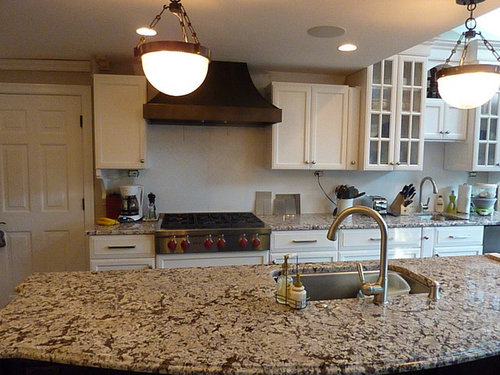
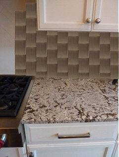
Finally selected backsplash! Concur?

phiwwy
11 years ago

So after looking at many many whites, and trying to find an interesting shape or pattern, I concluded that white was just too -- white. Fell in love with the taupe-y one on the right; it's stunning in person and is perfect with the Bianco Antico and the hood still will stand out. We would like the herringbone pattern with 2x8s. No accents, just field tile.

Thoughts?

Here is a link that might be useful: Original thread

Comments (27)

  • deedles
    11 years ago

    Which right? Can you do a closer-up?

    Like the range hood and lights! Beautiful.

  • phiwwy
    Original Author
    11 years ago

    Thanks :-)

    The set of 4 on the right (they are hand glazed, thus the variation).

  • deedles
    11 years ago

    Just a quick paint image... to see the color mostly:

    pretty! Looks to be a good fit with the counter top.

  • phiwwy
    Original Author
    11 years ago

    Deedles - very cool thanks! In the photos, my counter looks a bit pink - it is not. Therefore the tiles look like they also don't match, which they in fact do. Any chance you could do this on the other photo? I would love to see how it looks under the hood if it's at all possible. thanks!

  • deedles
    11 years ago

    Like so? Please bear in mind that I'm like Fred Flintstone with the image stuff, compared to some folks here.

  • a2gemini
    11 years ago

    That looks sharp!!
    When will you be joining the ABB alumni club!

    Deedles - you are way too modest - but I am thinking of getting the Adobe suite for us for the holidays. I might have to get some lessons from you!

  • deedles
    11 years ago

    *****raspberries blowing**********

    Thanks but....I'd suggest you talk to Bella for tips. She's getting to be quite the arteest!

  • phiwwy
    Original Author
    11 years ago

    Wow, thanks! I think I am convinced. There is some depth that I was really having a hard time getting out of the whites. I think it's warm.... do you?

  • AboutToGetDusty
    11 years ago

    Good choice - go for it!

  • deedles
    11 years ago

    It looks nice with the counter and cabs. Looks like you've found your tile!

  • springroz
    11 years ago

    LOVE that!!

    Nancy

  • badgergal
    11 years ago

    I think it looks very nice. I like the way it makes you cabinets stand out too.

  • ellendi
    11 years ago

    I am glad you are excited and only you can really tell how it looks and matches. I just feel it might be too busy with Bianco Antico. I would go with the lighter one as it looks like it doesn't have the variations like the darker one.
    The mock up convinces me that your choice competes with the granite. But it is your kitchen and if you are happy than go for it.

  • deedles
    11 years ago

    ellendi: I think if it looks busy, it's the fault of the paint program person (me). I think the variation is too highlighted and too repetitive in my version.

  • enduring
    11 years ago

    I love the darker of the two you have. If the colors go, I say do the dark like you want. It will be stunning.

  • rhome410
    11 years ago

    I LIKE that it pulls the darker tones out of the counter, and I particularly love it with the hood. It's a braver choice than something lighter, and I like that about it!

  • phiwwy
    Original Author
    11 years ago

    Thanks everyone for your honest opinions. I keep leaning strongly toward the darker, while I do really like the lighter one, it feels "safe" to me and would certainly be gorgeous, but I think the darker, rhome, is definitely braver and has a bit of an edge.

    For a herringbone pattern - would you choose 2x8's or 2x6's? Will be curious to hear those opinions!

  • enduring
    11 years ago

    Hey Phylhl, have you seen this post I did last year? I don't know if it will help in your decision regarding size of tile, but I hope so. It is just a collection of different sized herringbone.

    Here is a link that might be useful: Inspiration Images Herringbone

  • motherof3sons
    11 years ago

    Wowza! Beautiful tile and countertop!!!

  • phiwwy
    Original Author
    11 years ago

    enduring - great collection of herringbone! It got me searching on houzz as well to compare 2x8's vs 2x6's.

    OK now that we know the BS will be brown/taupe/whatever color it's called - actually it's called TWIG - I need to redo the stools. I just threw this lime green/gray fabric over the out of the box fabric which is the same color as the BS and same color as my kitchen chairs and bench seats. Should i cover them with a solid lime green, which is my accent color? Or keep them them solid Twig. Would that be too much of that color?

  • deedles
    11 years ago

    I'd like to see some red on those stools, actually.

    isn't there red in your stove?

  • phiwwy
    Original Author
    11 years ago

    Agree, red would be cool but I have lime green accents elsewhere - more pix soon. Plus, I think I will eventually get black knobs instead of the red. I love red, but that was my accent in my last kitchen and I'm ready for a change.

  • rosie
    11 years ago

    Really like taupe on the backsplash, and I think lime on those seats would be like a friendly hand waving to people to come sit down. :)

  • beekeeperswife
    11 years ago

    Did I ever suggest you look at srg215's kitchen? She did the BA counters, and ended up using a Manadala tile, in Stingray. In my last kitchen I had thought of using this tile but decided I wanted a brighter look, so I lived vicariously through her kitchen!

    You can do a google search for photos, but here is just one link I found.

    adding--your tiles look great with the counters!

    Here is a link that might be useful: srg215's BA kitchen with a dark bs

    This post was edited by beekeeperswife on Mon, Dec 17, 12 at 16:19

  • go_figure01
    11 years ago

    Hi phylhyl:
    An idea might be to make a template of a pattern for your stools. I did this with mine and have a few different prints and solids & am able to change them out.

    It was very easy to do and you can make the pattern fit tightly over the cushions so it looks like they are upholstered. It makes them easy to wash too.

    Your kitchen looks great! I have been watching your progress and look forward to seeing it all put together. How exciting you must be!!!

  • phiwwy
    Original Author
    11 years ago

    bee - thanks for that link - I had not seen that kitchen, it's gorgeous.
    go -- great idea about the stools. Mine are pretty easy to take apart and staple fabric to, I'm just going to go right over the out of the box fabric.