


Calling white kitchen owners for ideas of wall colors
fleur222
12 years ago
Sort by:Oldest
Comments (28)
Related Stories
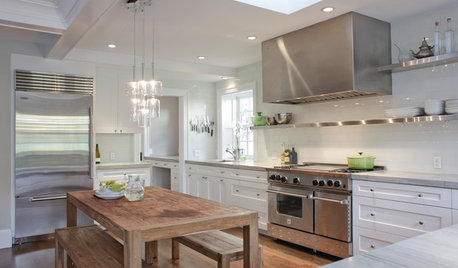
KITCHEN DESIGNCooking With Color: When to Use White in the Kitchen
Make sure your snowy walls, cabinets and counters don't feel cold while you're riding white's popularity peak
Full Story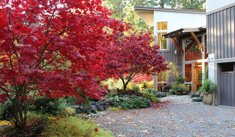
FALL GARDENINGHouzz Call: Show Us Your Fall Color!
Post pictures of your fall landscape — plants, leaves, wildlife — in the Comments section. Your photo could appear in an upcoming article
Full Story
DECORATING GUIDES10 Wonderful Ways to Colorize a White-Walled Room
Drawing a blank on white walls, you say? These decorating ideas can help your rooms come alive with color
Full Story
MOST POPULARMust-Try Color Combo: White With Warm Off-White
Avoid going too traditional and too clean by introducing an off-white palette that brings a touch of warmth and elegance
Full Story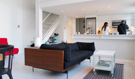
HOUZZ TOURSMy Houzz: Color Hits the Spot in a White-on-White Scheme
Bright red furniture strikes a dramatic pose against snowy walls and floors in a Montreal loft
Full Story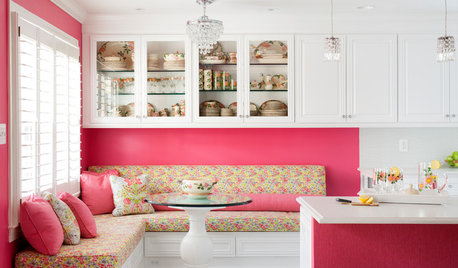
KITCHEN OF THE WEEKKitchen of the Week: A Punch of Pink for a White Kitchen
A homeowner shows her love of pink in bold walls that impart a cheerful vibe
Full Story
KITCHEN DESIGNHouzz Call: Pros, Show Us Your Latest Kitchen!
Tiny, spacious, modern, vintage ... whatever kitchen designs you've worked on lately, we'd like to see
Full Story
HOUZZ CALLShow Us the Best Kitchen in the Land
The Hardworking Home: We want to see why the kitchen is the heart of the home
Full Story
SMALL KITCHENSHouzz Call: Show Us Your 100-Square-Foot Kitchen
Upload photos of your small space and tell us how you’ve handled storage, function, layout and more
Full Story
KITCHEN DESIGNShow Us Your Best Kitchen Innovation
Did you take kitchen functionality up a notch this year? We want to see your best solutions for the hardest-working room in the house
Full Story

User
fleur222Original Author
Related Professionals
Agoura Hills Kitchen & Bathroom Designers · Brownsville Kitchen & Bathroom Designers · Buffalo Kitchen & Bathroom Designers · East Islip Kitchen & Bathroom Designers · East Peoria Kitchen & Bathroom Designers · East Tulare County Kitchen & Bathroom Remodelers · Sunrise Manor Kitchen & Bathroom Remodelers · Salinas Kitchen & Bathroom Remodelers · Winchester Kitchen & Bathroom Remodelers · Manville Cabinets & Cabinetry · Maywood Cabinets & Cabinetry · Rowland Heights Cabinets & Cabinetry · Watauga Cabinets & Cabinetry · Tabernacle Cabinets & Cabinetry · Fayetteville Tile and Stone Contractorsbatmansmama
User
User
dianalo
willtv
nini804
steph2000
fleur222Original Author
fleur222Original Author
nini804
kellienoelle
fleur222Original Author
beaglesdoitbetter1
chris11895
marcolo
macybaby
steph2000
jg1126
chris11895
fleur222Original Author
chris11895
dalmadarling
boxerpups
fleur222Original Author
boxerpups
fleur222Original Author