


Design Around #7 Vict./Queen Anne. Lurkers comment.
palimpsest
12 years ago
Related Stories
HOUZZ TOURSHouzz Tour: Lovingly Resurrecting a Historic Queen Anne
Dedication and a keen eye turn a neglected eyesore into the jewel of its Atlanta neighborhood
Full Story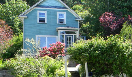
HOUZZ TOURSMy Houzz: Honoring the Past in an 1891 Queen Anne
Antiques and respectful renovations give a home in Oregon old-world charm and modern-day comforts
Full Story
ORGANIZINGDecluttering Ideas From Around the World
Home organizers share their tips on how to think and live more clearly
Full Story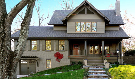
EXTERIORS7 Home Exterior Transformations
Before-and-after photos show how thoughtful renovations boost curb appeal
Full Story
MOST POPULARIs Open-Plan Living a Fad, or Here to Stay?
Architects, designers and Houzzers around the world have their say on this trend and predict how our homes might evolve
Full Story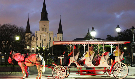
TRAVEL BY DESIGNTravel Guide: New Orleans for Design Lovers
Experience the city's energetic rebirth layered with centuries of history, seen in its architecture, museums, restaurants and more
Full Story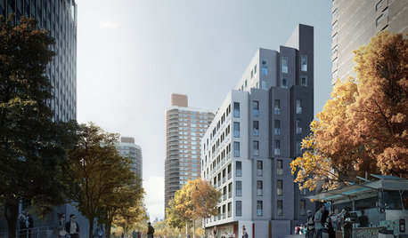
SMALL HOMESMicrounits Are Coming to NYC. See the Winning Design
Say goodbye to only arm-and-a-leg Manhattan rents. This plan for small prefab units opens the door to more affordable housing
Full Story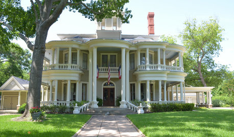
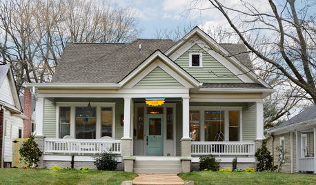
TRADITIONAL HOMESMy Houzz: Step Inside a Grand 1800s Victorian
A 7,000-square-foot historic estate returns to glory, thanks to loving renovations by a tireless Texas couple
Full Story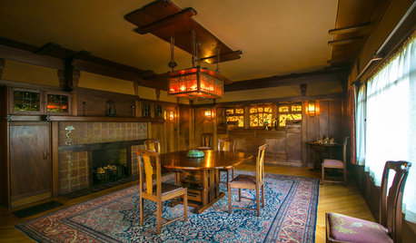
HOUZZ TVHouzz TV: Meet the Gamble House, a ‘Symphony in Wood’
Masterful use of wood helps make this Pasadena home, now open to visitors, a model of California bungalow style
Full Story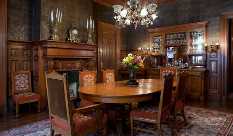
VICTORIAN DESIGNHouzz Tour: San Francisco’s Haas-Lilienthal House
Get a rare behind-the-scenes glimpse of this storied Victorian mansion from its decade-long caretaker
Full StoryMore Discussions


marcolo
cawaps
Related Professionals
Bloomington Kitchen & Bathroom Designers · Leicester Kitchen & Bathroom Designers · Montebello Kitchen & Bathroom Designers · United States Kitchen & Bathroom Designers · Rancho Palos Verdes Kitchen & Bathroom Remodelers · Tulsa Kitchen & Bathroom Remodelers · Vienna Kitchen & Bathroom Remodelers · West Palm Beach Kitchen & Bathroom Remodelers · Weston Kitchen & Bathroom Remodelers · East Moline Cabinets & Cabinetry · Mount Prospect Cabinets & Cabinetry · Riverbank Cabinets & Cabinetry · Gladstone Tile and Stone Contractors · Santa Rosa Tile and Stone Contractors · Bell Design-Build Firmsteacats
marcolo
orcasgramma
marcolo
live_wire_oak
orcasgramma
marcolo
cawaps
lalithar
Delilah66
roarah
orcasgramma
mudhouse_gw
mudhouse_gw
live_wire_oak
marcolo
sochi
mudhouse_gw
marcolo
lavender_lass
marcolo
cawaps
lavender_lass
sochi
orcasgramma
cawaps
mudhouse_gw
marcolo
mudhouse_gw
marcolo
Bunny
cawaps
purplepansies
bmorepanic
formerlyflorantha
palimpsestOriginal Author
sochi
formerlyflorantha
cawaps
sochi
sochi
cawaps
orcasgramma
palimpsestOriginal Author
clubcracker
palimpsestOriginal Author
igloochic
lavender_lass