
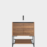


Symmetry in horizontal uppers--which do you prefer?
chaparral
12 years ago

Sort by:Oldest
Comments (26)
Related Stories

KITCHEN DESIGNHouzz Quiz: Which Kitchen Backsplash Material Is Right for You?
With so many options available, see if we can help you narrow down the selection
Full StoryKITCHEN DESIGN12 Great Kitchen Styles — Which One’s for You?
Sometimes you can be surprised by the kitchen style that really calls to you. The proof is in the pictures
Full Story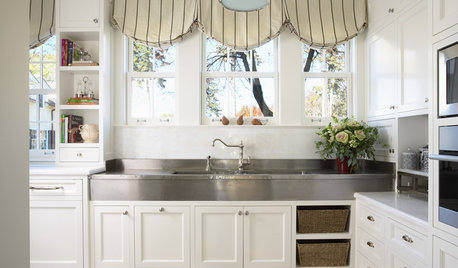
KITCHEN DESIGN8 Top Hardware Styles for Shaker Kitchen Cabinets
Simple Shaker style opens itself to a wide range of knobs and pulls. See which is right for your own kitchen
Full Story
MATERIALSKitchen Ideas: How to Choose the Perfect Backsplash
Backsplashes not only protect your walls, they also add color, pattern and texture. Find out which material is right for you
Full Story
MOST POPULAR50 Shades of Gray
Gray is hotter than ever, thanks to a hit novel full of risks and dark secrets. Tell us: Which paint shade possesses you?
Full Story
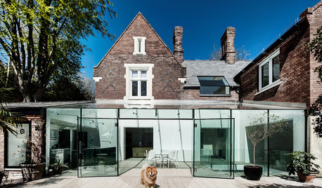
CONTEMPORARY HOMESHouzz Tour: An Air of Mystery, Grounded in Practicality
Not all is revealed at once in this new New Zealand home, which balances cocktail chic and family playspace
Full Story
MODERN ARCHITECTUREDesign Workshop: Additions With Attitude
Learn the strategies that can make extensions to existing home structures meaningful, respectful and of their time
Full Story
GARDENING GUIDESMeet the Grass-Carrying Wasp, a Gentle Pollinator of Summer Flowers
These fascinating insects nest in wood cavities and hollow plant stems
Full Story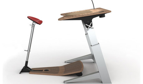
HOME OFFICESStand-Up Desks Rise to Health Challenges
Sitting all day may be wrecking your health. Are you going to stand for that?
Full StoryMore Discussions
herbflavor
cat_mom
Related Professionals
Highland Park Kitchen & Bathroom Designers · Dearborn Kitchen & Bathroom Remodelers · Glen Allen Kitchen & Bathroom Remodelers · Overland Park Kitchen & Bathroom Remodelers · Portage Kitchen & Bathroom Remodelers · Casas Adobes Cabinets & Cabinetry · Berkeley Heights Cabinets & Cabinetry · Canton Cabinets & Cabinetry · Town 'n' Country Cabinets & Cabinetry · Liberty Township Cabinets & Cabinetry · Bellwood Cabinets & Cabinetry · Channahon Tile and Stone Contractors · Green Valley Tile and Stone Contractors · Roxbury Crossing Tile and Stone Contractors · Schofield Barracks Design-Build Firmsellaf
blfenton
steph2000
dianalo
chaparralOriginal Author
sandca
chaparralOriginal Author
holiday2525
blfenton
chaparralOriginal Author
hlove
blfenton
dianalo
chaparralOriginal Author
chaparralOriginal Author
chaparralOriginal Author
ice1
ice1
kitchenkrazed09
chaparralOriginal Author
blfenton
chaparralOriginal Author
blfenton
chaparralOriginal Author