Shop Products
Houzz Logo Print
jeanninefay1

Help Picking Breakfast Nook Upholstery: 3 Options

Jeannine Fay
9 years ago

It's decision time on the banquette upholstery for our breakfast nook. Of course the options are endless, but I thought I'd start narrowing it down.

I'm posting three options. Kindly vote on your favorite.

The pattern fabric will go on the seat back and the faux leather fabric will go on the seat bottom.

OPTION 1

{{gwi:2141246}}

OPTION 2

{{gwi:2141247}}

OPTION 3

{{gwi:2141248}}

BOOTH PICS: The bare wood you see is what the upholstered foam will be attached to. They are removable so down the road if I need to reupholster I can just detach them. Our table will be made for the space once the seats are done. It will be natural cherry to match the island.

{{gwi:2141249}}
{{gwi:2141250}}
{{gwi:2141251}}

KITCHEN PICS: I'm adding a couple kitchen pics to give the overall feel of the space. some are pre but we just went with a cream subway tile.

{{gwi:2141252}}

An early shot- The booth area is on the right.

{{gwi:2141253}}

Thanks for your help.

Comments (48)

  • hsw_sc
    9 years ago

    Your kitchen is beautiful already!

    With that being said, my vote is for Option #1. It's warmer and is more interesting than the other two choices.

    PS-Enjoy your Orca. I really miss mine now.

  • decordummy_gw
    9 years ago

    Another vote for Option #1 (love your kitchen).

  • Hydragea
    9 years ago

    Love your kitchen! I would opt for the most colour so option 1.

    I wonder if you get oil cloth instead of faux leather? That way you could do the whole thing in the same fabric.

    Here is a link that might be useful: Deck chairs and stripes site

  • ci_lantro
    9 years ago

    Definitely #1 but I'd like to see the seat cushion upholstered in a solid aqua color instead of brown--the darker aqua. Thinking the natural cherry table is going to be plenty of brown.

    Cool telephone! (What's the wall color? I love it!)

    **Edited for clarity.

    This post was edited by ci_lantro on Fri, Dec 12, 14 at 11:03

  • Fori
    9 years ago

    Option 1 (because the others are brown. It's too pretty a room to make BROWN!).

  • suzanne_sl
    9 years ago

    Also #1. Your kitchen is lovely, but needs a color pick-up. The stripey fabric is a great jump off for other added bits of color in the kitchen.

  • tibbrix
    9 years ago

    #3. I like the texture and how well it goes with the seat fabric.

    #2 looks too restaurant-y for me.

    #1 is blah and too Southwestern looking.

  • practigal
    9 years ago

    Maybe it is just my computer, but these are all too neutral for me. The people responding are telling you to go with the brightest color. Will there be throw pillows in this area? If so, then it maybe okay to go neutral, if not, can you do a brighter color? It seems really odd to me to have stripes in this space as everything else in this room is large blocks of color. Why wouldn't you want all red or all aqua seating? This comment is coming to you from someone who is not an interior designer. I hope you post this on the home decorating forum too.

  • Jeannine Fay
    Original Author
    9 years ago

    Wall Color is : Ben Moore-Paris Rain.

    My first instinct was to go with solid color faux leather for back and bottom but these benches are almost 8 feet long each and that much of one solid color just felt like too much in the space. I'm a fairly neutral gal with warm earth tones to accent. I like blues, greens and oranges

    This space will see lots of action and I have two school age kids so I need durable. Hence my initial leaning toward all faux leather but again everything I put there just seemed to dominate.

    I called in a decorator and she presented me with Option 1. I do like it. Maybe just don't love it yet. The other two options were what I picked from her book and are definitely on the safer side. I may need to keep looking and will add options to this post if I find them. Thanks for the input all.

    This post was edited by beanpiele on Fri, Dec 12, 14 at 16:33

  • zeebee
    9 years ago

    A late voter, but I like the pops of color with #1 as well.

    Hee hee, we have the same kitchen table right now (ours is also place-holding by the banquette until we get our table made). DH mutters "bingo hall" whenever he sees it but that baby has been a workhorse.

  • User
    9 years ago

    No offense to those who chose #1 but I think you'd get tired of the fabric and the brown vinyl looks "cheesy diner" to me.
    #3 is too gray and cold, if my monitor is to be trusted. I personally like this one the best but not for your space.
    #2 colors looks brown enough to go with your current wall color. The back cushion fabric is understated and has a quality look.

  • cawaps
    9 years ago

    I guess I'm the dissenter. While I like the stripe in Option 1, I don't like it at all in combination with the color of the faux leather. With a different seat fabric, this might get might vote, but I think there are other colorful stripes that I would like better.

    I really like Option 2. The fabric for the seat back is subtle but striking. I'm not sure, though, how the color would play with the rest of you kitchen elements (the wood of the island has more reddish tones, and I think I'd have to see both together in the same light to evaluate properly).

  • mgmum
    9 years ago

    I'd like to see a brighter, more fun colour, but of the ones you have I like Option 1 for the stripes but maybe a gray/blue for the seat rather than the brown?

    Your kitchen is beautiful!

  • HomeChef59
    9 years ago

    I don't like any of them. I'd try again. The good news is you don't have to listen to me.

    If you like it, go for it. If you hate it later, it's easy to fix.

  • pricklypearcactus
    9 years ago

    Beautiful kitchen!! Really love the island. I like option #2 best, followed by option #3. I'm sorry to say I don't particularly like option #1, but that's just my personal preference/style.

  • marcolo
    9 years ago

    I think the faux leather/ vinyl look is extremely inappropriate for your vintage look (which is beautiful, btw). You can get Sunbrella, contract fabric etc. that is very easy to clean.

    1 is closest to the right ballpark but not it. And I'm about done with being nice about suggestions that people "tire" of interesting things faster than they do of boring things. Pop this.

  • User
    9 years ago

    I love your kitchen and your nook with windows is just awesome. I don't love any of the choices you've presented. I agree with Marcolo and yet I also can see the benefits of the faux leather. I have a Ballard banquette that's upholstered in a heathered grey Sunbrella and I scrub off my 5yo's handprints from the banquette every night, despite the fact that I usually give him a dishtowel as a napkin. It's held up for a year now, and hopefully he'll get neater as he ages but, well, with kids, vinyl isn't crazy. You just have to find the combination of fabric and pattern that does justice to your beautiful kitchen.

    There was a poster a year or two ago who upholstered a more formal banquette - it looks like she used vinyl for the seat cushion and it came out lovely.

    Here is a link that might be useful: Twofishies' banquette post

  • Bunny
    9 years ago

    Your kitchen is beautiful and I love the nook with the view outside.

    I don't think any of your choices are worthy of what you already have. I don't know what to suggest, but they are all drab and unattractive.

  • magpier
    9 years ago

    I kind of agree with the others that none of the options are just right for your (wonderful!) space. Of what you have, the best option is stripes of #1 but I don't like brown faux leather.

  • HerrDoktorProfessor
    9 years ago

    I vote for #2

  • cookncarpenter
    9 years ago

    Of those three, definitely #1, but I also would keep looking...

  • romy718
    9 years ago

    I read this this morning & my thoughts were "if you can't say anything nice, don't say anything at all."
    Your kitchen is lovely & the fabric options don't do it justice. Keep looking. There are tons of Sunbrella type fabrics available.

  • kirkhall
    9 years ago

    I liked option 2 (until I read all the comments, ha!)

    But, of the 3, I still like option 2. I don't like the brown in #1. And, #3 is too boring imo.

  • amykath
    9 years ago

    I like #2 of the three. If you want color, I would go with something other than option 1. I think option 3 is too dark.

  • flying_c
    9 years ago

    I also think more color and interest are needed, but #1 is not the way to do it. Maybe a floral pattern or a paisley? Something softer and more rounded than the stripe. And I'm thinking that blue would work really well, a medium or dark blue with some green and gray in it.

  • bookworm4321
    9 years ago

    I finished picking fabrics for pillow cases for my new office. The couches are aqua leather. I almost chose this fabric. Its an oldie but works well.

    Enjoy searching for fabrics, and find something you really like.

  • Jeannine Fay
    Original Author
    9 years ago

    Thanks for all the feedback guys. I actually really like the faux leather. Some of it really looks/feels like leather and it is just by far the way to go for clean up. i also don't want too too much going on in the nook so I think a solid seat matched with a print back is the way to go for me.

    That said, I agree that I have not found the what I'm looking for yet. I want it to be a pretty fabric without having too much going on in it. I know myself and I'll tire of it. I'd rather have something I can match a couple colorful pillows to to add interest. It needs to not show every smudge. I was hoping for something with a little bit of "nubbyness" to it. Something that feels cozy. I'll put my walking shoes on today and find some more options.

    Thanks again all.

  • Ivan I
    9 years ago

    Will the upper be tufted?

  • kitchendetective
    9 years ago

    What colors do you use in the rest of the house? Particularly in the adjoining areas?

  • Jeannine Fay
    Original Author
    9 years ago

    Have not decided on tufting yet, MareLuce. Maybe.

    Good question kitchendetective. Obviously the big picture plays into the decision.
    The adjoining rooms are the front hall and the dining room. Both are painted Ben Moore-Edgecome Gray.

    I took this pic to capture the one big color blob we have hanging over our dining room table.
    {{gwi:2141254}}

    Some throw pillows in the living room which is painted a Ben Moore color as well- think Philadelphia Cream.
    {{gwi:2141255}}

    And now Two More Options:

    Option 1- Favored my my husband and probably me... But don't worry you won't hurt my feelings if you don't like it:
    {{gwi:2141256}}

    Option 2-
    {{gwi:2141257}}

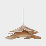
    Here's the light fixture we're going to hang in the nook. Yes it is a bit more modern than the others but we think it will work. Kind of trying to keep it a little vintage/modern around here I guess.
    {{gwi:2141258}}

  • rantontoo
    9 years ago

    I like the new option two especially after seeing your other fixture.

  • marcolo
    9 years ago

    I can see option 1 working. It does relate to some 1920s fabrics while being modern.

  • kitchendetective
    9 years ago

    The new Option 1 is really good.

  • SharonNM
    9 years ago

    I love option 2. I really love ikat looking fabric.

  • mgmum
    9 years ago

    I love the zig zag! If it was me, I'd go with the pale gray on the seat though. But it's not me! :)

  • Bunny
    9 years ago

    I like Option #1 with the darker gray as shown.

  • Ivan I
    9 years ago

    >> Have not decided on tufting yet, MareLuce. Maybe.

    The busier the fabric, the simpler the tufting needs to be.

    ex:
    https://www.houzz.com/photos/candice-tells-all-tv-series-hgtv-w-network-contemporary-dining-room-toronto-phvw-vp~5973066-Tells-All-TV-Series-HGTV-W-Network-contemporary-dining-room-toronto

    With tufting like above (what is that called?), what would look better, a busy fabric or something quieter?

  • HomeChef59
    9 years ago

    I was critical of the first group. I thought you could do better.

    I really, really like number 1 in the second group.

  • Jeannine Fay
    Original Author
    9 years ago

    MareLuce- Google tells me that's a diamond pattern. Very pretty.

    Are you thinking I should go with a solid and tuft it?

    If I could find a perfect solidish fabric I would be interested in that but it has been so hard to find something that doesn't look blah. Lighter fabrics interest me, but I just can't go there with kids. I do not want to stress every time they pile in the booth. Stress free living with kids does not entail light fabric in your eating areas. So then I go toward the darker solids and that's where it starts to look really drab. My first instinct to do all vinyl (or faux leather to sound classier) was not working out for this reason. Two long brown/tan/gray benches just seemed like a mud hole in my kitchen. And two red/green/orange... would dominate too much as well IMO. The cream vinyl looked better, but again.....a kid smudge magnet that I'll be crawling in to wipe down ad nauseam.

    That's what brought me to the world of patterns. I could still do some buttons with a pattern, but no dramatic tufting like you said.

    I wasn't expecting this part of our addition to be such a big challenge, but it's been my most confounding yet.

  • cawaps
    9 years ago

    I also really like the first option in the second batch. It looks sharp with the colors of the fixture. I might lean toward the lighter gray rather than the darker for the seat.

  • Ivan I
    9 years ago

    >> Are you thinking I should go with a solid and tuft it?

    No. I think a beautiful striped or vivid pattern would work great in your kitchen on the back. Vivid patterns also help hide stains.

    However, if you pick a striped pattern and then you diamond tuft it, the direction of the stripes will be all cattywampus. I saw a Houzz picture like that. It just didn't look right.

    One thing to consider for the bottom part of your banquette especially: very smooth wood with a stain to match your counters

    It's especially important with your banquette geometry to have a very very smooth seating surface for ease of entry and exit without creating a ton of static sparks from fabric or stress on knees.

    Smooth wood finish would look like this:

    https://www.houzz.com/photos/country-meets-city-traditional-kitchen-toronto-phvw-vp~70536-meets-city-traditional-kitchen-toronto

    I put this banquette in our kitchen 15 years ago. Everyone still loves it. People enter the house and gravitate towards sitting there.

    The mistake I made was with the measurements -
    I specified seat depth without making it clear that the seat back depth did NOT overlap this seat depth. Therefore, the seat is ~ 2" not deep enough for taller adults because of the back cushion overlap.

    Here is a link that might be useful: [Houzz banquette with smooth wood on bottom[(https://www.houzz.com/photos/country-meets-city-traditional-kitchen-toronto-phvw-vp~70536)

  • amykath
    9 years ago

    I put everything on the same page in powerpoint. After looking at it together, I think option 1 is the best. I think you may grow tired of the ikat.

  • practigal
    9 years ago

    On my monitor new option 1 looks best...try to set up samples in the space and see if you still like it in that lighting/surrounding. Thanks to mareluce for explaining about the potential seat depth ordering problem and aktillery for the cool side-by-sides. Personally I would not tuft any part of the banquette, dirt gets in cracks and really cannot be gotten out. It also makes it harder to get in and out of the seat. Feel free to do wild things with any throw pillows try to get those with easy to clean removable covers....I love the rest of your kitchen!

  • sprtphntc7a
    9 years ago

    i am the dissenter, i like the colors in option one, new batch, but not the pattern...too modern and too busy for me...hurts my eyes....
    option 2 , new batch, too southwestern/80's to me...("Golden Girls")....

    i like the pattern in original option one, but not the colors, too "dead"...
    i think you need a subtle pattern but with a pop of color...
    option 2 & 3 from original batch were just too boring...

    love the idea/look of solid seat and patterned back....i totally get your idea of faux leather seat, just so easy to wipe clean...which with kids is a MUST!!!!

    i don't think i would put pillows there, just a pain with kids that would more than likely knock them to the floor and if u have pets would get hair on them....more trouble than they are worth, IMO....who wants to clean pillows???
    get your color from the fabric....

    keep looking, you are getting close, IMHO

  • amykath
    9 years ago

    I agree on the not tufting the back. I do not think it goes with your style and would be a bit busy. Also flush material is so much easier to keep clean.

  • Jeannine Fay
    Original Author
    9 years ago

    Here's an option that leans more heavily on the green wall color I already have going on. It is a much softer pattern. I really like it. It does not match my living room light fixture, but I'm not thinking that's not most important here. I can only see that fixture from one pretty small area of our kitchen as the two rooms are only open to each other by a standard door way.

    Let's Call this Option 4 just to save confusion...

    {{gwi:2141259}}
    Next to wall color:
    {{gwi:2141260}}

    A backed up shot for perspective:
    {{gwi:2141261}}

    This post was edited by beanpiele on Sun, Dec 14, 14 at 13:38

  • a2gemini
    9 years ago

    Throwing in our back upholstery that we used on our banquette -the dots. I think something similar would add color to your kitchen and could be fun with your white kitchen.

    I am sure there are dots that would match your brown base or consider black for the base upholstery. We used the russet for our base and you want leatherette.

    {{gwi:2141262}}

  • Ivan I
    9 years ago

    Love Option 4. Beautiful with your wall color.

    If it were my banquette, I'd try to match the seat base leather color with the countertop color. Then all horizontal raised surfaces would be the same tone. It looks like there's a stripe in Option 4 that matches your countertop color.

Sponsored
Dave Fox Design Build Remodelers
Average rating: 4.9 out of 5 stars49 Reviews
Columbus Area's Luxury Design Build Firm | 17x Best of Houzz Winner!