Shop Products
Houzz Logo Print
whit461

Is this curtain color too strong?

whit461
10 years ago

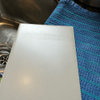
We are done with the major remodeling part, with a kitchen combined with dining room. Walls Blue Willow, white trim, oak floors, sisal rug, wood and dark lighting. As we focus on restoring the three DR windows, we are looking for what we want for treatments. Fund the fabric, Imperial Trellis from Shumacher, and fell in love. Bright splash of orange! Fits our style, we love the graphic. We can tie in other color home color scheme, accents in the kitchen, breaks up the bold blue/white. Is it too much? We see this everywhere with blue. Not cheap, but could be the final kitchen element.

Comments (13)

  • whit461
    Original Author
    10 years ago

    This is the DR end of the new kitchen

  • ltlfromgardenweb
    10 years ago

    For me it's a bit much although I am not a fun person. :-) If you would get enjoyment out of looking at them every day, by all means go for it! I think you would need at least a little bit of the same orange elsewhere so it doesn't look unintentional.

    Since I am not a fun person, I will also mention there's a home decorating forum that this question would probably be better categorized under.

  • ck_squared
    10 years ago

    I love it but yes, I do think it's too bold based on your other photo. You may tire of it quickly especially since the drapes will be the first thing to draw your eye in your room. Is that what you want? If you want to add orange, add it in smaller doses.

    Or... Look at your second photo again... see the touches of green? That's what I would play off of. Add more touches of green. Maybe drapes with blue and green in it.

  • herbflavor
    10 years ago

    the graphic reads formal.....a graphic of some sort, less formal may provide some good interest and embellishment for the space....along with a good solid rod hung above the window close to the ceiling, with some architecture to it. Note the more subtle graphic you have hanging in beige/white which sort of disappears because of the way it's hanging off to the side. I could see a more casual yet distinct graphic in black/white or dark charcoal/white or green/white.....maybe a valance across top and a side panel hanging on each side of window and then a textural shade right over the window itself[top/down bottom /up]...the window is not so big...either flank with fabric so it "grows" in scale or leave fabric off and do the shade thing. Have you ruled out shades of blue graphic to tie into wall color.....lots of options with ikats/etc and all various blues/grays/whites for some pattern.

  • User
    10 years ago

    The color isn't too bold if it's used a bit throughout the space. Orange would wake up the sleepy blue and be really fun. However, if it's the only splash of that brightness, it's kinda in your face. It can't stand alone and work.

  • User
    10 years ago

    I like fun prints, but three dining room windows with two panels would be too much for me. Have you considered doing shades with it?

    [Traditional Kitchen[(https://www.houzz.com/photos/traditional-kitchen-ideas-phbr1-bp~t_709~s_2107) by Cockeysville General Contractors Smithouse

  • romy718
    10 years ago

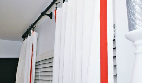
    Chrisopher Peacock did a bright orange valance but carried through the orange into his family room with white panels with an orange stripe. i am not loving the orange with the Blue Willow. Maybe it looks better IRL?

  • romy718
    10 years ago

    Family room with orange.

  • Gooster
    10 years ago

    I'm not one to shy away from a bold color, and I love trellis prints. You can see, however, in the examples shown (which I looked at both in planning my kitchen -- lol) you can see the color repeated at least three times in the space.

    I agree it does read formal, but the bright color and a less formal shape (like the roman blinds used above) can cut that down.

    Also, your wall color is reading a bit more muted than what your photos shows. If you notice Peacock's example, his orange is more muted and the undertones in the FR are more complementary. It's hard to tell with the two different photos, however -- in the store lighting with the warm wood, the warm tones are being accentuated.

    FYI, I sourced a lot of trellis print samples. Richloom Kirkwood is nearly identical (and a tenth of the price), but their orange seems a bit too sherbet-y (if that makes sense). I've seen only the outdoor version of it, and it is quite thick, unfortunately.

  • suzanne_sl
    10 years ago

    The reason you often see blue and orange together is that they are complementary colors - they fall opposite of each other on the color wheel

    I'm a little concerned that the depth of orange in the fabric will overwhelm the "strength" of the blue. I like the idea of Roman shades to reduce the color impact just a little. As you said, you can tie it in with color accents in the overall scheme.

    An idea to help you make up your mind: buy a yard or so of this fabric and bring it home to audition in your space. Regardless of your ultimate decision, you can use that yard to make throw pillows or something. It's a great fabric.

  • mark_rachel
    10 years ago

    I'm worried that your eye will be drawn right to the orange and miss so many other elements in the space. The space seems so calm and airy. I don't see how the orange fabric will work. It looks too "little kid" room to me.

  • whit461
    Original Author
    10 years ago

    You guys are the best. This is why I love this site. Peacock really hit it, right? Roman Shade, more muted, maybe the graphic needs to be the orange on white, not the white on orange? We took down two walls when we opened up this space in March. Now the kitchen has a double window over the sink, a single window at the peninsula, then a full length window to finish that wall and two windows on the front of the DR. 6 Roman Shades may be too much. DW really loves that style, though, and has talked about it before. We would use some jars and other items spread in the kitchen to balance the bold color in your face. Also, add some similar coloring into the LR opposite to bring it more together. Somehow tone it down, better balance, not quite so much in your face. We can sign out the entire bolt and hang it on one side for a couple of days and see how we feel. I do love this trellis, though. Also, the pic in the kitchen is not in a good light, it just showed the space better than others.

  • joaniepoanie
    10 years ago

    Love the fabric and the idea of valances or romans as opposed to long panels..will be just enough...along with splashes of orange in other accessories.