Shop Products
Houzz Logo Print
marthastoo

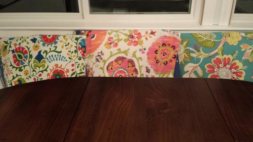
Help picking out banquette fabric

marthastoo
10 years ago

We have a mostly white kitchen (BM Chantilly Lace on cabinets), so we wanted color in the banquette cushions. The island has a gray stain that is a greenish-gray with a Calacutta marble top and the backsplash tiles will be a "light sage yellow-green to gray-green" (looks almost taupe to me IRL).
{{!gwi}}

We've narrowed it down to three choices:

Here's a shot with the drum chandelier, which could affect your opinion. Also, we are going with a dark brown ("rustic mahogany") circular table (not this one, but similar in color)

A shot of the other end of the kitchen to give you an idea of the style of the kitchen:

Comments (53)

  • KBSpider
    10 years ago

    I like the one on the left the best. I think the design is more "finished" than the other ones, which I think would fit your space better; maybe because the others have such prominent flowers and the flower edges are "pouffy" (probably wrong word; I hope I'm making sense!). Plus, there are more colors in the one on the left, which would give you more freedom to change other accessory colors without competing with the cushions. Hope that helps!

  • hazeldazel
    10 years ago

    I like the blue one the best - it adds color and the tone of the blue looks like it would go with the gray backsplash. The other ones are a bit folksy and I would worry that the white background of the fabric wouldn't match the white of the cabinets.

  • fourkids4us
    10 years ago

    Very pretty kitchen - love the light fixtures and your counters. Would love to see more of your kitchen.

    My question, Are those roosters on the canisters on the counters? Though I can't see them very well in the picture, they don't seem to go with the fabrics you chose, neither in color or style. That said, I personally prefer the one on the right with the blue background but I'm drawn to bold colors with your cool kitchen. Second choice would be the middle one. I really like that one also, but not sure about the white background. Do you have kids? I ask b/c in my family, I would worry about staining or discoloration though that may not be of any concern for you. Where is the banquette in relation to the kitchen space and what color will be on your walls?

    Please share more about your lovely new kitchen!

  • marthastoo
    Original Author
    10 years ago

    fourkids - Ignore the canisters - they are from our old kitchen and we haven't bought new ones yet. We do have two children 10 and 12, so all the fabrics are Sunbrella-esque (treated indoor/outdoor fabric but not actually Sunbrella brand - they didn't have any florals and colors that we liked). The banquette is on the end of a corner of a 14.25' x 21' kitchen about 52" away from the long run of cabinets (with the sink). We have BM Genesis White on the walls, which is a very pale blue/gray . Most of the kitchen is covered with cabinets, so there is actually very little painted wallspace.

  • romy718
    10 years ago

    All three of them are pretty but I am leaning toward the bold blue on the right. I love the color contrast with the white banquet & the dark wood table. It also compliments your backsplash & it matches your teapot. My close second choice is the middle one. I like that one with your drum shade chandelier.
    Your kitchen is beautiful. The Calacatta is gorgeous & I still love the pendants.

  • bicyclegirl1
    10 years ago

    I like the one on the right. As the others have said, I'm not sure about the white background on the other 2. Beautiful kitchen! Show us pictures after the banquette is finished!

    This post was edited by bicyclegirl on Sun, Nov 3, 13 at 9:26

  • fourkids4us
    10 years ago

    I just noticed your pretty blue teapot-love the pop of color on the stove! I just touched one of the photos on my iPad to enlarge it so I cold see the fabrics better, and ended up in your photo album and saw the photo taken from the opposite side of your kitchen, showing a great view of where your banquet is. Love all the windows! I think I'm going to stick with my first choice of the one on the right. It has some gray in it that the others don't have which ties into the marble and other grays you have/will have with the paint and backsplash. Will you have just pillows as shown or is there a bottom seat cushion too? Great idea using a sunbrella-type fabric. I'm trying to find something in that type of fabric for my dining room chairs. Where did you find your fabrics?

    Can't wait to see your finished kitchen!

    This post was edited by fourkids4us on Sun, Nov 3, 13 at 0:25

  • juddgirl2
    10 years ago

    You have a beautiful kitchen and I'm looking forward to seeing your banquette because I'm considering putting one in my kitchen. I can't tell from the photo - is the base made of wood and painted to match the cabinets?

    I vote for the blue on the right. The color looks good with the darker stain on the table and is a nice contrast to the white cabinets.

  • localeater
    10 years ago

    I like the blue one best. I like the richness and the warmth of the colors. I can't like the middle one because it screams pink to me and I really don't like pink. I do love that one's design softness though, so despite its coloration it would be my second choice.
    Funny what I think KBSpider referred to as more finished in the first fabric is what I dislike about it. I find the edges of the design too sharp and hard.

    BTW can you please post the details of your chandelier- I am in the market and I think I am in love!

  • rubyclaire
    10 years ago

    Another vote for the fabric on the right. The colors are gorgeous!

  • remodelfla
    10 years ago

    And yet another blue vote...lovely fabric and colors.

  • Gracie
    10 years ago

    My favorite pattern is the middle one, but not pink. I don't care for the tropical feel of the blue one in your traditional kitchen. The left one reminds me of Pennsylvania Dutch folk art.

    I looked through all your photos. There's a lot going on, so I'd look for a quieter pattern.

  • marthastoo
    Original Author
    10 years ago

    Thanks everyone for the input.

    pbathome - here's a daytime shot.

  • marthastoo
    Original Author
    10 years ago

    fourkids - the swatches are from Calico Corners.

    juddgirl - the base is custom made with the cabinets, so they are all the same color and design.

    localeater - the drum chandy is from Horchow. It's made of smoky capiz and I am in love with it. It's so pretty unlit during the daytime - the natural mother of pearl just glows. Here's a shot of it during the daytime, although the photo doesn't truly capture its beauty::

  • bpath
    10 years ago

    They are both adorable, but I'm still voting for the blue. While it is garden-y, it also has elements that go with the formal elements in the kitchen.

    Can I borrow the pink one for my screened porch? It really is pretty, but it's more cute-casual to me.

    Thanks for the pic of the utensil drawer. Looks like you can get more in that drawer, and more accessible, than a normal drawer, cabinet, or canister. Nice!

  • marthastoo
    Original Author
    10 years ago

    Also, another option is to do two-tone cushions, like 2littlefishes. We wanted to get a 4" cushion on bottom and matching back cushion, maybe with contrasting piping? We could do a solid on the bottom, although DH doesn't like that look.

  • bookworm4321
    10 years ago

    I like the blue one too.

    Sunbrella has a thin striped pattern, predominantly in blues. If you watch The Big Bang Theory, its the fabric on pillow that Sheldon uses.

  • Kim
    10 years ago

    I vote for the blue background on the right. Too much white with the others in my opinion. Your kitchen is beautiful !!

  • localeater
    10 years ago

    TY Martha- I just ordered it- I can't believe I committed to a light. Of course it is on back-order until January and if when it comes it doesn't work I can always return it. I have been looking at DR lights for so long and this one was the right size, right finish and my DH and both DS liked it.
    Thank you ever so much. If I hadn't seen it illuminated in your posting I wouldn't have fallen in love.

  • marthastoo
    Original Author
    10 years ago

    Localeater - I'm so glad you ordered it! You won't be disappointed. It honestly is one of my favorite things in my new kitchen, along with my Dornbracht faucet (with the biggest arc evah), my pantry door, and mullioned cab doors.

  • mrspete
    10 years ago

    I vote for the turquoise on the right. Your kitchen is so white, so neutral. You need the punch of color. Also, the color will wear better than the whites as time passes. It's also beautiful!

  • romy718
    10 years ago

    Martha, may flowers got me thinking. Have you considered doing a neutral fabric & adding pillows for a punch of color. It could be a better long term choice as you could easily change the pillows. You would then also have the option to change pillows like you change placemats, tablecloths & dishes for seasons & holidays. You might even find pretty accent pillows at Pottery Barn, etc.
    Your light fixtures, glass door style & calacatta (and backsplash) have added an element of elegance to your kitchen. These fabrics are beautiful but I wonder is you should consider something that blends better with both the elegant features & the more casual features of your island finish, table & chairs. I couldn't find a picture on Houzz that perfectly suits your kitchen, but I did find some nice pics of banquettes with neutral fabrics, both light & dark with pretty accent pillows. I don't have "designer vision", just throwing out another idea. I saved some pics if you want me to post them. Ignore me if I am off base, I won't be offended.

  • lavender_lass
    10 years ago

    Definitely the turquoise! :)

  • Gracie
    10 years ago

    I agree with romy about the fabric conflicting with the elegance of the rooms. So many things are calling for attention, and at some point you have to pull back. I think the turquoise and orange is too bright and bold, and I can't see the relationship to the other room elements. I guess they are the "fun pop of color" people like to put in quiet rooms, but you do have ornate elements already. Maybe you could put together a mood board using that fabric.

    I don't know that you'd want loose pillows--some people have pointed out that they get in the way.

  • marthastoo
    Original Author
    10 years ago

    Romy and may_flowers - we considered a neutral fabric and that certainly would be the safe option. DH and I feel that the kitchen is so overwhelmingly white (which it may not seem in photos, but we are still waiting on DW and fridge panels which will add to the whiteness) and needs color. Pillows can have the same effect, but pillows will most likely get thrown into another room since it will get into the way of day-to-day eating. We do plan to get pillows, but solids and/or simpler and understated prints. We want a zippered cover, so no permanent cushions to worry about being married to. I guess we're afraid of being too safe and circumspect with this banquette. Everything else is pretty safe and neutral in this kitchen.

    That said, all options are still on the table. So Romy - feel free to post away some pretty options! I'd love to see them!

    This post was edited by marthastoo on Sun, Nov 3, 13 at 15:08

  • Gracie
    10 years ago

    I wasn't suggesting a neutral, just something not quite so bold. 2littlefishes showed a good selection when she was looking for banquette fabric.

    This post was edited by may_flowers on Sun, Nov 3, 13 at 16:31

  • romy718
    10 years ago

    This is a nook versus a banquette but the fabrics are more elegant, more subdued, but still have color. I was recently on the hunt for a fabric for a laundry room bench cushion that my dogs sit on. I was limiting my search to Sunbrella type fabrics because of the durability. One of the sales ladies pointed out to me that the the 15 year old cushion I was replacing was not a Sunbrella fabric, but a durable fabric that was protected with a factory applied scotchguard type product. Muddy feet, upset tummies, etc. and the cushion still looks great. You could also do a heavy duty type fabric on the seat (spills more likely) and a less durable pretty fabric on the upper cushion.

  • romy718
    10 years ago

    This pic doesn't show much of the banquette but a dark fabric to contrast with your white wood & light floors. Upper fabric or pillow in another fabric.

  • romy718
    10 years ago

    Neutral fabric with subtle striped fabric.

  • romy718
    10 years ago

    One of my favorite kitchens.

  • romy718
    10 years ago

    Neutral seat.

  • romy718
    10 years ago

    Another with different seat & back cushion

  • romy718
    10 years ago

    Another

  • romy718
    10 years ago

    Last one

  • michoumonster
    10 years ago

    i like your turquoise blue one. very fresh and pretty!

  • cawaps
    10 years ago

    Of the fabrics you posted, I like the blue the best, but I think there are better options out there. Like some of the other posters, I found the style of the fabrics to be a bit at odds with the overall style of the kitchen. The kitchen is very elegant and refined; the fabrics are great but read too casual for the space.

    I looked for fabrics that have color but are a bit more traditional, with less internal contrast. The pic shows a few fabrics I liked along side your kitchen. The ones on the bottom are Sunbrella; the rest are indoor/outdoor fabrics I found on buyfabrics.com.

    This post was edited by cawaps on Mon, Nov 4, 13 at 10:49

  • Annie Deighnaugh
    10 years ago

    Of the 2 choices, I like the blue better, but I agree with some of the others that the mood of the fabric doesn't go with the elegance of your kitchen. I also wonder where the color comes from as they don't seem to associate with the lovely palette in your kitchen. I think you can add color without going quite so OTT.

    For example, this stripe is indoor/outdoor, from calico corners, has the turquoise, and yet pulls colors from the rest of the kitchen so it looks more like it belongs.

  • bpath
    10 years ago

    Fabric on a banquette is obscured by the table, so a peek of something interesting is, well, intriguing and inviting. I don't want to confuse "elegant" with "formal", and I think the fabric is lovely and its shapes pick up the curves of the island brackets, and the garden trellis look of the glass-door cabinets.

    What will the chairs look like? Will they be upholstered on the backs?

    OTH, 2littlefishes' banquette is an all-time favorite :)

  • sprtphntc7a
    10 years ago

    out of the three you picked, i like the blue...
    that being said, i do agree with other posters that you need a fabric a bit more refined and formal...
    i would definitelly do a dark background to make it pop... you have enough white in your kitchen, you need some color...
    of the ones cawaps posted, i like the 1st and 3rd on the right... the 1st on right i like the pattern but would probably do a different color if possible and the 3rd on the right i like as is...
    personally, i would not do flowers or stripes, everyone has that....go for a pattern if possible...

  • kitchendetective
    10 years ago

    What colors will you have in the rest of the house, especially any that have sight lines into the kitchen?

  • romy718
    10 years ago

    Marthastoo, can you post a picture of your kitchen from the range end of your kitchen looking at the banquette area? it looks like you have beautiful windows behind the banquette area & some cabinetry next to it? I love your light fixture above the banquette. It really goes well with your other light fixtures.
    That utensil drawer is great. Is that something that can be added to a drawer after cabinet construction is complete?

  • marthastoo
    Original Author
    10 years ago

    Romy - thank you so much for taking the time to post pics. I have seen many of those since I have been looking for photos of banquettes. TBH, I haven't seen many examples of bold, vibrant colors/prints and that may be a function of people shying away from that look. DH and I still like the idea of brighter/polychromatic print, but we just really need to think this out with swatches in the room. So much for getting the banquette done for Christmas! I'm at work now, but I can get a photo later today of the banquette area. We are still waiting for a lot of trim work to be finished, but you'll get the idea. I had my cabinet maker make the utensil drawer based on a few photos I had seen on Houzz. ::wub:: I'm not sure if it can be retrofitted for the canisters since you need enough clearance for the tops of the utensils.

    cawaps - thank you for taking the time to mock up a mood board. DH are doing all the design ourselves w/o KD or any designer (we are doing almost a whole house remodel) and while I like to think everything has been well thought out, that obviously hasn't happened consistently!

    bpathome - the other chairs will be PB Napolean chairs in chestnut stain, which is wood and has an open design in the back. We may put cushions on later - not sure now.

    kitchendetective - the kitchen has a 5' opening to the family room, which we are still renovating. It's painted BM Cameo White, a creamy white that reads almost beigey-peach in some lights with BM Decorator's White trim. The family room furniture is very nuetral with a beigey sofa and love seat, sage green velvet chairs and cream and brown rug. We have red and white oak mixed floor in a Provincial stain. Interpretation: very bland and neutral.

    This post was edited by marthastoo on Mon, Nov 4, 13 at 12:18

  • fourkids4us
    10 years ago

    Romy, if you click on one of the photos above, it will open her album and there you can scroll through - there is one of the view you asked for showing the huge windows surrounding her banquette. I clicked on one of the photos accidentally and discovered the album has a picture which gives a vantage point from the range end of the kitchen.

  • romy718
    10 years ago

    Marthastoo, you & DH have done a beautiful job designing your kitchen. I hope all my elements work as well together as yours have. I saw your sunny banquette area on the photo link fourkids4us pointed out. What a great space. Whatever you choose is going to be beautiful.
    I'm at a loss to figure out a light fixture to go over my kitchen table that will work with my island pendants. Your light fixture choices are perfect. I'll be asking for your help once my pendants are hung.

  • marthastoo
    Original Author
    10 years ago

    Here's a view of the banquette wall. The cookbooks will stay and already add much needed color to the room. The table will be circular (this table is too high and is getting returned) and the chairs will match the dark stain. The white office chair will stay.

    The windows aren't as sunny as one would assume. There is a 4' overhang on the back of the house (see rain chain) and our property is heavily wooded. The only real sunlight comes in on the left east-facing window in the morning. This is also the main reason why we went so overwhelmingly white in our choice because of the darkness of the room.

  • romy718
    10 years ago

    Marthastoo, the drum chandelier look just beautiful from this view. What a great work space. Such a pretty view from your window. Thanks for posting the pic.

  • homebuyer23
    10 years ago

    Your kitchen is beautiful so far! Your marble is stunning and your light fixtures are beautiful.
    What is your perimeter counter material?

    I do really like the blue fabric and I think it would look great, though as I always say I am no expert here and am always one looking for advice and don't think Im the best at giving it!

    I also like the 3rd down on left side that cawaps posted. My eye was instantly drawn to it, the brown background is a nice contrast to the white and ties into the island cabinetry and table, and the contrasting light & dark blues, gold, cream colors on the fabric are pretty and seem to tie in to accent colors I assume you like ...aqua tea kettle & aqua fabrics.

    Good luck with another tough choice!

  • amykath
    10 years ago

    Of the three I am voting for the blue as well. You have a fab kitchen! So elegant! Some of the photos posted have some lovely fabric choices as well!

  • Gracie
    10 years ago

    I too like the one homebuyer mentions, if you want a bolder print. When I compare cawaps samples to the turquoise and orange, it reads even more tropical to me. I am even seeing fish shapes in it now. I can easily see it poolside in Florida on a couple of lounge chairs.

  • calumin
    10 years ago

    We also have a very white neutral-color kitchen with banquette. We used a Knoll neutral gray fabric for the banquette but then added color and variety in the pillows. We figured we would swap out pillow covers more often than the actual banquette cushion.