Shop Products
Houzz Logo Print
formerlymotherof3sons

Cabinetmaker Gone! Time to Talk Backsplash Part II

motherof3sons
11 years ago

Hello all,

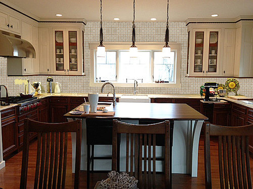
I have the tile setter scheduled for mid December and need to make a decision ASAP! A big shout out to OLDBAT2BE for helping with the photoshop mockups. She is the "bees knees" for doing this for me. Thank you OB2B!

A bit about us. It is just DH and me - LOVE being an emptynester. We are a family 12 - 8 adults and 4 kids (3, 2, 1 and 6 mo). We hangout in the kitchen most days or are within steps. The floor plan is open and casual. It is literally one large area that serves three needs - living, dining, cooking. There are craftsman influences throughout the house, but nothing purist.

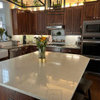
The upper cabinets are painted cream with cherry accent, lowers stained cherry and floors gunstock oak. The counters are Kashmir Creme and Walnut.

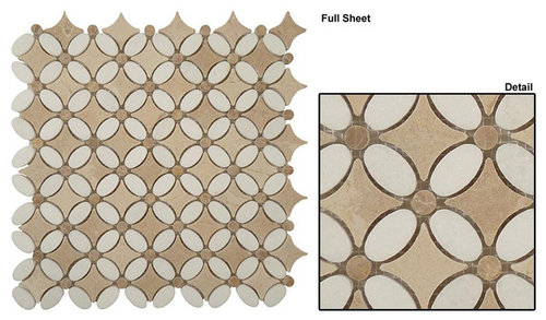
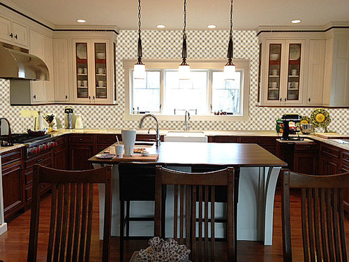
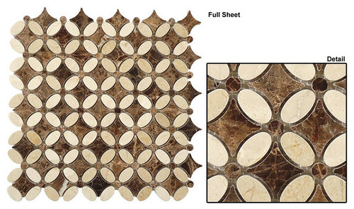
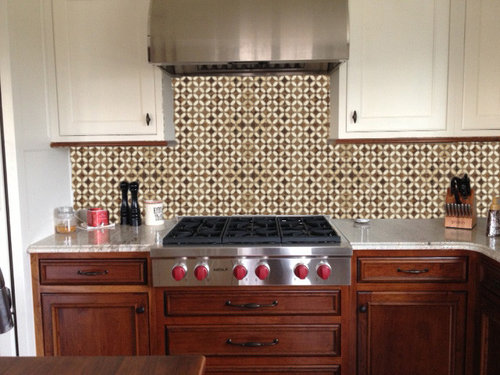
Below are the possible tile patterns with their respective mockups. Let me know your thoughts. Thanks in advance my GW friends!

OPTION 1

OPTION 2

OPTION 3

Comments (44)

  • motherof3sons
    Original Author
    11 years ago

    I failed to add...

    1) Grout will play a critical role in defining the pattern
    2) I am open to any other recommendations for tile, layout, etc.

  • deedles
    11 years ago

    LOVE that tile! You know, your kitchen has turned out so much better than the inspiration pic on that magazine cover.

    Anyway, I like the 3rd one. To my eye, the darker palette seems to tie into the neat dark accents on your uppers. Not sure I love it all around the window, though. But IRL it could be great. Hard to tell on computer monitors.

  • rhome410
    11 years ago

    Oh, wow. This is hard!

    I really like how the pattern of the first one looks with not a lot of contrast between the 2, and the darker in the centers, rather than the petal shapes... but really miss the connection that the dark stone in the other 2 choices have with the cherry.

    The 2nd one, which I like best close-up, looks like gingham in the mockup, so I'm not as much of a fan. It has almost a country flavor, but I'm not sure it would look at all like that in person. The dark dots, though, connect with the cherry trim nicely, and let it stand out.

    I was sure, just looking at the tile for #3, that it would be too dark, and the contrast would make it too busy... But the mock-up isn't either dark nor too busy for me, and I like it. Maybe it doesn't let the cherry trim stand out as much. But I think, in the end, it's rich and elegant, and it's my favorite.

    I can't really see the counter to dbl check how it would look when standing in the room.

  • raee_gw zone 5b-6a Ohio
    11 years ago

    I think #3 is too bold and dominating for the space. I think that I prefer #1-- you get the pattern, but it is an accent, not the primary thing you look at.

  • motherof3sons
    Original Author
    11 years ago

    Here's the granite. Thanks for the reminder Rhome!

    Kashmir Creme

  • Gracie
    11 years ago

    #1 is kind of boring and bathroomy. I also saw gingham in #2. I love #3.

  • a2gemini
    11 years ago

    Love them all! The grout will make or break the tile!

  • grlwprls
    11 years ago

    I have that same tile in the honey onyx version. I think I like your #2 best.

  • motherof3sons
    Original Author
    11 years ago

    @grlwprls - You have the honey onyx version?!?!?! Would you please post a picture?

    Thanks much!

  • taggie
    11 years ago

    I like #2 best. #3 is just way too much, it's all you see in the whole kitchen, and I agree with the previous poster that #1 looks kind of bathroomy.

    Do you have to take it up around the window and to the ceiling? I think that's part of the issue with none of them being quite perfect (IMHO). I'd recommend looking at mockups of each tile finished just to standard backsplash level with paint around the window. I just don't think this pattern carries up to the ceiling well, but I do think it's lovely at backsplash level.

  • motherof3sons
    Original Author
    11 years ago

    Thanks everyone for the postings! Where to stop the tile is undecided at this point.

  • EngineerChic
    11 years ago

    I really like the third one. I usually go for less contrasty backsplashes, but I think I like the contrast against the pale uppers and the nod to the darker lower cabs. I love your granite, BTW, very pretty!

  • williamsem
    11 years ago

    3 then 1. I think 2 has too much contrast within the small pattern and I also see the gingham mentioned above.

  • taggie
    11 years ago

    If the tile stopped at window level then I'd choose #3 in a heartbeat. I just tried covering the window part with my hand, and when I do that #3 looks a lot better than #2 I think.

  • localeater
    11 years ago

    I love the cherry accent on your white uppers, it is one of my favorite parts of your kitchen. With #3 backsplash, I feel that lovely detail is lost/overwhelmed. I vote for #1 which ties it all together without clamoring.

  • badgergal
    11 years ago

    I think #3 looks the best. To me, it makes your gorgeous cabinets stand out more than the other two do. The tile and the cabinets are both show stealers and they have to share the lead roll. #3 keeps the two elements balanced.
    I usually like tile going up and over windows but in you kitchen it might be too much of a good thing. Maybe you could mock it up just going to the level of the bottom of upper cabinets on the window wall. I would still carry the tile up to the bottom of the hood.
    Can't wait to see how it turns out.

  • chloe.chloe
    11 years ago

    I like # 3 as well. Very striking and I think it anchors the wide, open space you have.

  • amandasplit
    11 years ago

    Am I the only one who liked 1 the best?? It seems the most neutral and in the same tone as the cabinets, as opposed to competing with them.

    Love your kitchen! Gorgeous! I drool over the space and appliances.

  • lolauren
    11 years ago

    It's hard to pick as they could all work. I lean towards the first one, as it is interesting but still lets your cabinet details shine and stand out.

    #2 is lovely but is making me a bit cross-eyed. I don't like #3 close-up and it makes it hard for me to pick out the details of your space...

  • Kathy Rivera
    11 years ago

    #3. #1 is too boring, #2 does look gingham.

    But I don't think you can do the whole wall with any of them - way too much/busy/dark and detracts from your beautiful cabinets. I think doing something like this with #3 is your best bet (can never remember whose GW kitchen this is!! sorry!)

  • rhome410
    11 years ago

    If you don't go all the way up and around the window, I'd consider going up a little higher than the bottom of the upper cabinets, like 6 or 8" higher..wherever it seems graceful and balanced. Makes it more of a design decision than "just stopped with the cabinets." JMO

  • blfenton
    11 years ago

    #1 - ok - just ok
    #2 - funny, but the first thing I also saw and thought of was gingham
    #3 - reminds me a little countrysh look

  • Gracie
    11 years ago

    The first thing I noticed was how #3 gives the space a cohesive look with your very dark dining room furniture. Also, your white dishes in the glass cabinets don't fade away like they do with the lighter color backsplashes. I think it's a perfect balance! I love your lights too!

    What's the name of the tile?

  • grlwprls
    11 years ago

    I should have said "I have the honey onyx in boxes waiting to be installed". Oddly, it was my husband who pushed for it. I love wallpaper, so I'm hoping this will give me the graphic punch I want. I'm tiling behind the range to the ceiling - about 54 sq ft - and down to the (future) Witch Hazel Corian.

  • hlove
    11 years ago

    My vote is definitely #3.

  • sas95
    11 years ago

    I like #3.

  • dljmth
    11 years ago

    #3 seems the most interesting.

  • motherof3sons
    Original Author
    11 years ago

    Thanks again to OldBat2Be! Here are pics with the tile at different heights.

  • oldbat2be
    11 years ago

    You're most welcome, motherof3sons. I keep forgetting to ask, what color is the island and how does that play into your choices?

  • motherof3sons
    Original Author
    11 years ago

    The island is the same color as the uppers with a walnut top. Any of the tile enhance the island.

  • wolfgang80
    11 years ago

    If I were standing at the range looking at the tile three feet from my face, I'd pick 1 or 2. From farther back, I'd pick 3 or 1, probably in that order. I don't think #3 is that much to look at up close, based on your pictures of the tile unmounted.
    #2 looks blurry and makes me dizzy in every picture of it mounted.

  • laughablemoments
    11 years ago

    I felt a sigh of relief when I saw the pictures of the tile not going all the way up the wall. It's a pretty tile, but it needs small doses or I feel dizzy looking at it. I really appreciated the breathing space of gentle color around the top of the window.

    What if you stopped the tile at the same height as the muntin of the windows? I'm not sure if that's exactly the right term, but I think that would make the most cohesive horizontal line and cause the least eye jumping.

    Beautiful kitchen! Love your mix of cream and wood. : )

    Not sure which tile I'd pick, other than to toss #2 out of the running. I too am getting the dizzying gingham feel from it on my screen.

  • badgergal
    11 years ago

    I vote for #3 to the height of the upper cabinet bottoms as a first choice or # 3 to the height of the horizontal divider in the windows as a second choice. Either will look great. You definitely don't need to go above the window with the tile.

  • taggie
    11 years ago

    I actually like #2 best now that I see them all, and after I've gone back to look at the closeup of #3 at the range wall. I don't think the colors of #3 are flattering to your cabinets up close (tho from farther away it looks okay).

    This one is my favorite, and yes it's a bit blurry but I'm just voting based on the colors and I think it will look fabulous in real life where the floral pattern will show more clearly:

  • deedles
    11 years ago

    Still #3 kept lower as per the second pic. That looks beautiful!

    3... Three.... iii...

  • carp123
    11 years ago

    these are great! love your kitch!
    I like all of the tile. seems like option 1 & 2 go best with the granite. I do love how 3 has a bold pattern. I am a big fan of tile to ceiling...but in this case the gorgeous window is not quite centered in the space so i would do the 3 quarter way up. good luck!

  • User
    11 years ago

    I like the tile height that is closest to the bottom of the cabinets and I like tile 1 the best in these renditions. I think that tile 2 will look a lot different depending on the grout choice, probably less gingham and more subtle which would look nice too. Any choice you make will look nice, your kitchen is very unique and lovely!

  • Ann Scheley
    11 years ago

    Tile #3, with height to bottom of the cabinets. It really makes a statement. I like it A LOT!

  • function_first
    11 years ago

    What Deedles said (at 4:12). Love 3. To me it underscores your bold move in mixing dark and light on the uppers and the island.

  • rhome410
    11 years ago

    The low one seems like it's just hanging on by a thread, and needs a bit more. I would go a row or two higher with the lower option (choosing exactly how much by how much of the pattern you wanted there and where is the 'right place' to end it)... Close to halfway between the bottom of the cabinet and the first shelf. If it lined up with the shelf and the muntin, I feel like that would be too much matching lines of things that shouldn't be connected.

    The higher one seems too much and fights with the balance of your window design. Again, JMO.

  • motherof3sons
    Original Author
    11 years ago

    Thank you all so much for the comments. I am planning to do some tile boards and play with grout colors. Still so on the fence!

  • annettacm
    11 years ago

    I definitely think you should NOT go above the window. I like all three tiles, but I noticed when you showed the different heights, your beautiful window trim jumped out at me, and the paint above will be a nice complement to the tile below. Much softer on the eye while still giving a fabulous effect. I'd go a little higher than the bottom of the cabinet, but not too much.... actually, reading above.... what Rhome said!

    I should just start out by always saying "what Rhome said" :)

  • a2gemini
    11 years ago

    #2 with the lower profile - the other looks like it is swallowing your beautiful kitchen!

  • BerlinGirl
    11 years ago

    I like three. I iked 1 at first, then kept comparing...def three it is!

Sponsored
Davidson Builders
Average rating: 5 out of 5 stars1 Review
Franklin County's Full-Scale General Contractor