


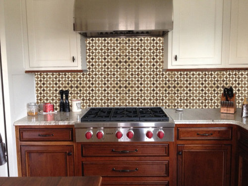
Cabinetmaker Gone! Time to Talk Backsplash Part II
motherof3sons
11 years ago


Sort by:Oldest
Comments (44)
Related Stories
KITCHEN DESIGNAlternatives to Granite Countertops, Part II
Still looking for a new kind of countertop? Try sodalite, zinc, limestone, onyx and more
Full Story
WORKING WITH PROSWhat to Know About Working With a Custom Cabinetmaker
Learn the benefits of going custom, along with possible projects, cabinetmakers’ pricing structures and more
Full Story
KITCHEN CABINETSCabinets 101: How to Work With Cabinet Designers and Cabinetmakers
Understand your vision and ask the right questions to get your dream cabinets
Full Story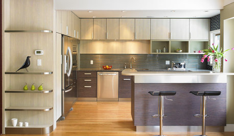
KITCHEN DESIGNExpert Talk: 12 Ways to Get a Designer-Kitchen Look
Professional designer Ines Hanl reveals her thought processes on select kitchen remodels
Full Story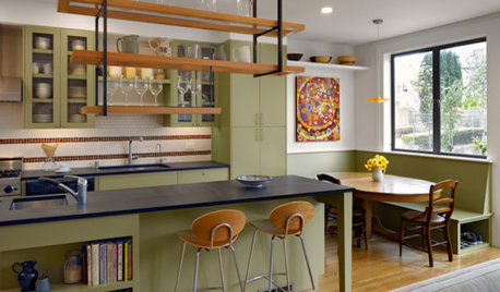
KITCHEN DESIGNAlternatives to Granite Countertops, Part III
9 more reasons to rethink the granite kitchen counter
Full Story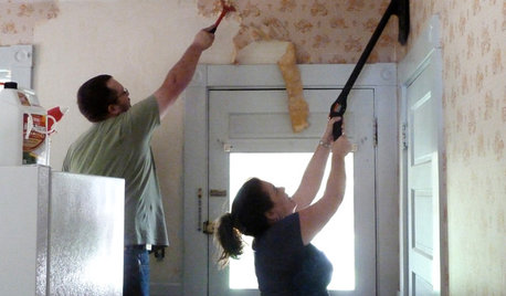
DECORATING GUIDESHow to Remove Wallpaper in 4 Steps
Learn the best way to remove wallpaper with only water (and elbow grease) so your next wall treatment will look great
Full Story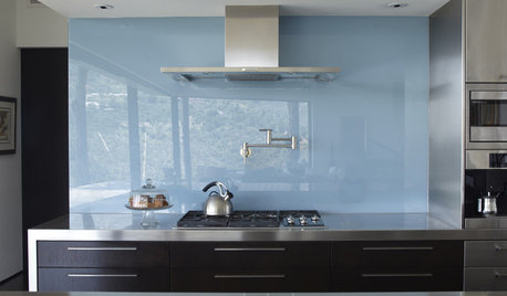
KITCHEN DESIGNThe Future of Backsplashes
Grout is out. Continuous sheets of glass, stone, metal and porcelain are saving cleaning time and offering more looks than ever
Full Story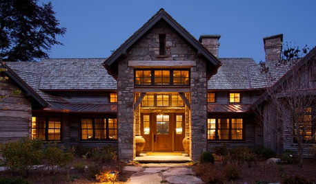
RUSTIC STYLEOld Southern Highlands Style for a New North Carolina Retreat
Antique woods add a sense of history to a gracious part-time home in the Blue Ridge Mountains
Full Story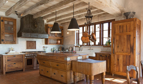
RUSTIC STYLEKitchen of the Week: Found Objects and Old Italian Farmhouse Charm
A homeowner and her cabinetmaker create a personal version of European-inspired comfort and simplicity
Full Story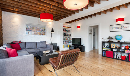
LOFTSMy Houzz: Ronnie Wood’s Old Art Studio Gets a Makeover
Check out this contemporary update of a former factory flat that survived World War II bombs and use by a member of The Rolling Stones
Full Story


motherof3sonsOriginal Author
deedles
Related Professionals
Bethpage Kitchen & Bathroom Designers · Brownsville Kitchen & Bathroom Designers · Georgetown Kitchen & Bathroom Designers · Sun City Kitchen & Bathroom Designers · Terryville Kitchen & Bathroom Designers · 93927 Kitchen & Bathroom Remodelers · Beverly Hills Kitchen & Bathroom Remodelers · Oceanside Kitchen & Bathroom Remodelers · Pueblo Kitchen & Bathroom Remodelers · Vista Kitchen & Bathroom Remodelers · Graham Cabinets & Cabinetry · Warr Acres Cabinets & Cabinetry · Tabernacle Cabinets & Cabinetry · Mililani Town Design-Build Firms · Oak Hills Design-Build Firmsrhome410
raee_gw zone 5b-6a Ohio
motherof3sonsOriginal Author
Gracie
a2gemini
grlwprls
motherof3sonsOriginal Author
taggie
motherof3sonsOriginal Author
EngineerChic
williamsem
taggie
localeater
badgergal
chloe.chloe
amandasplit
lolauren
Kathy Rivera
rhome410
blfenton
Gracie
grlwprls
hlove
sas95
dljmth
motherof3sonsOriginal Author
oldbat2be
motherof3sonsOriginal Author
wolfgang80
laughablemoments
badgergal
taggie
deedles
carp123
User
Ann Scheley
function_first
rhome410
motherof3sonsOriginal Author
annettacm
a2gemini
BerlinGirl