


Kitchen Floorplan Review
Mary4070
9 years ago

Sort by:Oldest
Comments (13)
Related Stories
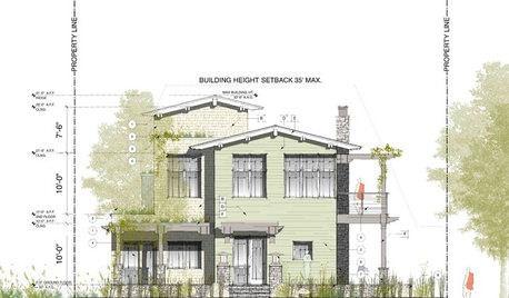
ARCHITECTUREThink Like an Architect: How to Pass a Design Review
Up the chances a review board will approve your design with these time-tested strategies from an architect
Full Story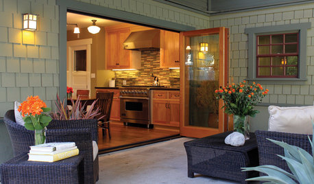
GARDENING AND LANDSCAPINGSpring Patio Fix-Ups: Earn Rave Reviews for Your Patio's Entrance
Consider innovative doors, charming gates or even just potted plants to cue a stylish entry point for your patio
Full Story
DESIGN PRACTICEDesign Practice: The Year in Review
Look back, then look ahead to make sure you’re keeping your business on track
Full Story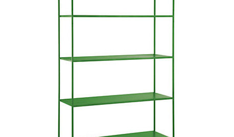
PRODUCT PICKSGuest Picks: 21 Rave-Review Bookcases
Flip through this roundup of stylish shelves to find just the right book, toy and knickknack storage and display for you
Full Story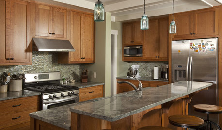
KITCHEN CABINETSCabinets 101: How to Choose Construction, Materials and Style
Do you want custom, semicustom or stock cabinets? Frameless or framed construction? We review the options
Full Story
KITCHEN WORKBOOKHow to Remodel Your Kitchen
Follow these start-to-finish steps to achieve a successful kitchen remodel
Full Story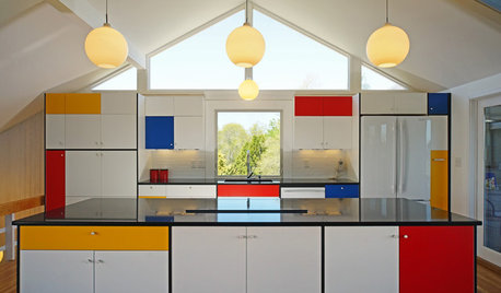
KITCHEN DESIGNKitchen of the Week: Modern Art Inspires a Color-Blocked Look
In a midcentury beach house on Martha’s Vineyard, a redesigned kitchen embraces the look of Mondrian
Full Story
MORE ROOMSThe New (Smaller) Great Room
Subtle Partitions Add Intimacy to the Classic Open Floorplan
Full Story
KITCHEN OF THE WEEKKitchen of the Week: The Calm After the Storm
Ravaged by Hurricane Sandy, a suburban New York kitchen is reborn as a light-filled space with a serene, soothing palette
Full Story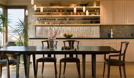
KITCHEN DESIGNKitchen of the Week: Organic Modernism in Seattle
Craftsmanship from top to bottom gives a linear kitchen overlooking Puget Sound a natural feel
Full StoryMore Discussions


Mary4070Original Author
sjhockeyfan325
Related Professionals
Highland Park Kitchen & Bathroom Designers · Lafayette Kitchen & Bathroom Designers · West Virginia Kitchen & Bathroom Designers · Bellevue Kitchen & Bathroom Remodelers · Southampton Kitchen & Bathroom Remodelers · Upper Saint Clair Kitchen & Bathroom Remodelers · Fort Lauderdale Cabinets & Cabinetry · Jefferson Valley-Yorktown Cabinets & Cabinetry · Prospect Heights Cabinets & Cabinetry · Sunrise Manor Cabinets & Cabinetry · Town 'n' Country Cabinets & Cabinetry · Vermillion Cabinets & Cabinetry · Roxbury Crossing Tile and Stone Contractors · Englewood Tile and Stone Contractors · Bell Design-Build Firmsdebrak2008
dilly_ny
Jillius
Mary4070Original Author
bbtrix
debrak2008
lavender_lass
quequeg
lavender_lass
Mary4070Original Author
quequeg