Shop Products
Houzz Logo Print
pugrolls

Backsplash: WWYD?

pugrolls
13 years ago

I wasn't planning on posting any kitchen photos until I was all done, but I've hit a wee road block and need help from my esteemed GWers.

I had been planning to go with a carrera marble backsplash to tie in with the gray countertops. I've noticed, however, that at night with the lights on, my countertop takes on a darker, almost muddy green undertone, which I fear doesn't coordinate very well with the ultra white/blue undertones of marble. Additionally, the "other half of the Kitchen Committee" thinks that we should do a green glass backsplash to bring in some stationary color (largely, I think, because he really likes an inspiration photo I showed him that has green glass tile).

So, if this was your (urban Seattle) kitchen, what kind of backsplash would you put in?

(In addition to the backsplash, I will also be adding a valance to hid the undercabinet lights).
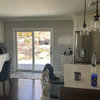
Natural light only:

Kitchen lights on:

My inspiration photos:

My husband's favorite inspiration photo:

Thoughts much appreciated!

Comments (25)

  • homechef
    13 years ago

    I think you can't lose either way. If you go with the glass tile, it will give the kitchen a more modern look. I personally am a sucker for all things marble. I think if you choose marble, you can later add color accents, and you won't be limited to the green.

    Beautiful kitchen so far!

  • cbrfd
    13 years ago

    You've done an amazing job on your kitchen. Congrats. I'm doing a kitchen with similar colours and while researching my backsplash, which will be white carrara marble basketweave pattern with white dots, I came across one that might work for you. It's white carrara marble basketweave pattern with green dots. That way you can have your carrara marble and keep DH happy with the green addition. :) Here is a link to a photo:

    http://www.amazon.com/Bianco-Carrara-Carrera-Basketweave-Polished/dp/B0043JH57K/ref=sr_1_1?ie=UTF8&s=hi&qid=1288636268&sr=1-1

    By the way, I'm looking for pendants just like yours. Would you mind telling me the name of yours and where you found them. Thanks.

  • pugrolls
    Original Author
    13 years ago

    Thanks, homechef and amoraljardin!

    amoral, I stumbled across the pendant lights at my local Lowe's -- they were the perfect compromise between what I wanted and what DH wanted -- and was delighted by the affordable price! (I had been looking at far more expensive pendants that we didn't like nearly as much). I will insert a link below.

    Here is a link that might be useful: Light Pendants at Lowe's

  • palimpsest
    13 years ago

    Would the Ming Green marble mosaic be too minty for your countertop? Sometimes its pretty subtle like carrera but with the green cast.

  • cbrfd
    13 years ago

    Thanks pugrolls..... I'll be going to Lowes for sure -Hopefully they have it in Canada.

    Palmimsest. I absolutely agree with you. If it could be found with a softer green I think it would lovely.

  • mamabear2010
    13 years ago

    I think either would work great. I personally love love love marble, but the glass would really go well in your urban kitchen!

  • pugrolls
    Original Author
    13 years ago

    palimpsest, I had that exact thought and snagged a small sample of ming green this weekend. I think it does prove to be "too minty" against my countertops, which is pretty "earthy," especially at night (or during these dark Seattle days, for that matter! ;)

    amoral, that carrera with the green dots looks interesting. Thanks for suggesting it.

  • plllog
    13 years ago

    I'm not clear on how much color you want. I think the green glass subways in the inspiration picture will look too flat in your space. It needs either glossy or sparkly, though glossy is probably too much shine for the counter.

    Stone and Pewter Accents (Lunada Bay and Malaga Cove tiles) has some that might look great. I don't know if they have the right green in the Fossil collection, but it has some sparkle with a uniformity you can't get from a mixed mosaic. On the other hand, a mosaic with stainless and glass, and perhaps some stone as well, might look awesome.

  • kitchendetective
    13 years ago

    How about something here?

    Here is a link that might be useful: 300 colors available for this series

  • fly964
    13 years ago

    Oh, I agree with plllog. Pewter or stainless accent tiles would give you nice sparcle picking up some lighter tone of your gray countertop. It's of course very personal but I would stay away from mosaic as I am concerned that i would get tired of it. Your kitchen looks beautiful!!

  • sparklekitty
    13 years ago

    Pugrolls - What about calacatta marble - like carrera, but with more warm tones against the white - a taupe, gray, almost brown, goldish. I used it in my bathroom. It tends to be a bit more expensive than carrera, but you may find a good source. I think it would look amazing with your gray-muddy (in the best way :) counters, the white and the wood island. By the way, what is your counter material?

    Here is the best photo I found in the link below.

    Here is a link that might be useful: white kitchen with calacatta marble back splash

  • remodelfla
    13 years ago

    Holy Smokes kitchendective... what an incredible collection they have! I can't even imagine how expensive it must be...

  • pugrolls
    Original Author
    13 years ago

    plllg, sigh. Yeah, I think that's part of my problem -- I don't think I KNOW how much color I want. When I was envisioning a marble backsplash, I had planned on bringing in pops of color with bright accessories. DH definitely seems to be set on doing some sort of color in the backsplash, but...I just don't know. Sigh. Thanks for the link, I do like your suggestions.

    kitchendetective -- wow! Cool stuff! (But indeed, it does look pricey).

    fly and sparklekitty, thanks for your thoughts!

  • remodelfla
    13 years ago

    Ming Green Basketweave at only $11{{!gwi}}
    They also had straight mosaics.

    Here is a link that might be useful: Mosaics

  • pugrolls
    Original Author
    13 years ago

    Ooo...thanks for that link, remodelfla! I'm going to have fun cruising that site.

    And sparklekitty, the counters are quartz (specifically, Chroma Quartz by Pental in "Stormy Sky Polished").

  • amysrq
    13 years ago

    I have spent an inordinate amount of time looking at green tile over the last two years! It was to go with a counter that I eventually replaced, no it is all now moot. But, two products come to mind...

    The first is from Artistic Tile. Look at their Jazz Glass, Miles Modular, Peggy Light Green. That could be a way to get some color, but not too much. It is different from the "usual" mosaic tile. I don't know about the functionality of all those tiny grout lines, but I love the look.

    I also considered Hirsch Glass tile from the Murano Vena line in color JS3256. It is darker than the Peggy, but not quite as much as your husband's inspiration. Both tiles have the variation inherent to a "stained glass" tile, less uniform than a glossy, one-color glass tile.

    What is your counter material? Love the whole look! Yum!

    Here is a link that might be useful: Here's the Hirsch

  • sparklekitty
    13 years ago

    Pugsrolls - Your kitchen is looking lovely - classic with a contemporary feel. Calm with contrast in the two different cabinets. I get the problem - you just aren't sure which direction you want to move the kitchen. More classic with the marble or more contemporary with the green. It is a great open pallet as is and could look good either way (or others that you haven't even mentioned) but I think your kitchen might benefit from a back splash with some "texture". Not literal hand feeling texture but more detail movement, depth, versus the flat glossy green tile. I think the marble was the right direction with the veining and variation.

    That is just my opinion and that said I still think the green would be lovely and does not limit your accents (dark blue would be great, see the gold/yellow on the table in the photo, etc.)

  • remodelconfused
    13 years ago

    Looks awesome. I just signed my contract tonight to start my whole kitchen remodel. Demo starts Monday. I too am trying to figure out my backsplash. I personally like the first 2(glass/marble kind).You may get bored with the green over time and I think the first is more neutral. But really both are beautiful and your kitchen looks AWESOME! congrats!

  • formerlyflorantha
    13 years ago

    Can you find something that pulls out the gray of the countertops and the dark wood brown of the island? You also need a 3rd color, but it doesn't have to be in the permanent decoration--could be on windows, objects, stools, whatever. I really feel the need of more of that brown--is it a chocolate brown? And can you find something with a clearish glass to pick up the theme of the light fixture?

    Try a few rugs for a splash of color for a while. See how you like working in there.

    You can forego the permanent backsplash for now, if you need to live with the room and get a feel for it. Paint works fine, so does wallpaper. Personally, I'd avoid the fashionable tile styles; you're working with a room that needs some timelessness OR something distinctively contemporary. Click your way through the backsplash subset on the finished kitchen blog and you'll get to the point where you're going to say "they're almost all the same." If that's fine with you, great, but if you want distinction, wait until you can find it.

    That first inspiration kitchen would cry out for color if the green objects weren't there, backsplash or not.

  • bmorepanic
    13 years ago

    I'm thinking the xeon lights are creating the green undertone - the light is very deep yellow-gold plus your blue-silvery paint = green. I'm afraid the green glass could turn illuminated lime.

    It might be mission statement time. Maybe develop a few phrases for your kitchen - like my kitchen is ... fill in the blank ... and then evaluate what backsplash helps finish your view. Ask hubby to do the same thing.

    Currently, the kitchen reads fairly modern, steely and white. Those same qualities could be part of "is light and airy in all seasons" and "easy to clean". I'm a little bit scared of the color of the bianco marble ones reading more layers of white-steel (unless that's what you want). I also recognize that would be absolutely neutral in your kitchen.

    Remember the scale of your space is different from the scale of the inspiration photos - particularly vertically. Sometimes the scale changes the look - Whatever you do will be a larger proportion of the color mix than shown in the inspiration pics.

  • shaughnn
    13 years ago

    Hello Pugrolls,
    I was just at the United Tile showroom in Renton yesterday and saw a polished quartzite in 3"x6" that resembled Calacatta marble, with some honey veining and a greenish tint and a very nice sheen. Your kitchen photo immediately reminded me of that tile. Maybe it's a good fit for your splash?
    Best of luck,
    Shaughnn

  • 10KDiamond
    13 years ago

    pugrolls,
    It's been a few months and I am wondering what choice you made on the backsplash. Do tell!

  • breezygirl
    13 years ago

    Pugrolls--I'm hoping you finished your kitchen by now. I know you picked a tile. Do tell! Or show!! Purdy please!!?!

  • prill
    13 years ago

    Bumping

  • jmaurry
    11 years ago

    Pugrolls- did you ever find your backsplash? How do you like your stormy sky counters? I am also considering them, I think the color is very pretty. It's a nice warm but not too dark gray- a hard to find color.

0