


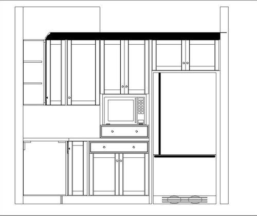
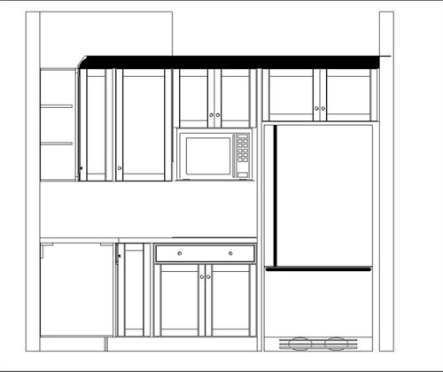
Vertical Asymmetry and MW placement
autumn.4
10 years ago

Related Stories
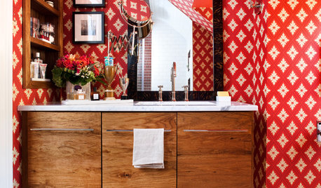
BATHROOM DESIGNRoom of the Day: A Bland Bath Goes Bold
Daring red wallpaper and asymmetry put a small, outdated bathroom on the path to memorable
Full Story
REMODELING GUIDESArchitect's Toolbox: Strike a Balance With Symmetry
Home exteriors, landscapes and interior rooms feel orderly and restful when designed with two mirror-image halves
Full Story
LANDSCAPE DESIGNFrame a Garden View for Intrigue and Abundance
Set the stage for curiosity and delight by emphasizing framed scenes in the landscape, near and far
Full Story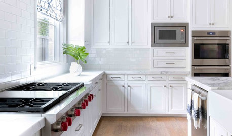
KITCHEN APPLIANCES9 Places to Put the Microwave in Your Kitchen
See the pros and cons of locating your microwave above, below and beyond the counter
Full Story
10 Ways Symmetry Can Rescue Your Room
Balancing elements of your decor can add drama, unify a collection or downplay a TV screen. Here’s how to do it
Full Story
KITCHEN WORKBOOKNew Ways to Plan Your Kitchen’s Work Zones
The classic work triangle of range, fridge and sink is the best layout for kitchens, right? Not necessarily
Full Story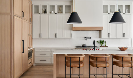
KITCHEN DESIGNStash It All: Know the 3 Zones of Kitchen Storage
Organize storage space around your kitchen’s main activities for easier cooking and flow
Full Story
DECORATING GUIDESDitch the Rules but Keep Some Tools
Be fearless, but follow some basic decorating strategies to achieve the best results
Full Story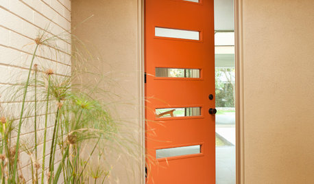
CURB APPEAL77 Front Doors to Welcome You Home
Crossing the threshold is an event with these doors in a gamut of styles
Full Story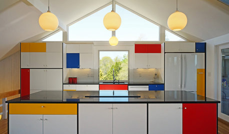
KITCHEN DESIGNKitchen of the Week: Modern Art Inspires a Color-Blocked Look
In a midcentury beach house on Martha’s Vineyard, a redesigned kitchen embraces the look of Mondrian
Full StoryMore Discussions


jakuvall
autumn.4Original Author
Related Professionals
Gainesville Kitchen & Bathroom Designers · Montrose Kitchen & Bathroom Designers · Moraga Kitchen & Bathroom Designers · Schaumburg Kitchen & Bathroom Designers · Woodlawn Kitchen & Bathroom Designers · Olympia Heights Kitchen & Bathroom Designers · Citrus Park Kitchen & Bathroom Remodelers · Boca Raton Kitchen & Bathroom Remodelers · Calverton Kitchen & Bathroom Remodelers · Centerville Kitchen & Bathroom Remodelers · Fort Washington Kitchen & Bathroom Remodelers · Jacksonville Kitchen & Bathroom Remodelers · Phoenix Kitchen & Bathroom Remodelers · West Palm Beach Kitchen & Bathroom Remodelers · Wilmington Island Kitchen & Bathroom Remodelersjakuvall
autumn.4Original Author
autumn.4Original Author
GreenDesigns
autumn.4Original Author
taggie
autumn.4Original Author
aries61
autumn.4Original Author
aries61