


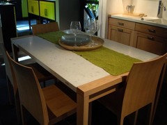
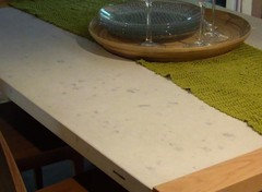
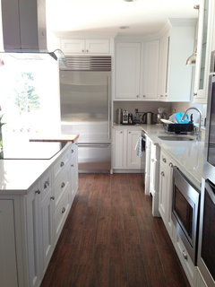
crazy to like misty carrera?
tuxedord2
10 years ago
Featured Answer
Sort by:Oldest
Comments (16)

barthelemy
10 years agoUser
10 years agoRelated Professionals
Buffalo Kitchen & Bathroom Designers · San Jacinto Kitchen & Bathroom Designers · University City Kitchen & Bathroom Remodelers · Plainview Kitchen & Bathroom Remodelers · Minnetonka Mills Kitchen & Bathroom Remodelers · Allouez Kitchen & Bathroom Remodelers · Vienna Kitchen & Bathroom Remodelers · Parsippany Cabinets & Cabinetry · Tinton Falls Cabinets & Cabinetry · Whitney Cabinets & Cabinetry · Cornelius Tile and Stone Contractors · Hermosa Beach Tile and Stone Contractors · Oak Grove Design-Build Firms · Schofield Barracks Design-Build Firms · Yorkville Design-Build Firmstuxedord2
10 years agobarthelemy
10 years agobarthelemy
10 years agotuxedord2
10 years ago
blackchamois
10 years agotuxedord2
10 years agochristine40
10 years agotuxedord2
10 years agoIliN
10 years agoIliN
10 years agoIliN
10 years agotuxedord2
10 years agoIliN
10 years ago
Related Stories
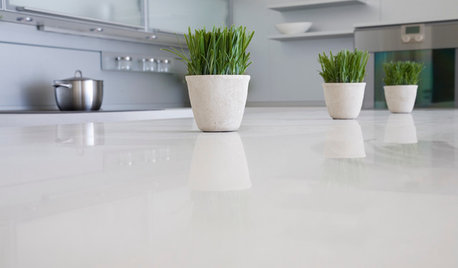
KITCHEN DESIGNKitchen Counters: Stunning, Easy-Care Engineered Quartz
There's a lot to like about this durable blend of quartz and resin for kitchen countertops, and the downsides are minimal
Full Story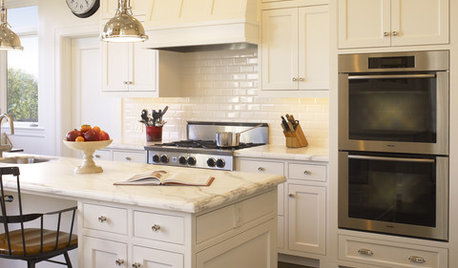
PRODUCT PICKSGuest Picks: Details for a Classic White Kitchen
Check out these white tiles, countertops and accessories, plus a few stainless steel touches, for a pristine-looking cooking space
Full Story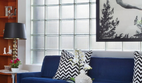
HOUZZ TOURSHouzz Tour: Freshening Up a Modern California Box
Geometric Fabrics, Soft Rugs and Photographs Add Personal Style
Full Story
KITCHEN DESIGNCountertop and Backsplash: Making the Perfect Match
Zero in on a kitchen combo you'll love with these strategies and great countertop-backsplash mixes for inspiration
Full Story
COLOR12 Tried-and-True Paint Colors for Your Walls
Discover one pro designer's time-tested favorite paint colors for kitchens, baths, bedrooms and more
Full Story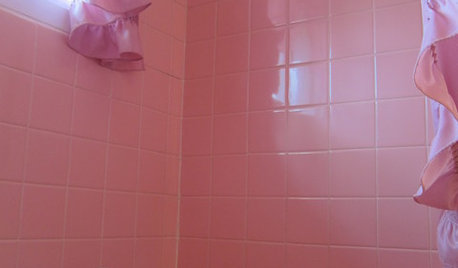
BATHROOM DESIGNTickled Pink in the Bathroom
We asked you to show us your vintage pastel bathrooms — and you responded with a tsunami of photos and comments
Full Story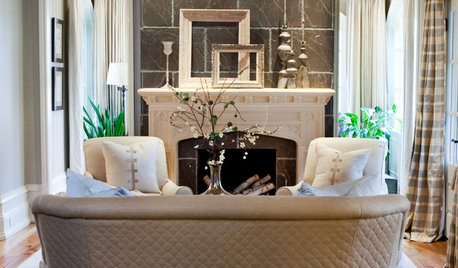
FUN HOUZZGuessing Game: What Might Our Living Rooms Say About Us?
Take a shot on your own or go straight to just-for-fun speculations about whose homes these could be
Full Story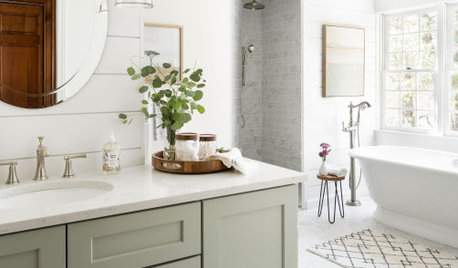
BATHROOM DESIGN14 Design Tips to Know Before Remodeling Your Bathroom
Learn a few tried and true design tricks to prevent headaches during your next bathroom project
Full Story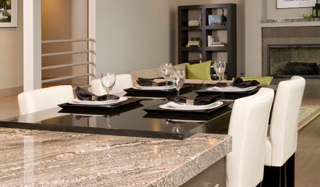
REMODELING GUIDES9 Hard Questions to Ask When Shopping for Stone
Learn all about stone sizes, cracks, color issues and more so problems don't chip away at your design happiness later
Full Story
COLORHave You Heard the Hues? 15 Colors You May Not Know About
Name-drop these shades at holiday parties — or better, try one on your walls — and expand your palette possibilities
Full StoryMore Discussions


tuxedord2Original Author