


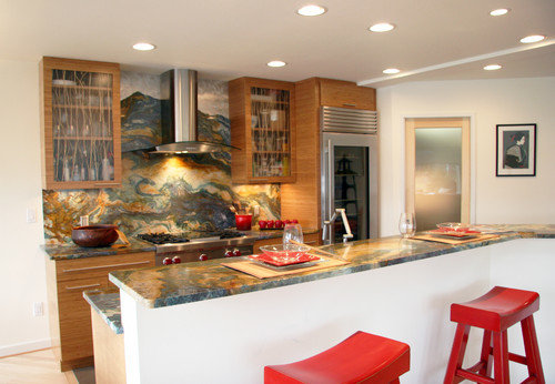
For those of you who want the backsplash to be the focal point...
steph2000
12 years ago
Featured Answer
Sort by:Oldest
Comments (20)

lavender_lass
12 years agocoastal_modern_love
12 years agoRelated Professionals
Commerce City Kitchen & Bathroom Designers · King of Prussia Kitchen & Bathroom Designers · Ridgefield Kitchen & Bathroom Designers · San Jose Kitchen & Bathroom Designers · Holden Kitchen & Bathroom Remodelers · Apex Kitchen & Bathroom Remodelers · Bethel Park Kitchen & Bathroom Remodelers · Omaha Kitchen & Bathroom Remodelers · Oxon Hill Kitchen & Bathroom Remodelers · Salinas Kitchen & Bathroom Remodelers · Toms River Kitchen & Bathroom Remodelers · Plant City Kitchen & Bathroom Remodelers · Ridgefield Cabinets & Cabinetry · Palos Verdes Estates Design-Build Firms · Plum Design-Build Firmsallison0704
12 years agopalimpsest
12 years ago
dejongdreamhouse
12 years ago
sas95
12 years agodejongdreamhouse
12 years agocluelessincolorado
12 years agoadvanced
12 years agomarcolo
12 years agobellsmom
12 years agosas95
12 years agosteph2000
12 years agoBalTra
12 years agodejongdreamhouse
12 years ago
lazy_gardens
12 years agodianalo
12 years agosteph2000
10 years agoangela12345
10 years ago


Related Stories
KITCHEN DESIGN10 Creative Ways to Establish a Kitchen Focal Point
Here’s how to create a statement-making cooking space with your backsplash, countertop, appliances, cabinets and more
Full Story
DECORATING GUIDES6 Focal Points to Build a Beautiful Interior Around
Not sure what element to make the attention getter in your room? Find some great choices here
Full Story
FIREPLACESMake Your Fireplace the Focal Point
17 Ways to Light Up Your Fireplace with Wall Treatments, Artwork, and More
Full Story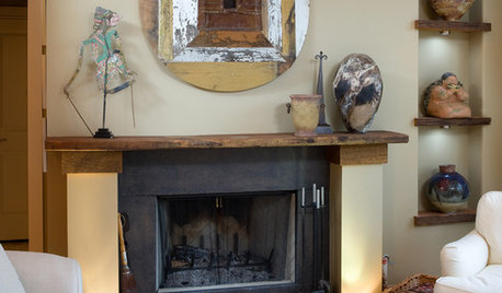
DECORATING GUIDESDecorating the Mantel: Create a Fireplace Focal Point
If the "haphazard disarray" school of style has your mantel as a student, consider these techniques for a more artfully balanced arrangement
Full Story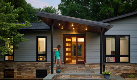
CURB APPEALEntry Recipe: New Focal Point for a 1970s Ranch House
A covered terrace draws visitors to the front door and creates a modern, interesting approach in a Baltimore-area home
Full Story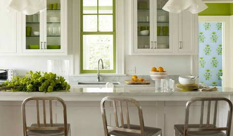
DECORATING GUIDESSecondary Colors Create a Punchy Focal Point
See how green, purple and orange bring a room to life
Full Story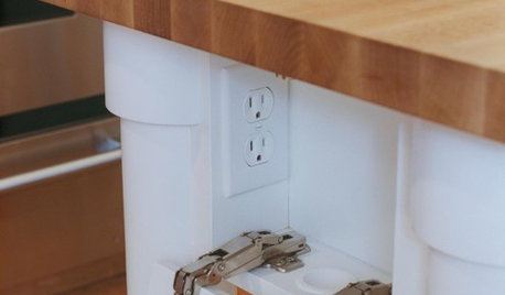
KITCHEN DESIGNHow to Hide Those Plugs and Switches
5 ways to camouflage your outlets — or just make them disappear
Full Story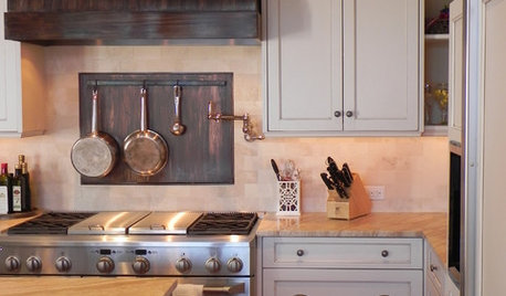
KITCHEN BACKSPLASHESKitchen Confidential: 8 Options for Your Range Backsplash
Find the perfect style and material for your backsplash focal point
Full Story
DECORATING GUIDESThose Built-Ins Are Going to Look Smashing in Color
Painting cabinetry in striking hues can bring focus and personality to a room
Full Story
KITCHEN CABINETSAre Those Sleek Handleless Kitchen Cabinets for You?
Get the lowdown on this increasingly popular streamlined look
Full StoryMore Discussions


willtv