


Are kitchens headed in this direction?
palimpsest
12 years ago
Related Stories
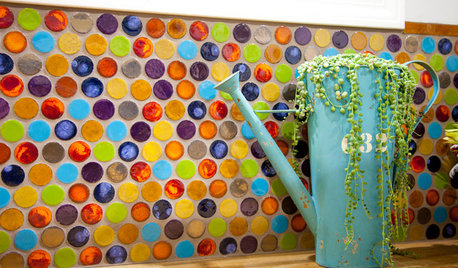
TILE5 Head-Turning Tile Styles for Backsplashes and More
If plain subway tile would derail your bold decorating vision, these dashing tiles can help you arrive at a brilliant solution
Full Story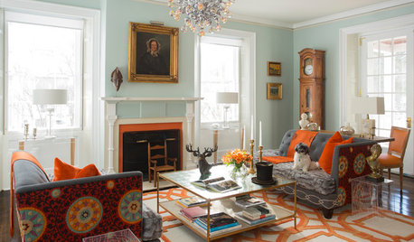
COLORFUL HOMESHouzz Tour: Turning Tradition on Its Head in Vermont
Leopard-spotted stairs, Victoriana paired with Lucite and other daring style moves give a home in a shire a completely new twist
Full Story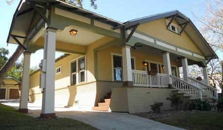
ENTRYWAYSPorte Cocheres Steer Driveway Style in the Right Direction
More than a carport, these covered structures attached to a home provide protection beautifully
Full StoryHOUZZ TOURSHouzz Tour: Pros Solve a Head-Scratching Layout in Boulder
A haphazardly planned and built 1905 Colorado home gets a major overhaul to gain more bedrooms, bathrooms and a chef's dream kitchen
Full Story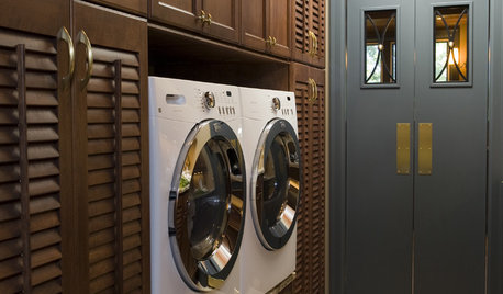
DESIGN DICTIONARYSwing Door
Swing doors open easily in both directions, making it a classic choice for kitchens and laundry rooms
Full Story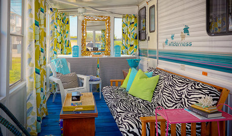
LIFEYou Said It: ‘They Looked at Me Like I Had 10 Heads’
Design advice, inspiration and observations that struck a chord
Full Story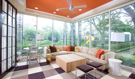
MOST POPULARHeads-Up Hues: 10 Bold Ceiling Colors
Visually raise or lower a ceiling, or just add an eyeful of interest, with paint from splashy to soothing
Full Story
GARDENING GUIDESGet a Head Start on Planning Your Garden Even if It’s Snowing
Reviewing what you grew last year now will pay off when it’s time to head outside
Full Story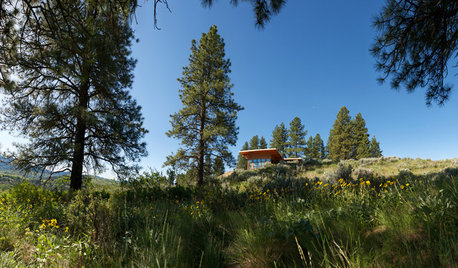
REMODELING GUIDESWhen Retirement Came Early, a Couple Headed for the Hills
A Seattle pair turn their part-time home into a full-time one, remodeling it to gain views and help it stand up to snow, sun and wind
Full Story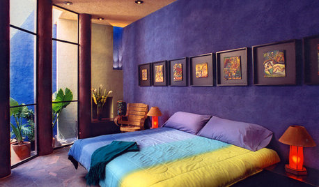
BLUEHead Into Bold Southwest Color Country
Break free from the land of blah with vivid paints and tiles that bring the look of Southwest mountains, gems and sky to your home
Full StoryMore Discussions


palimpsestOriginal Author
BalTra
Related Professionals
Fresno Kitchen & Bathroom Designers · Pleasant Grove Kitchen & Bathroom Designers · Saint Peters Kitchen & Bathroom Designers · Feasterville Trevose Kitchen & Bathroom Remodelers · Boca Raton Kitchen & Bathroom Remodelers · Cleveland Kitchen & Bathroom Remodelers · Omaha Kitchen & Bathroom Remodelers · Plant City Kitchen & Bathroom Remodelers · Norfolk Cabinets & Cabinetry · North Massapequa Cabinets & Cabinetry · Tenafly Cabinets & Cabinetry · Vermillion Cabinets & Cabinetry · Wheat Ridge Cabinets & Cabinetry · University Park Cabinets & Cabinetry · Mililani Town Design-Build Firmsmpagmom (SW Ohio)
cawaps
GreenDesigns
gr8daygw
marcolo
sombreuil_mongrel
mtnrdredux_gw
breezygirl
palimpsestOriginal Author
marcolo
palimpsestOriginal Author
breezygirl
palimpsestOriginal Author
palimpsestOriginal Author
mtnrdredux_gw
jterrilynn
palimpsestOriginal Author
sochi
breezygirl
plllog
palimpsestOriginal Author
breezygirl
mpagmom (SW Ohio)
palimpsestOriginal Author
marcolo
marcolo
palimpsestOriginal Author
jterrilynn
enduring
mindstorm
mtnrdredux_gw
kitschykitch
marcolo
palimpsestOriginal Author
breezygirl
mtnrdredux_gw
Circus Peanut
nancybee_2010
marcolo
User
marquest
enduring
User
plllog
aliris19
palimpsestOriginal Author
function_first
marquest