


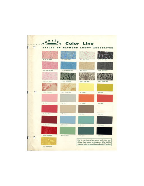
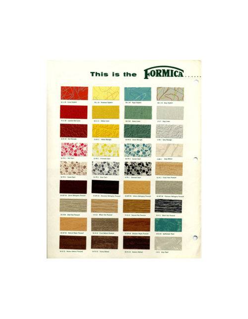
Design Around This #4: Formica Patterns are coooool!
cawaps
12 years ago


Related Stories
LIVING ROOMSNew This Week: 5 Living Rooms Designed Around the Fireplace
Overcome one of design’s top obstacles with tips and tricks from these living rooms uploaded recently to Houzz
Full Story
THE ART OF ARCHITECTUREDesign Workshop: Put Industrial Mesh to Work Around the Home
From open gratings to fine weaves, commercial metal mesh is a durable and beautiful choice for residences too
Full Story
DECORATING GUIDESWorld of Design: Decorating Ideas From 10 Renters Around the Globe
Even if you don’t own your home, you can live beautifully. Browse these ideas from international tenants who’ve made their spaces special
Full Story
PLANTING IDEASGreat Garden Combo: Play With Foliage Patterns in a Border
Splashes, spots and stripes: Confidently mix things up in your border planting with our 4-step recipe
Full Story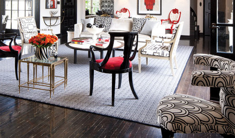
DECORATING GUIDESGet Patterns Down Pat: Working With Patterned Furniture
Time to perfect your accents. Learn how to use pattern on furniture pieces to totally transform your rooms
Full Story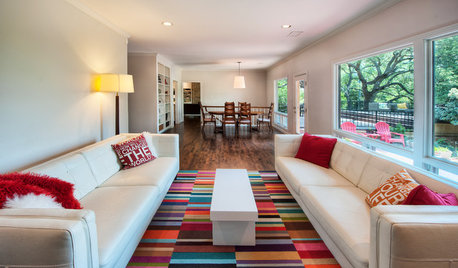
PATTERN17 Gorgeous Ways to Work In a Patterned Area Rug
Add spark underfoot and pull a room together all around with a patterned rug as bold or subtle as you please
Full Story
PATTERN8 Ways to Treasure the Diamond Pattern at Home
It can soften steel or punch up plain fabric. See if this timeless motif can enhance any of the rooms around your own home
Full Story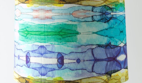
PRODUCT PICKSGuest Picks: Brush Up on Painterly Patterns
Use free-form stripes, vibrant florals and watercolor tones on furniture and accessories to evoke art around the home
Full Story
DECORATING GUIDESGo for the Glow: Mother-of-Pearl Shines Around the Home
Illuminate your interior designs with ethereally iridescent mother-of-pearl tiles, flooring, accents and more
Full Story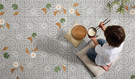
TILEWorld of Design: How Modern Geometric Designs Are Reinventing Cement
Intricate and eye-catching, the patterns of today’s cement tiles mark a break with their past while preserving an age-old technique
Full StoryMore Discussions


roarah
cawapsOriginal Author
Related Professionals
Bloomington Kitchen & Bathroom Designers · Carlisle Kitchen & Bathroom Designers · La Verne Kitchen & Bathroom Designers · Glade Hill Kitchen & Bathroom Remodelers · Camarillo Kitchen & Bathroom Remodelers · Champlin Kitchen & Bathroom Remodelers · Dearborn Kitchen & Bathroom Remodelers · Garden Grove Kitchen & Bathroom Remodelers · Kuna Kitchen & Bathroom Remodelers · Beaumont Cabinets & Cabinetry · New Castle Cabinets & Cabinetry · Oakland Park Cabinets & Cabinetry · Parsippany Cabinets & Cabinetry · Wadsworth Cabinets & Cabinetry · Liberty Township Cabinets & Cabinetryformerlyflorantha
sochi
sochi
cawapsOriginal Author
angie_diy
biochem101
gsciencechick
palimpsest
roarah
sochi
live_wire_oak
palimpsest
live_wire_oak
chocolatebunny
Kode
live_wire_oak
chocolatebunny
ideagirl2
palimpsest
palimpsest
marcolo
cawapsOriginal Author
cawapsOriginal Author
palimpsest
jterrilynn
GreenDesigns
Kode
hlove
palimpsest
mtnfever (9b AZ/HZ 11)
GreenDesigns
sochi
sochi
palimpsest
jterrilynn
palimpsest
skyedog
sochi
mtnfever (9b AZ/HZ 11)
sochi
cawapsOriginal Author
cawapsOriginal Author
sochi
live_wire_oak
sochi
palimpsest
jterrilynn
cawapsOriginal Author