


Design Around This #3: 1920s Kitchens and All That Jazz
Welcome to this week's episode of "Design Around this." The challenge:
Design a 1920s kitchen in a way that is usable today. Show all major design elements on a mood board. You can tell us about the house first and even describe your "clients" if you want.
Important: Do not post the One True Kitchen in any form. We debated whether to even allow white cabinets at all, but some suggested they would be OK as long as color was used on permanent features and fixtures -- not accessories. However if you have the cheek to "design" a kitchen with white cabinets plus white subways plus marble or soapstone counters, we will have no mercy on you.
SO, WHAT'S A 1920s KITCHEN?
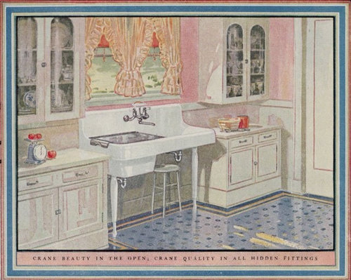
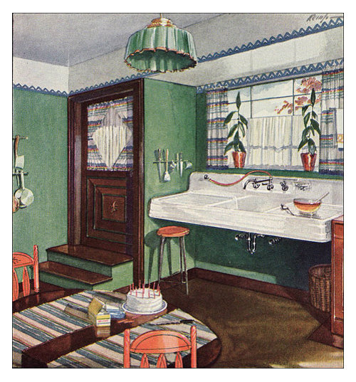
During the 1920s, kitchens evolved from the all-white sanitary style of the late 19th and early 20th centuries into something new. No longer purely functional rooms occupied by the chef and scullery maid, they became the domain of a new breed of housewife--in Julia Child's words, the "servantless American cook." And this cook wanted something pretty.
Enter color. Style. New European influences brought home by doughboys coming back down to the farm after they'd seen Paree. An exuberant mishmash of historical styles revived and redefined, including Tudor manors,

storybook cottages,
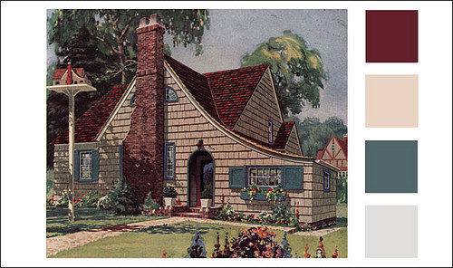
French farmhouses, Swiss chalets, English parsonages, and Dutch, Spanish and American colonial revival styles.
{{!gwi}}
There was also a new influence on the scene, ushered in by the 1925 Exposition Internationale des Arts Decoratifs et Industriels Moderns--Art Deco. But it was a small influence so far, and inspired more by the fluid forms of natural movement rather than the blinding speed of machinery. Only at the end of the decade did we see the big sweeping metallic curves of the Chrysler building.
{{!gwi}}
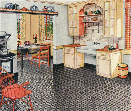
Whatever its style, the 1920s kitchen was pretty--and by pretty, I mean feminine. Stoves, like the furniture of the time, perched on delicate cabriole legs.
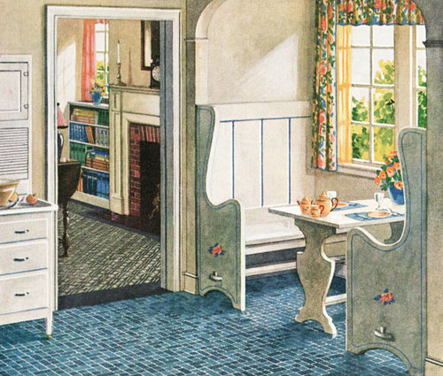
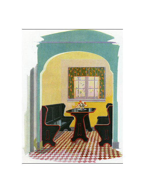
Nooks were popular, in every color.
Do not rely only on these few pictures for inspiration. Your required (but highly enjoyable) homework: Visit both galleries (1 & 2) in this fantastic site of 1920s kitchen images and get inspired. Also poke through American Vintage Home's albums on flickr. (Note that a lot of these images are linoleum ads, but you can use another flooring material if you wish.)
Some...
Comments (129)

marcolo
Original Author12 years agoI'm not color-phobic. But I think one of the hopes of these threads is to influence the way GWebbers design their kitchens. I'd love to show people who live in '20s houses who like white cabinets (or light-painted cabinets, like yellow or pale turquoise, maybe) how NOT to put an Edwardian OTK in a '20s house, even if they're not specifically going for "vintage."
palimpsest
12 years agoHere was my original fixture for over the sink area. I think this drove the project into more of a facsimile 20's kitchen with new appliances though so I skipped it and went with a MCM fixture that riffed of the flowers in the wallpaper.
So whats next?
marcolo
Original Author12 years agoWell, with this thread, have we come up with a kitchen a GW'er might actually implement, or not yet?
In terms of next topics--I vote for either a material that your average GWer would not use in a kitchen, or try to make everything else rigid and neutral if they did; OR, if we do styles again, an updated "Tuscan"/old world kitchen.
lavender_lass
12 years agoMarcolo- I don't think most GW'ers are ready for a lot of color. Many seem much more comfortable with neutrals and a splash of color.
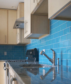
While something like the apple green I used would look great on an island with wood top...similar to this combination... {{gwi:2109525}}From 1920s kitchen project
And maybe wood or white perimeter cabinets with an apple martini quartz countertop with mosaic tile backsplash... {{gwi:2109620}}From 1920s kitchen project
{{gwi:2109621}}From 1920s kitchen projectMost people would probably think it's too much color...and even hesitate to use the apple green as a wall color, with white cabinets...which would also look great with that glass mosaic {{gwi:2109622}}From 1920s kitchen project
And would probably feel quite daring settling for a 'pop of color' like this mixer... {{gwi:2109623}}From 1920s kitchen project
For the next project, I vote for updated old world kitchen!
amarantha
12 years agoHello All,
I just wanted to chime in that these have been really great, very informative and enlightening. So thanks to all that put such great thought and a good amount of time in putting these together. I can see myself using some of these -either some of the items/resources in the kitchens and also using the story board idea itself as a tool for future work to be done in our kitchen. I have lots of clipped pieces but putting them together in a document really helps. I love color and wood and stone and... it's just putting them all together that I need help with.
And to add -those amazing refrigerator fronts above- I've got a fridge that needs panels and I don't want to hide it or make it look like it's part of the cabinetry but might want to make it look like an older ice box or early refrigerator. This has given me ideas and I'm sure there are more out there.Marcolo, I think with this thread (and the Colonial revived one too) there are certainly elements/kitchens that could be used in the current time. Personally, I would love to see a "design around" copper or other metals. Not everything metal but maybe just some really cool copper hood or refrigerator covered in a sheet metal. Not every one's style I know. And marrying of metals too - how to combine the copper with chrome or stainless steel. So many people ask all the time about mixing finishes of faucets, hardware, lighting.
Anyway just thoughts,So thanks and looking forward to more.

cawaps
12 years agoClearly, I have too much time on my hands. Here is a 3rd attempt, with white cabinetry. It is basically the OTK with tile wainscoting in blue and brown and pulling in the blue in the hutch and fabrics. Is it sufficiently 1920s?
Cute 1924 Seattle house.

Tile wainscoting kind of like this

But I want to use blue 4x4 tiles for the field and the trim in chocolate brown
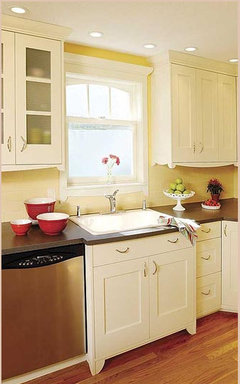
{{gwi:2109626}}{{gwi:2109627}}Walnut countertops on white inset shake cabs.
Linoleum tile floor, patterned in smoky quartz and coffee, and off-white paint color
{{gwi:2109631}}{{gwi:2109632}}
Hutch and some fabric choices for curtains and upholstery
{{gwi:2109634}}{{gwi:2109635}}{{gwi:2109636}}Lighting
{{gwi:2109637}}{{gwi:2109638}}palimpsest
12 years agoi vote for the unusual material this time. how about if we each look for something and we can pick one of them. i picked the agate, so maybe i should abstain, or at least it should not be a material like that. something is the matter with the shift button on this keyboard.
marcolo
Original Author12 years agoI like, cawaps. However, I would bet that the typical GWer thinks "light" and "airy" are synonyms for "good," so the color scheme might be a little dark for them.
You are onto something with swapping out the counters and backsplash. To me those are the key elements that make the OTK an anachronism in a '20s house, as well as a "kit" with an expiration date stamped on it.
Are we moving onto Tuscan next? Is that the feeling, or am I misreading? Who's the hapless volunteer who will kick it off?
angie_diy
12 years agoCawaps: I like it. I have only two concerns, and one is frivolous. One concern: will the tile wainscoting look too much like, uhh, a bathroom? Or is/was that a normal scheme for kitchens, too?
Second one: brown and blue has never been a favorite. Now, it makes me think of wires in European electrical cords. (Brown is the hot wire, in case you ever need to know! :^)jterrilynn
12 years agoMarco do you mean the American fake Tuscan or Tuscan region of Italy? It seems like it would be a better learning experience to study the region and culture of Tuscany and come up with real kitchen examples of the people who live there. Or, mix our fake with the real for a look?
marcolo
Original Author12 years agoI'm thinking fake Tuscan. Looking at real Tuscan kitchens would be an option for inspiration.
What I mean is, I think these threads are most helpful if they offer alternatives for real problems. One was about colonial revivals--most common house style in many parts of the country. This is about '20s kitchens, which is what a lot of people have in older cities.
But what do you do if you love Tuscan kitchens, when everybody tells you that your oversized corbels/faux-finished walls/roosters are dated and tacky (which they are)?
I think we should drill down into why people liked/like them. The warmth, the (somewhat prepackaged) sense of family, the focus on food or the love of Italian things. I think the Old World style kitchen is doomed to make a return someday, and there's got to be a better way of doing it.
So somebody could make a design based on actual Tuscan (or Italian) kitchens if they wanted. But I don't think it's 100 percent necessary to solve the problem.
cawaps
12 years agoMarcolo and Angie, thanks for the kind words. I am having way too much fun with this.
"Will the tile wainscoting look too much like, uhh, a bathroom?" I'm not sure what modern remodelers will think, but in the two galleries of vintage kitchens Marcolo linked to, there are a bunch of kitchens will partly or completely tiled walls, and a few more that have a chair rail with the lower wall painted or possibly papered a contrasting color. I've seen lots of vintage kitchen with tile in person, although in modern kitchens tile seems mostly reserved for the backsplash.
Marcolo, I tried doing brown & cream tile with blue on the walls to keep the harder-to-change elements neutral. But I didn't like it as well (I played with Benjamin Moore's Color Viewer to get a sense of balance and proportion). A lot of kitchens don't have very much wall without cabinets, so the overall effect might not be that dark (upper wall and cabinets are white). Probably not "light and airy," though. The blue and brown are going to ground it.
marcolo
Original Author12 years agoApologies, I completely overlooked palimpsest's reply--we must have been cross-posting. Off to find an unusual material!

sochi
12 years agoI'd also prefer using an unusual material rather than faux Tuscan. Faux Tuscan scares me a bit.
How about knotty pine? A challenge for sure, but I'm also starting to see it more.
cawaps
12 years agoI like the idea of reinventing Tuscan, but I think for this round I would prefer to pick an object and see how many different styles people can work it into. It's still constrained but in a different direction.
I suggested earlier that we might do the color pink, because it was so very popular for kitchens and so very unpopular now. How would you make it work in a contemporary kitchen?
As for objects, I have too many ideas (that seems to be my pattern lately). If I have to pick just one to suggest, I think I'd go with the linoleum Litho (B/W) below.
Vetrazzo?
Back-painted glass?
Unusual tile (all Ann Sacks, available in multiple colors; we could let people choose the color or we could specify)
{{!gwi}}{{gwi:2109639}}{{gwi:2109640}}Wacky linoleum?

Laminate, not imitating stone?
{{!gwi}}{{!gwi}}{{!gwi}}{{!gwi}}
{{!gwi}}
enduring
12 years agoLooking forward to the unusual material this time and getting back to a tasteful Tuscan next time. How about that vote from me it is counts from one who has only observed.
BTW I love color, there is no bad color, its all about the relationship. That's my color philosophy.
enduring
12 years agoI don't know what I trying to write in that second sentence! I think I need to go fix supper.
skyedog
12 years agoAnother observer comment/idea - how about metal cabinetry? So practical yet so underused.
sochi
12 years agoBack to an earlier question: do any of you observers or posters think you'd like a kitchen similar to any of the kitchens posted? Elements you really like and might try to use? Do they make you want to embrace more colour, or run away from it screaming? Are they practical at all?
marcolo
Original Author12 years agoGood job, cawaps. I'm kind of mentally stuck even with what kind of material to look for. I did run across some items I wish I'd seen for this thread.
ideagirl2
12 years agoLavender, do you have aqua, pink, and light green, all in your kitchen? Maybe the little girls had tooo much influence. Would you use all three?
Mtnredux, I'm not LavenderLass but I certainly would! It's certainly a girly color combo, but if anything it's slightly restrained, for the late 1920s. It's all pastels, colors we currently think of as "going together"--a lot of kitchens and especially baths from that era have at least three colors if not more, and in shades that we no longer think of as going together. Here's an example--peach and burgundy(!):
{{!gwi}}My big question for Lavender is where she found those gorgeous light fixtures...
ideagirl2
12 years agoi was wondering how much of that look was trying to sell the scutwork of feeding a family by making it look purty.
Another way of looking at that is trying to make feeding a family more cheerful and pleasant by making it pretty. If you're going to spend so much time in that room, it feels better if the room is pretty...
lavender_lass
12 years agoIdeagirl2- Thank you! Nice to see someone else loves color, too. I wanted something girly and pretty, for a Storybook cottage of the late 1920s.
Here's the link :)
Here is a link that might be useful: Link to 'gorgeous light fixtures'
skyedog
12 years agoTo answer Sochi's question, I think overall, the kitchens got a little to vintagy for me. And I live in a 100 yr old house. If the utility rooms of a house don't have the original elements to work with it's so hard to recreate them and make it work. I prefer a simpler interpretation of a period kitchen - one that uses modern appliances and more traditional looking light fixtures. Something easy to clean. Nothing overly eclectic.
I already have a colorful kitchen and house so I don't need to be sold on that. I was surprised there wasn't a red/white kitchen with yellow and jade accents. It's more 40's but it works so well and no one really knows period colors anyway.
I thought about proposing a plum colored cabinet scheme with the Cafe de Paris copper engraving set from Winchester Tile in the back splash - maybe a teal ceiling to set it off - but it would take me a week just to get it all posted correctly.

mtnrdredux_gw
12 years agoI wouldn't want any of these, including the one I did. I thought of the exercise more as being a designer and having to do what your client wants, not necessarily what you like.
But there are many elements I really love here. Marcolo's fringe chandelier, LavLass' apple green sideboard, Pal's exhaust fan (but its probably useless IRL, no?), the Italian icebox, the white sink on the teak(?) pedestal, roarah's tile, the chocolate aga, just to name a few. This exercise does bring out some new and fun elements that are a little different from "pick which one of these seventeen nickel cargo lights you like".
(just for the record, i do like nickel cargo lights)
marcolo
Original Author12 years agoI liked many of the kitchens. Whether I'd install one would depend on the house--it would still to flow with the rest of the space in some way.
There are many, many ways to approach "vintage." If you like patina, quirkiness and a sense of layering, that's one feel. If you just want inspiration from the colors and elements of an earlier era, that's different. It's especially complicated with an era like the '20s, I think. It was so varied. Five years earlier, women were dressing like Kate Winslet in "Titanic." Suddenly their chests are flat and their hair is in short pincurls. A lot of entirely new aesthetics seemingly emerged out of nowhere during a few short years. Which aesthetic you pick makes a big difference. Remember, a lot of the RH industrial decay look is based on the '20s, too. And we didn't seem to touch that aspect at all.
I do hope that at least just once we can point someone to this thread to stop him or her from installing a 2003 version of a 1900 scullery in a 2011 kitchen because they think it's "timeless."

GreenDesigns
12 years agoUnusual materials...hmmmm...not exactly a "material", but it is a uncommon "inspiration piece" that I'm working with right now for a project. It's giving me a headache and I'm working late, mostly because of the constraints that the client has me working under. :(
Teak, rosewood, and walnut dining table by Milo Baughmanenduring
12 years agoHow tall are the ceilings? You could hang it upside down and make it into a light fixture.
GreenDesigns
12 years agoApologizing for the hijacking...
It's the centerpiece in the dining room, which is the center of the open concept plan. But the client wants the One True Kitchen, and doesn't really want white anywhere else because of the wish for color on the walls and the perceived maintenance and lack of wear with white furniture. Pulling your hair out yet? LOL! I'm trying to convince her that we need some white furniture elsewhere, or else eliminate the white shaker kitchen in favor of wood. I've got plenty of ideas, but they keep getting shot down!
Dining chairs? Hmmmm..

Leather is easy to keep clean, right? Even white leather?I do love the suggestion to make it a light fixture. LOL! That's a riff on one of my ideas to have a shaped soffit with recessed lighting in a wood veneer over the kitchen island, but "that's too dark".
palimpsest
12 years agoMilo Baughman is one of those MCM designers I like partly because their work veers from classic to ugly and back again. (I think Wormley, Paul Evans, and Karl Springer fit here too). I have a Baughman Parsons table in burl, and 3 Trends II T-back chairs.
cawaps
12 years agoSo the kitchen is OTK and the rest of the house is supposed to be colorful MCM? Small wonder you're pulling your hair out.
cawaps
12 years agoI'll volunteer. Has there been a consensus on any particular material? Otherwise I will probably go with one of the ideas from my post (I'm leaning toward the Croco linoleum or the Beluga Formica).
I'll probably post it on Saturday, so if you want to weigh in before then, please do.
marcolo
Original Author12 years agoCool. Please remember to repost the rules from my bulleted list, or at least the ones that apply (homework not needed here). Those were all responses to people's input.
GreenDesigns, can you get your client to at least do one of the woods from the table as a countertop?
ideagirl2
12 years agoTo answer Sochi's question, yes, I really like this. Which ones would I want to live in? Let's see... Roarah's; Sochi's; Cawaps' first one; and possibly Marcolo's and LavenderLass's.
I love me my 20s kitchens!
And now here's my shot... a French art deco 1920s kitchen:
The floor, which has radiant heat (the whole house is heated with radiators), is ceramic tile in burgundy and sky blue with green and yellow piping (this floor is actually from 1931... two years late... so sue me! Haha).
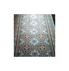
And here's a closeup so you can see the colors better:

The walls have tile wainscoting roughly like this:
...except in a combination of blue subways, black stripes at the top and bottom and a one-inch stripe of Mission Tile West's "Falling Leaf" deco liner located just over 3" (one row of subways plus grout) below the top black stripe. Here's the deco liner (ideally the putty-colored parts of this would be cream to resonate with the floor tile):

The field tile:
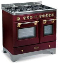
The cabinets are pale yellow with furniture feet and feminine shapes:
The counters might be a golden-toned butcherblock (similar to but lighter than the floor in that cabinet photo), but I'm not sure. For some reason, counters are always the hardest for me.
The range, of course, would be my range:
marcolo
Original Author12 years agoThat's great. I've never seen anybody here use or refer to Crown Point's transitional line. It could be seen as slightly cartoony but has a cute retro feel.
Why not use it in your kitchen?
lavender_lass
12 years agoI like the cabinets...are they the Crown Point? They would look good, in your kitchen. The color seems right, too. Are you still thinking about faux soapstone? It looks like a good combination :)
ideagirl2
12 years agoWhy not use it in your kitchen?
Because it would cost right about twice as much as what the Amish charge. But isn't it great? I love it.
It's frameless, BTW, which I mention because I know many people here go nuts for frameless. :-)
jterrilynn
12 years agoideagirl, where did you find the first floor tile picture? I was looking for something like that for my idea's but could not find anything. I really like that floor.
ideagirl2
12 years agoLavender, you're right--I saw a picture of these cabinets somewhere with soapstone counters. It looked just fantastic. I was in LOVE! The counter had a regular eased edge, and that simplicity was great, since the cabs have enough curves themselves.
I'm sure they would look fantastic and I would love them, but they would cost about $20k. (I got a quote for my layout.) I know that's not a huge amount by some people's standards, but it is by mine.
ideagirl2
12 years agoJterrilyn, that floor is actual antique tile I saw on The Antique Floor Company's site (see link below). They're a French company based in Burgundy. This particular floor sold a good while ago (understandably). It was, quote, "recovered from a town house in the Champagne region of France." I'm sure it wasn't cheap, and shipping it from Burgundy to the US would also not be cheap.
There are several close-ups at the website that you could use to recreate this tile, if you had infinite money. :-)
Here is a link that might be useful: French antique floor tile at the Antique Floor Company
lavender_lass
12 years agoOh, I'm not that in love with the cabinets (although they're very nice) I was thinking the COLOR would be perfect for your kitchen...to go with the laminate faux soapstone. It would be beautiful with your range and sink. Have you looked at your kitchen post, lately? Did you see the link to Mama goose's kitchen...and the jadite? Just some ideas :)
ideagirl2
12 years agoYeah, the color of those cabinets is fantastic. I swoon! Am I wrong, though, to be still fixated on this belief that stained wood is better for resale? It also is, indisputably, better at hiding dirt. But... I waver... I mean, maybe stained wood is generally better for resale, but a kitchen that actually looks RIGHT for the house, even though that means painted, is equally good?
lavender_lass
12 years agoGo with the paint! As you said, if people don't understand the bathrooms, they won't get the kitchen either...and don't deserve your house! :)
jterrilynn
12 years agoThanks for the site ideagirl, I do not think I have ever had such inspiration from pictures of tile before. A persons mind could really get on a run.
angie_diy
12 years agoIdeagirl: This thread caused me to waver on the wood-vs-paint issue, too. I love wood, eschewed paint. (I have no concerns about resale. I couldn't even guess which would be better for resale.) Then my idea board upthread had me say, "Hmmm. I like that look!"


roarah