


More questions on glazing
MizLizzie
11 years ago
Sort by:Oldest
Comments (9)
Related Stories
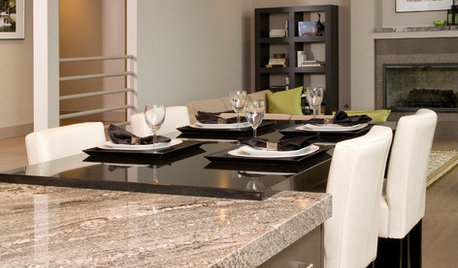
REMODELING GUIDES9 Hard Questions to Ask When Shopping for Stone
Learn all about stone sizes, cracks, color issues and more so problems don't chip away at your design happiness later
Full Story
FEEL-GOOD HOMEThe Question That Can Make You Love Your Home More
Change your relationship with your house for the better by focusing on the answer to something designers often ask
Full Story
MOST POPULAR8 Questions to Ask Yourself Before Meeting With Your Designer
Thinking in advance about how you use your space will get your first design consultation off to its best start
Full StoryREMODELING GUIDESConsidering a Fixer-Upper? 15 Questions to Ask First
Learn about the hidden costs and treasures of older homes to avoid budget surprises and accidentally tossing valuable features
Full Story
GREEN BUILDINGConsidering Concrete Floors? 3 Green-Minded Questions to Ask
Learn what’s in your concrete and about sustainability to make a healthy choice for your home and the earth
Full Story
CURB APPEAL7 Questions to Help You Pick the Right Front-Yard Fence
Get over the hurdle of choosing a fence design by considering your needs, your home’s architecture and more
Full Story
5 Questions for Houzz Design Stars
Post Ideas for Updating an Exterior, Balancing an Off-Center Window and More
Full Story
5 Questions for Design Stars
Add Your Ideas for Outdoor Storage, Cheering Up a Fireplace and More
Full Story
Design Dilemmas: 5 Questions for Houzzers!
Post Ideas for Landscaping for a Modern Home, Updating a Rental and More
Full Story
Easy Green: 6 Must-Answer Questions Before You Buy
Thinking about buying ecofriendly furniture? For a truly environmentally conscious home, ask yourself these questions first
Full Story
suzanne_sl
MizLizzieOriginal Author
Related Professionals
Lafayette Kitchen & Bathroom Designers · Pleasant Grove Kitchen & Bathroom Designers · Pleasanton Kitchen & Bathroom Designers · United States Kitchen & Bathroom Designers · Feasterville Trevose Kitchen & Bathroom Remodelers · Cocoa Beach Kitchen & Bathroom Remodelers · Londonderry Kitchen & Bathroom Remodelers · Tulsa Kitchen & Bathroom Remodelers · Princeton Kitchen & Bathroom Remodelers · Christiansburg Cabinets & Cabinetry · Murray Cabinets & Cabinetry · Watauga Cabinets & Cabinetry · Saint James Cabinets & Cabinetry · Green Valley Tile and Stone Contractors · Bloomingdale Design-Build Firmsjakuvall
Bunny
MizLizzieOriginal Author
User
sas95
jakuvall
MizLizzieOriginal Author