


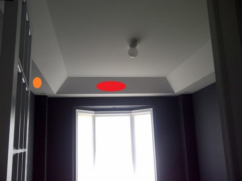
Painting - where to stop?
thornhill
11 years ago
Sort by:Oldest
Comments (11)
Related Stories
REMODELING GUIDESWhere to Splurge, Where to Save in Your Remodel
Learn how to balance your budget and set priorities to get the home features you want with the least compromise
Full Story
LIFEStop the Toy Takeover by Changing the Way You Think
Make over your approach and get gift givers onboard with your decluttering efforts by providing meaningful toy alternatives
Full StoryKITCHEN OF THE WEEKKitchen of the Week: We Can’t Stop Staring at This Bright Blue Island
A single mom updates her childhood kitchen, so she and her daughter have a functional and stylish space
Full Story
LAWN ALTERNATIVESStop Fighting the Patchy Lawn!
Here are 3 situations where a garden may be a better idea than more turfgrass
Full Story
HOMES AROUND THE WORLDWorld of Design: 11 Book Lovers and Where They Like to Read
Bibliophiles across the globe reveal their top books and favorite reading spots, from a 2-story library to an artfully curated book nook
Full Story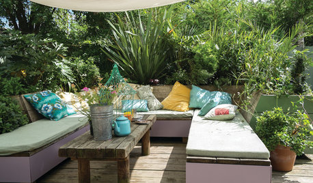
LIFEHouzz Call: Where (and What) Are You Reading This Summer?
Whether you favor contemporary, classic or beach reads, do the long and lazy days of summer bring out the lit lover in you?
Full Story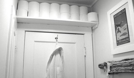
BATHROOM DESIGNBathroom Storage: Where to Keep the TP?
The Houzz community steps in with 19 tidy toilet paper storage solutions
Full Story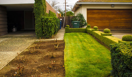
EXTERIORSWhere Front Yards Collide: Property Lines in Pictures
Some could be twins; others channel the Odd Couple. You may never look at property boundaries the same way again
Full Story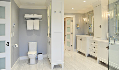
BATHROOM DESIGNBath Remodeling: So, Where to Put the Toilet?
There's a lot to consider: paneling, baseboards, shower door. Before you install the toilet, get situated with these tips
Full Story
HOLIDAYSGuys, Where Do You Feel Most at Home?
For Father’s Day, we’d like to hear from the men. What part of your house makes you feel most like yourself — grounded and alive?
Full Story


bluetea57
caryscott
Related Professionals
East Islip Kitchen & Bathroom Designers · El Dorado Hills Kitchen & Bathroom Designers · Federal Heights Kitchen & Bathroom Designers · Highland Park Kitchen & Bathroom Designers · King of Prussia Kitchen & Bathroom Designers · Mount Prospect Kitchen & Bathroom Designers · Winton Kitchen & Bathroom Designers · Athens Kitchen & Bathroom Remodelers · Charlottesville Kitchen & Bathroom Remodelers · Park Ridge Kitchen & Bathroom Remodelers · Patterson Kitchen & Bathroom Remodelers · Billings Cabinets & Cabinetry · Warr Acres Cabinets & Cabinetry · Baldwin Tile and Stone Contractors · Brentwood Tile and Stone ContractorsthornhillOriginal Author
thirdkitchenremodel
deedles
Cavimum
bluetea57
thornhillOriginal Author
laughablemoments
mountaineergirl
bluetea57