


Next Step...Painting....and I need your help!! [Photo heavy]
Buehl
15 years ago
Sort by:Oldest
Comments (60)
Related Stories
KITCHEN DESIGNHere's Help for Your Next Appliance Shopping Trip
It may be time to think about your appliances in a new way. These guides can help you set up your kitchen for how you like to cook
Full Story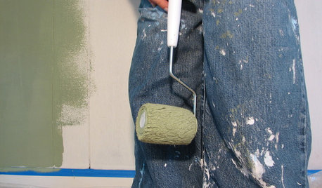
PAINTINGHelp! I Spilled Paint on My Clothes — Now What?
If you’ve spattered paint on your favorite jeans, here’s what to do next
Full Story
WORKING WITH PROS5 Steps to Help You Hire the Right Contractor
Don't take chances on this all-important team member. Find the best general contractor for your remodel or new build by heeding this advice
Full Story
ORGANIZING4 Questions to Help You Organize Your Favorite Photos
Organize your keeper photos with a system that's just right for you, whether it's in the cloud or you can hold it in your hand
Full Story
EXTERIORSHelp! What Color Should I Paint My House Exterior?
Real homeowners get real help in choosing paint palettes. Bonus: 3 tips for everyone on picking exterior colors
Full Story
GARDENING GUIDESGardening Solutions for Heavy Clay Soils
What’s a gardener to do with soil that’s easily compacted and has poor drainage? Find out here
Full Story
KITCHEN DESIGNKitchen Sinks: Fireclay Brims With Heavy-Duty Character
Cured at fiery temperatures, fireclay makes for farmhouse sinks that just say no to scratches and dents
Full Story
HOUZZ TOURSMy Houzz: Going Heavy on the Metal for Industrial-Style Beauty
Steel and iron pieces mix with antiques and heirlooms in an eclectic Netherlands home
Full Story
COLORPick-a-Paint Help: How to Create a Whole-House Color Palette
Don't be daunted. With these strategies, building a cohesive palette for your entire home is less difficult than it seems
Full Story
COLORPaint-Picking Help and Secrets From a Color Expert
Advice for wall and trim colors, what to always do before committing and the one paint feature you should completely ignore
Full StoryMore Discussions
pluckymama
budge1
Related Professionals
Bethpage Kitchen & Bathroom Designers · Fox Lake Kitchen & Bathroom Designers · Pleasant Grove Kitchen & Bathroom Designers · Beach Park Kitchen & Bathroom Remodelers · Shawnee Kitchen & Bathroom Remodelers · South Lake Tahoe Kitchen & Bathroom Remodelers · South Plainfield Kitchen & Bathroom Remodelers · Southampton Kitchen & Bathroom Remodelers · Weymouth Kitchen & Bathroom Remodelers · South Jordan Kitchen & Bathroom Remodelers · Kaneohe Cabinets & Cabinetry · Red Bank Cabinets & Cabinetry · Town 'n' Country Cabinets & Cabinetry · North Bay Shore Cabinets & Cabinetry · Fayetteville Tile and Stone Contractorsdavid123
borngrace
berryfarm
laxsupermom
pbrisjar
marybeth1
victoriajane
lovetocook9
sdionnemoore
joanr
igloochic
rosie
remodelfla
caryscott
BuehlOriginal Author
dawnbc
annab6
marilyn234
lyno
beachbum
Valerie Noronha
simoneb
bama12
caryscott
BuehlOriginal Author
mommyto4boys
sailormann
BuehlOriginal Author
lyno
BuehlOriginal Author
lyno
BuehlOriginal Author
sailormann
elizpiz
pluckymama
marybeth1
BuehlOriginal Author
cheri127
msrose
sue_ct
BuehlOriginal Author
crescent50
ramses_2
sturdy
sue_ct
BuehlOriginal Author
lyno
dollfanz