


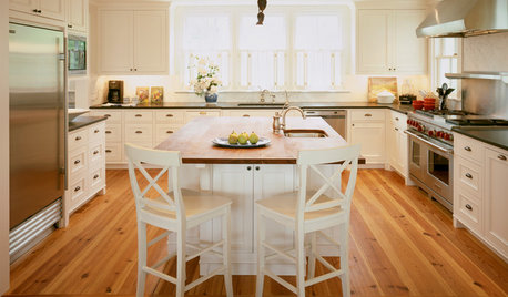
Finished Kitchen Posting - Modernish Remodel
dan_in_austin
13 years ago
Sort by:Oldest
Comments (14)
Related Stories
KITCHEN DESIGN3 Steps to Choosing Kitchen Finishes Wisely
Lost your way in the field of options for countertop and cabinet finishes? This advice will put your kitchen renovation back on track
Full Story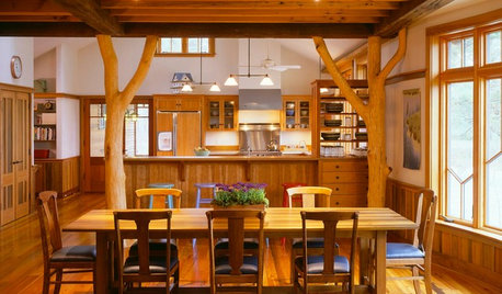
KITCHEN DESIGNOpening the Kitchen? Make the Most of That Support Post
Use a post to add architectural interest, create a focal point or just give your open kitchen some structure
Full Story
CONTRACTOR TIPSContractor Tips: Countertop Installation from Start to Finish
From counter templates to ongoing care, a professional contractor shares what you need to know
Full Story
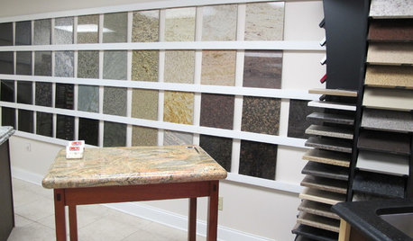
KITCHEN COUNTERTOPSWalk Through a Granite Countertop Installation — Showroom to Finish
Learn exactly what to expect during a granite installation and how to maximize your investment
Full Story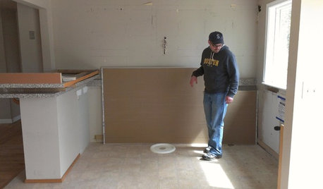
KITCHEN DESIGNStylish New Kitchen, Shoestring Budget: See the Process Start to Finish
For less than $13,000 total — and in 34 days — a hardworking family builds a kitchen to be proud of
Full Story
KITCHEN DESIGNHere It Is! See Our Finished Kitchen Sweepstakes Makeover
This lucky New Jersey homeowner got improved storage, upgraded finishes and a better layout to accommodate his family of 6
Full Story
REMODELING GUIDESPro Finishing Secret: Aniline Dye for Wood
Deeper and richer than any stain, aniline dye gives wood stunningly deep color and a long-lasting finish
Full Story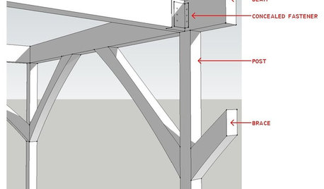
REMODELING GUIDESKnow Your House: Post and Beam Construction Basics
Learn about this simple, direct and elegant type of wood home construction that allows for generous personal expression
Full Story
KITCHEN DESIGNYour Kitchen: Mix Wood and Painted Finishes
Create a Grounded, Authentic Design With Layers of Natural and Painted Wood
Full StorySponsored
Central Ohio's Trusted Home Remodeler Specializing in Kitchens & Baths
More Discussions


zeebee
jakabedy
Related Professionals
Flint Kitchen & Bathroom Designers · Greensboro Kitchen & Bathroom Designers · Hillsboro Kitchen & Bathroom Designers · Hybla Valley Kitchen & Bathroom Designers · La Verne Kitchen & Bathroom Designers · Palmetto Estates Kitchen & Bathroom Designers · Winton Kitchen & Bathroom Designers · Honolulu Kitchen & Bathroom Remodelers · Spokane Kitchen & Bathroom Remodelers · Holt Cabinets & Cabinetry · Warr Acres Cabinets & Cabinetry · West Freehold Cabinets & Cabinetry · Wells Branch Cabinets & Cabinetry · Gardere Design-Build Firms · Glassmanor Design-Build Firmsdianalo
honeychurch
lolog72
formerlyflorantha
jabelone
pricklypearcactus
chinchette
palimpsest
flwrs_n_co
gsciencechick
katsmah
dan_in_austinOriginal Author