Shop Products
Houzz Logo Print
nwrain_gal

What tile color on backspash ?

NWRain-Gal
10 years ago

hi everyone,

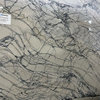
We had the quartz countertop of Vicostone/Pental in "Tobacco" installed Monday and now I have to decide on the backspash tile color.

Background:

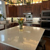
House: 1925 bungalow / craftsman flavor. Galley Kitchen gutted, all wood custom shaker style cabinets with Ogee edge on doors and drawers. Paint on cabinets: Rhodda paint latex enamel in C014 - "Cotton", an off white with some slight cream tone in some light, greyish tones in other lighting. My drawer handles and pulls will be matte black. Wall color will be the golden color you see in the picture.

White appliances and white oak sand-in-place floors to be stained a golden med brown tone. (not too dark because the old hardwoods in the rest of the house are a golden amber honey tone)

in the kitchen I want a classic timeless look in keeping with the age of my house. Something that will be in style a long time.

Kitchen faces north but has a small breakfast nook off to the side that faces west. I get a lot of reflection from the white house next door on sunny days. I want to do a 3 x 6 subway tile in a matte finish. The choices are limited when you go matte. The tiles to the right are Daltile 0790 Artic White, the ones on the left are 775 Daltile Biscuit. (I ruled out American Olean matte Biscuit...too pinkish for my white colors.)

I will have a lot of white in the kitchen with the cabinets, the appliances, and backspash. There is a bit of white/cream/taupe and black veins in the quartz. Don't want these whites to fight each other. So far my favorite is to stick with the Artic White and keep it simple.

I have toyed with the idea of adding a thin pencil liner either in white tone on tone or picking a color in the guartz, and maybe adding it on top of the first row of tile only. I fear I might be cluttering it up and don't want to tire of it in the future.

Which color 3 x 6 do you like? And what do you all think of the pencil liner idea?

Thanks everyone for your feedback.

Comments (24)

  • NWRain-Gal
    Original Author
    10 years ago
    last modified: 9 years ago

    Continued from the above post.

    This is a picture of the kitchen from another view

    {{gwi:1969594}}

  • NWRain-Gal
    Original Author
    10 years ago
    last modified: 9 years ago

    Not sure why pic didn't come though...... try again

  • oldbat2be
    10 years ago
    last modified: 9 years ago

    NWRain_Gal - Your countertop and cabinets look very pretty together! The yellow paint on my monitor is looking a little 'harsh' for some reason, hopefully entirely different in real life. I prefer the tile to the left (biscuit), but perhaps the yellow is throwing me? Can you post a picture of the kitchen taken from 'straight on' (easier to photo-shop). I think you'd do well with just the subway (I'd suggest avoiding the pencil liner) and perhaps do something with the grout (more grey?). Best, oldbat2be

  • deedles
    10 years ago
    last modified: 9 years ago

    I don't know, a pencil liner in grey might be neat. Check out a few pics down in this thread.

    Here is a link that might be useful: pencil liner tile

  • amykath
    10 years ago
    last modified: 9 years ago

    I am going out on a limb here but I think a darker tile would add interest.

    Maybe one of the darker colors in your countertop.

  • NWRain-Gal
    Original Author
    10 years ago
    last modified: 9 years ago

    Hi oldbat2be,

    Thanks for your feedback on my choices of backsplash tile.

    I looked for a straight on picture of the kitchen, but the contractor had already papered the counter with rosin paper for the electrician to hook up a switch and outlet, so I am posting this one of the other side. I hope this helps.

    I agree that the yellow is a bit strong in the pictures. the paint I used in the pictures is "Gold" by Devine paint. I had used Devine in the past in the dinning room and main bath and had wonderful results. They must have changed the formula because the Gold on the kitchen walls was way thin, didn't cover well, and when the cabinet and crown molding painters took off their masking tape the paint went with it! I decided to go with the Miller Paint "Golden" which is their version of Devine's Gold. (haven't painted it yet because the painters have to return to do lots of touch ups to the cabinets...long story) In person the color is a rich, deep golden yellow . I had it on my walls in the kitchen years ago in a Valspar Signature color called Honey Pot. The old cabinets were painted white then too. I hope that when the kitchen is completed I will be fine with it again because I really liked it.

    for the backspash I am leaning toward the arctic white because it blends with the cabinet color and also with the white appliances. The biscuit does go well with the counter though. I am just afraid of the different whites clashing with each other. What do you think? I'm open to all suggestions.

    After a while you start going nuts with all these decisions!

    NWRain-Gal

    Here is a link that might be useful: Devine Gold

  • oldbat2be
    10 years ago
    last modified: 9 years ago

    A few images for your viewing pleasure :)

    Matte daltile arctic white 3x6 grey grout

    Matte daltile arctic white 3x6 White grout:

    Matte daltile biscuit:

    Arctic white carried to the ceiling:

    3x8 Heath galaxy thin brick:

    And because it's a favorite and always fun to see (not what you're looking for, I know):

    Heath tile:

  • ellendi
    10 years ago
    last modified: 9 years ago

    My counter wound up browner than I expected and seemed to clash with my Dove White counters. We used Grazia Rixi creama. It blended with a cream in the counter and was a good transition from the white to brown toned counter.

    My vote would be like Aktillery suggested. Go with one of the darker shades of beige from your granite.
    If whites aren't right, they can make other elements looks dirty. Just a word of caution: sometimes the color tone can change drastically when the entire BS is installed. A surprise considering you are living with samples in your kitchen for weeks on end and go in confident that you have made the right decision.

    When you do pick a tile, make a sample board and this will also include the grout. See how it looks in the morning afternoon and evening.

    The BS is the one element that can wait. No need to rush into a choice.

  • oldbat2be
    10 years ago
    last modified: 9 years ago

    Definitely make a sample board. It's easy, cheap and you can reuse the tiles! I'll be glad to photoshop those once you have them in place and then you will know you will be happy with your decisions.

  • a2gemini
    10 years ago
    last modified: 9 years ago

    NWRainGal
    Can't wait to see your sample board. I am leaning towards the biscuit tile vs the whiter tile as well.
    I think the white would be crisp and would go nicely with cabs and the wall color but the biscuit pulls in the counter better.
    Like Ellendi - I went with Grazia Rixi Crema - and I also put in a strip of mosaic. The mosaic that I used would not work with your counter but if you want, I can post a picture.

    PS - Now I know why it rained on our PNW bicycle trip - with a handle like yours - it is bound to rain - but everyone kept telling us the rain doesn't start until the 2nd week in October - but we had rain almost every day (Spokane and Northern Idaho area)

  • blackchamois
    10 years ago
    last modified: 9 years ago

    I'm liking the heath galaxy thin brick, or the arctic white with the gray groute.

    And I'm a big fan of carrying it up to the ceiling.

    Nice mock-ups oldbat!

    Agree with ellendi to do a sample board!

    Good luck and keep us posted!

  • carree
    10 years ago
    last modified: 9 years ago

    I just want to say that oldbat2be is a great contributor with her creative mock ups. I'm loving it.

  • amykath
    10 years ago
    last modified: 9 years ago

    I second carree, very sweet of oldbat to take the time to mock up ideas for us!!

    I am voting for the darker brick! Or something like it.

  • ALLI1570
    10 years ago
    last modified: 9 years ago

    I am planning on using the same countertop and am stuck on the backsplash too. I had originally been looking at a matte sand beige for some contrast (see photo). Now I think I am going to do a backsplash in the countertop material and use beadboard for the rest of the space between the backsplash and the upper cabinets. I also was originally planning on a sort of butter yellow for the walls but now I think I am going to stick with more of a light beige.

  • NWRain-Gal
    Original Author
    10 years ago
    last modified: 9 years ago

    Many thanks are in order to oldbat2be for the the choices and mock-ups that she wonderfully created. Thanks to ellendi’s and a2gemini’s suggestion of Grazia Rixi Crema (which we went to see at a local tile shop). DH thought Grazia Rixi Crema was too creamy for our slight off white cabinetry and they also came in a gloss which we were trying to stay away from.
    Also many thanks to BlackChamois, carree, aktillery for their suggestions and thoughts.

    After much soul searching and contemplation, we decided to keep it simple and timeless and go with the Daltile Arctic White matte. I then made, as suggested, a sample board with some choices of grout. One choice was Custom building material’s Fusion “Alabaster”- a taupe off-white, Custom building material’s Snow White- a grayish white and a sample of what my Mother used in her kitchen remodel last year Fusion “Antique Linen”- a warm toned pinkish cream. We looked at them in all sorts of lighting and decided to go with the Alabaster to give it some definition and it also perfectly matched the taupe in our Vicostone Tobacco quartz countertops.

    The tile setters just finished applying the grout 2 days ago. It looks very classic and timeless, just like we wanted. The grout looks slightly different in various lighting situations. In natural light (no UC lighting) it looks taupe. With the UCL it looks slightly lighter and grayish. We like it a lot and it matches the era of our house well. I plan to bring in color to the kitchen in my accessories which can be changed through out the year and seasons.

    All the lighting: center ceiling light, cans, UC, LED upper cab accents, and sink pendant were installed last Monday. Looks nice and so much brighter!

    The hardwood floor was stained and 2 coats of sealer applied. There is one more coat to go in satin at the very end of the project. The sealer was a major disruption in our lives!! The smell was unbearable!!!!! They said that we should be out of the house for 2 days. Ha! The two days turned into 5 days! We slept on air mattresses at my parents house! My DH likened the smell and eye irritation to tear gas in the Navy! OMG! I am NOT looking forward to the next round of smell and inconvenience taking place at the end of the kitchen remodel!!!!! (in 2 weeks) The floors look beautiful though. A nice contrast in darkness (stain was a golden brown ) and wider plank (3 1/4in) compared to our original 90 year old 2inch amber color white oak floors in the rest of the house.

    The range hood and venting (damper on backorder) went in a few days ago, as well as the dishwasher (a Whirlpool Gold top control). We are holding off on install of the FS GE Profile Dual Fuel range until the floors are done. Don’t want any more “opps” surprises along the way!

    Glass inserts in the top accent cabinets to be chosen still....I'm thinking seeded clear glass?

    We are waiting for some cabinet paint issues to be resolved first. That is a another long story where incorrect people trying to finish the job too fast. They are going to fix all the issues to achieve the look that should have been done in the first place! (like a month ago!) Hopefully happily and not resentfully.

    To alli1570: I feel your dilemma in the backsplash selection. Our counter selection could make the backsplash go in so many different ways. It has many colors in it which make it hard to choose. We chose the Daltile Arctic White to keep the vintage/timeless look and also because this is my “forever kitchen” and I certainly don’t want to be doing this again when I’m 80! (even though I feel like I have aged dramatically during this renovation LOL!) I’ll love it if you could post the result of your final backsplash choice and see what you chose overall to go with the Tobacco Vicostone Quartz.

    I am posting a few pics of the of the progress.

    Thanks to everyone, NWRain-Gal

    P.S. Could anyone please tell me how to post multiple pic in the body of your post? I have an iMac. I am slightly techy challenged:)

  • NWRain-Gal
    Original Author
    10 years ago
    last modified: 9 years ago

    Pic of Range wall in above posting

  • NWRain-Gal
    Original Author
    10 years ago
    last modified: 9 years ago

    Pic in daylight of tobacco quartz counter and daltile Arctic White with alabaster grout

  • NWRain-Gal
    Original Author
    10 years ago
    last modified: 9 years ago

    Pic of Hardwood white oak floor with the golden brown stain and the 2 coats of the sealer....the smelly stuff! (taken from breakfast nook looking toward kitchen). the sealer comes in gloss but the final top coat will be in satin. I think it will give a nice contrast to the mostly white in the kitchen.

    So far, what do you all think?

  • blackchamois
    10 years ago
    last modified: 9 years ago

    I love simple, classic and timeless and i think a white subway tile is just that! I truly love that look. Great choice! Beautiful kitchen!

  • oldbat2be
    10 years ago
    last modified: 9 years ago

    Huge smile on this end, love it!

  • romy718
    10 years ago
    last modified: 9 years ago

    The backsplash looks great, clean & classic. I think you made a perfect choice! Congrats!

  • cruzinpattis
    10 years ago
    last modified: 9 years ago

    NWRain-Gal
    Love your kitchen!

    I am very interested in the Tabbacco color by Pental Quartz.
    Saw it at a cabinet maker shop.
    They gave me a quote but now want to check out other places to get another one...
    Can't seem to find any place that stocks it.

    Do have a few questions - hope you don't mind....
    What type of store / place did you see the quartz? I live on Long Island.

    Can you describe the colors....Your pictures show more of a beige / tan color..... What I saw on a tiny sample piece was cream, gray, taupe, and a hint of green.

    Do you see any water marks? Stains?

    Any info you can provide will be greatly appreciated...

    Thanks in advance.

  • mweitz
    8 years ago

    ...... Enjoyed reading this discussion. I am at the beginning of a kitchen remodel & have chosen pental tobacco quartz as my countertop. I am going with hexagonal mochachino stained glass tile as the backsplash (sample below); My cabinets will be refinished white.


  • Melissa Haydon McCormack
    3 years ago

    Nw rain- did you use glossy? Also did you are your cabinets bright white?

Sponsored
Wannemacher Interiors
Average rating: 5 out of 5 stars26 Reviews
Customized Award-Winning Interior Design Solutions in Columbus, OH