Shop Products
Houzz Logo Print
michelew9090

Michelew90 backsplash quest 2

michelew90
9 years ago

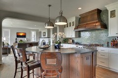
My kitchen

Comments (150)

  • kitchendetective
    9 years ago
    last modified: 9 years ago

    Michele, Were you thinking of all over, or as a field around a feature?

  • michelew90
    Original Author
    9 years ago
    last modified: 9 years ago

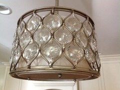
    Here's a close up of my lights. The crystals really glisten. I thought glass in beverage area and/or as an accent may work-somewhere else. I like the scrafitto and filigree also as well as the beautiful kitchen pic with the diamonds that are outlined in some sort of liner(may be too much unless it was more subtle)..

  • Gracie
    9 years ago
    last modified: 9 years ago

    Dark and somber, urban, at odds with your white glazed cabinets, hardware, and lights.

    But what do you like about it? I can't really tell what it is, but it seems to be glass mimicking a stone texture. Is it glass and stone?

  • romy718
    9 years ago
    last modified: 9 years ago

    I like the color of the photo shop YOU did, 10/6, 8:31. Impressed, I didn't catch that you photoshopped it. It's the tile from 10/6, 8:04? Pretty, but would it outshine your granite?
    When you look at P&L, they have some metallic ceramic tiles. I think you have posted a P&L backsplash you liked of a curvy pattern in a bronzy/gold metallic.
    Good luck today.

  • kksmama
    9 years ago
    last modified: 9 years ago

    Would you consider the filagree tiles as your whole backsplash? Either the ones May_flowers posted set as diamonds, or these without a border or frame? I'm hoping you're going to get something textural and monochromatic without adding a shape, and without being too plain.

    [

    [(https://www.houzz.com/photos/backsplashes-craftsman-kitchen-portland-maine-phvw-vp~18017738)

    [Craftsman Kitchen[(https://www.houzz.com/photos/craftsman-kitchen-ideas-phbr1-bp~t_709~s_2116) by Portland Tile, Stone & Countertops Old Port Specialty Tile Co

  • jess1979
    9 years ago
    last modified: 9 years ago

    Can you tell me what finish your pulls are?

  • michelew90
    Original Author
    9 years ago
    last modified: 9 years ago

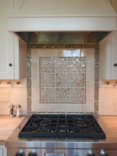
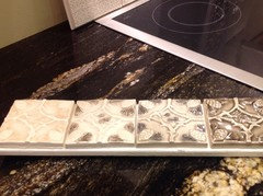
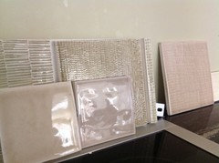
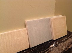
    Pictures Pratt and Larson samples. The light filigree is the only sample board they had -brought some other textures, metallics and colors to check

  • michelew90
    Original Author
    9 years ago
    last modified: 9 years ago

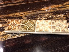
    Picture 2

  • michelew90
    Original Author
    9 years ago
    last modified: 9 years ago

    Pic3

  • michelew90
    Original Author
    9 years ago
    last modified: 9 years ago

    Colors -not pattern

  • michelew90
    Original Author
    9 years ago
    last modified: 9 years ago

    Colors -2

  • michelew90
    Original Author
    9 years ago
    last modified: 9 years ago

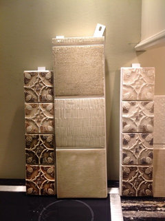
    Picture of different textures

  • michelew90
    Original Author
    9 years ago
    last modified: 9 years ago

    Like the top and bottom textures on the board in the center...obviously in a different color...this sample is green

  • kitchendetective
    9 years ago
    last modified: 9 years ago

    I like the top-most texture in the last photo. I like bottom-most color in photo today at 21:53. I think I like first and third glazes at 21:38. Does anyone think that the Scraffito and Filigree may be too Old World for a transitional kitchen?

  • Gracie
    9 years ago
    last modified: 9 years ago

    Yes, and too small a pattern. 5" textured tiles are going to be too busy regardless. WZ has a few with larger patterns that are more contemporary. I think we've exhausted traditional styles.

  • michelew90
    Original Author
    9 years ago
    last modified: 9 years ago

    Close up of textured tile-it's really a pattern not a texture. the textures come in any size you want. Here's a link to a different view of one of the textures I like. Link below

    Here is a link that might be useful: [https://www.houzz.com/photos/private-residence-g-traditional-bathroom-austin-phvw-vp~4541742[(https://www.houzz.com/photos/private-residence-g-traditional-bathroom-austin-phvw-vp~4541742)

    This post was edited by michelew90 on Wed, Oct 8, 14 at 7:53

  • jess1979
    9 years ago
    last modified: 9 years ago

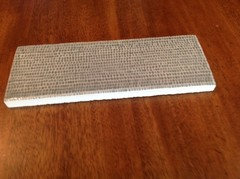
    I agree with may flowers. I have the P&L tile and it is busy. It is not installed yet but the counters will be quartz blizzard. I attached a picture that shows the Pratt and Larson tile close up. Do you remember the finish for your pulls. I have lights with a similar finish as yours and have been trying to decide on the finish for the knobs. I really liked your pulls.

  • michelew90
    Original Author
    9 years ago
    last modified: 9 years ago

    I would do a texture in a subtle monotone matching my cabinets

  • Gracie
    9 years ago
    last modified: 9 years ago

    What makes this difficult are the competing styles. You have traditional with the white glazed cabinets, arched hood, moldings, and hardware. So that wants a subway or other ceramic tile with possibly a framed area. With just that, there's so many possibilities for tile. We've kissed a few of those frogs.

    But there's glamour transitional with the lights, and there's three of 'em, so they can't be ignored. Then that granite-- it's molten lava. Do you even try to compete?

    This new batch of samples is more contemporary. Most have some sort of linear motion. I'd use the bottom in the texture trio because it's a subtle pattern and keeps the eye flowing with the granite. I don't like the tension that vertical lines and linen textures add. I would use a longer subway too because 3' x 6' feels a little choppy.

    Though the metallics look good in the WZ photo, it's the arabesque shape that keeps it transitional. Arabesque is too much pattern with your granite, and I can't picture metallics with your cabinets.

  • michelew90
    Original Author
    9 years ago
    last modified: 9 years ago

    So....I like the texture in the middle only in the color of the small square on the left. I'd like to see a sample in a better color. The spotty texture doesn't fight with the granite so much because there are no "lines". Instead of using those all over, I could possibly combine squares and subway like the board in filigree posted on 10/5@21:02. The Metallics I posted last night could be used as the liner or ignored completely. Another option could be to bring in encore chocolate as the liner... I wouldn't use contrasting grout anywhere.
    Did you look at the Houzz pic? Clearly, I don't follow trends or design rules, really :). With that said, I don't want to end up with a weird backsplash that turns off potential buyers if I ever sell.
    Btw I looked at the walker zanger glass at the store--not even close to how it looked online...good call.

  • michelew90
    Original Author
    9 years ago
    last modified: 9 years ago

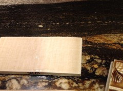
    Better pic

  • romy718
    9 years ago
    last modified: 9 years ago

    Is there a pattern in the bottom sample? I can't see a pattern or a distinct texture. Is that the backsplash you linked to at 07:38? What about the colors? Anything, color wise, giving you the "ah ha" moment?

  • Gracie
    9 years ago
    last modified: 9 years ago

    Romy, I think I see some brushstrokes across the tile. That motion feels a little more contemporary than a crackle and will show less of a variation between individual tiles.

    "I would do a texture in a subtle monotone matching my cabinets"

    I think this is what's not working. The cabinets are cool and the granite is warm. Tile that matches the cabinets has looked flat. Maybe you could find a cream with a subtle caramel or gold brushstroke. This is a stone tile IIRC, but I'll post it just for illustration and because I have it saved:

  • romy718
    9 years ago
    last modified: 9 years ago

    I'm totally confused. I must have been posting while you were adding additional photos. I thought you liked the bottom & top samples of the tile board displayed last night at 23:17.
    I saw the Houzz photo. It doesn't look subtle in that photo but it is more subtle in a lighter color? The one all the way to the left of your latest picture looks the least patterned. Why not just a beautiful glaze? I am not in your kitchen looking at all your elements together, so if you say the spotty elements don't compete with your granite, go for it. The color you like is the small tile on the right (of your most current picture)?
    Sounds like your making progress.

  • michelew90
    Original Author
    9 years ago
    last modified: 9 years ago

    Here it is again.
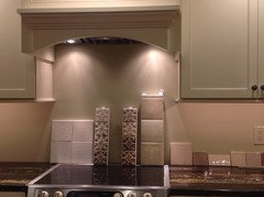
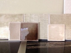
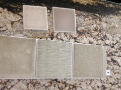
    front: Encore smoke, encore chocolate(put in to compare),Pratt and Larson crackle watercolor.
    back: Pratt and Larson sample board. The texture on left--may as well be crackle..middle--too much, right, would like to see how watercolor sample color or slightly darker)looks over that texture.
    I see how it may seem too modern but as I sit at my island looking at it, the pattern/texture is very subtle and doesn't distract me at all. I'll keep looking at it in different light. TD likes the filigree..hope this isn't too confusing. I'm just blurting out my thoughts right now.

    This post was edited by michelew90 on Wed, Oct 8, 14 at 13:42

  • romy718
    9 years ago
    last modified: 9 years ago

    Love the Watercolors, gorgeous tile. The color looks good. It's the small square on the right?

  • michelew90
    Original Author
    9 years ago
    last modified: 9 years ago

    Yes small square on right is Pratt and Larson crackle rustic bisque w71

  • michelew90
    Original Author
    9 years ago
    last modified: 9 years ago

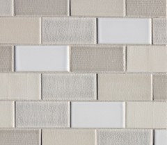
    I guess I'm trying to pitch something like this but using the new texture instead of filigree

  • kitchendetective
    9 years ago
    last modified: 9 years ago

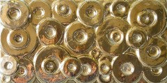
    This was the tile that reminded me of Romy's favorite bowl, from Dunis Studios.

  • kitchendetective
    9 years ago
    last modified: 9 years ago

    I did not want to try editing that. I believe it comes in 300 glazes, if you wanted one row of it.

  • romy718
    9 years ago
    last modified: 9 years ago

    My bowl - it's never been about the circle pattern, just the modern/transitional look of the bowl.
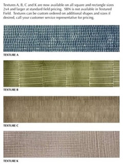
    I did a Google Image search for "Pratt and Larson Textures" & found several pics. The 3x3 square is the attached pic is Textures A and the 3x6 tile is Textures K.
    On your sample board Textures K on the left & Textures A on the right. It does look less patterned in a lighter color. It's a glossy finish, correct? So Textures K is a little more textured than a crackle?
    Not sure why I feel the need to define these textures.

  • michelew90
    Original Author
    9 years ago
    last modified: 9 years ago

    Yes, that's right. I like A --less linen-like

  • romy718
    9 years ago
    last modified: 9 years ago

    I'm very detailed oriented - too detail oriented. More details on P&L Textures.

  • jess1979
    9 years ago
    last modified: 9 years ago

    I just looked on our box this is A. It is glossy and you can feel the texture on it.

  • romy718
    9 years ago
    last modified: 9 years ago

    I think I might have mislabeled your Textures samples. If you look at the vertical picture of the Textures tile board, going from top to bottom, that skinny sample on the top (#1), is that Textures A? #2 is Texture C? #3 is Texture B? and #4 is Texture K? I totally missed the skinny sample.
    Now that we might have everything identified, which one do you like and how are you proposing to use it?
    I'm sorry, but I'm not sure if you meant to use the Textures as an overall field tile or within a framed insert.

  • Gracie
    9 years ago
    last modified: 9 years ago

    I don't like A on the gold-colored board. It's going to have an orange peel effect in a solid color. You need the white around the spots, so maybe that means you have to go darker for the glaze to pool in the indentations?

  • michelew90
    Original Author
    9 years ago
    last modified: 9 years ago

    Here's another example of the textures. It s a little more lively than crackle

  • michelew90
    Original Author
    9 years ago
    last modified: 9 years ago

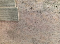
    On my granite
    Like color of small biscuit square..the other small square is smoke

  • romy718
    9 years ago
    last modified: 9 years ago

    I believe the light grey tiles in that picture are a crackle tile, 2nd row, 2nd tile.
    I was looking at that picture trying to identify each tile. The description on the website says A, B, C & K. I sure don't see B. The white is just a plain glossy tile.

  • romy718
    9 years ago
    last modified: 9 years ago

    I like the small square on the left also. I noticed it when you initially posted this set of samples. It has the warmth your tile needs. Is it dark enough? Can you take a picture of it by itself, verticle with your granite & cabinets?
    Edit: meant it has the warmth your granite needs.

    This post was edited by romy718 on Wed, Oct 8, 14 at 15:47

  • michelew90
    Original Author
    9 years ago
    last modified: 9 years ago

    I just went back to the tile store. Pratt and Larson no longer uses the intaglio line (the sample board with three textures from earlier). They've replaced it with the textures line. The light blue is a sample of texture A. It is less textured and more subtle than the previous samples from yesterday. I'd call it a more "modern crackle"

    They only had it In blue....To the left is the crackle in rustic bisque

  • kitchendetective
    9 years ago
    last modified: 9 years ago

    Have you ruled out this one?

  • Gracie
    9 years ago
    last modified: 9 years ago

    The rustic bisque looks pretty good. That lighting is also helpful. Can we see it with Smoke in that lighting?

  • michelew90
    Original Author
    9 years ago
    last modified: 9 years ago

    No,I haven't ruled anything out.
    I accidentally returned the smoke today.
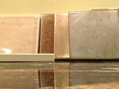
    Here's a close up pic. Left to right-texture K in color w70, texture A in color w87, plain crackle in w71 (rustic bisque). As you can see, they are all crackle. The textures are very, very subtle compared to the sample I had yesterday (intaglio line). It looks like Jesse has the Intaglio. I was told by TD you could still buy Intaglio, but Pratt and Larson is transitioning to this more subtle texture line.I like them all but may prefer one of the textures to bump up the crackle effect.

  • Gracie
    9 years ago
    last modified: 9 years ago

    In the other photo, you showed a lot of the cream and gold areas of the granite. I wanted to see which of the cream and brown toned tiles worked the best with it.

  • bookworm4321
    9 years ago
    last modified: 9 years ago

    Just want to mention that when you see just a few tiles, they may not seem "interesting: enough. When they fill a wall, all those variations in size, color, finishes add up.

    15:35 post; I like the small upper left tile.

    As always, I leave color opinions to the real experts.

  • michelew90
    Original Author
    9 years ago
    last modified: 9 years ago

    I like the way this backsplash changes with light reflection and texture but appears to be all the same color. What do you think of this? I don't know what it is.

    Mayflowers which photo are you referring to? One of them was taken on the island, one on beverage area, and another on range wall.

    I guess I'll be starting a new thread soon. I'll call it michelew90's backsplash quest3.

    Here is a link that might be useful: [https://www.houzz.com/photos/kitchen-mediterranean-kitchen-houston-phvw-vp~6687033[(https://www.houzz.com/photos/kitchen-mediterranean-kitchen-houston-phvw-vp~6687033)

  • kitchendetective
    9 years ago
    last modified: 9 years ago

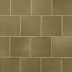
    Ann Sacks toadskin has texture. Not linear like Houzz photo, though.

    Here is a link that might be useful: A S Toadskin