


Help me pick some lights!
nomorebluekitchen
15 years ago
Sort by:Oldest
Comments (26)
Related Stories

PRODUCT PICKSGuest Picks: Hot Air Balloons Help Decor Soar
Flying onto wallpaper, pillows, lighting and more, hot air balloons lift rooms up, up and away
Full Story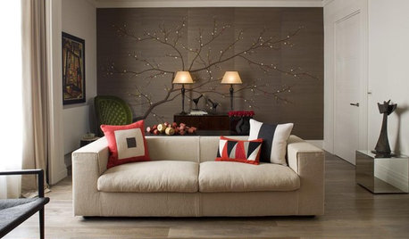
PRODUCT PICKSGuest Picks: Help Your Home Blossom With Floral Decor
Sprinkle hints of spring around your rooms with fabrics, wall coverings and more that recall nature's charms
Full Story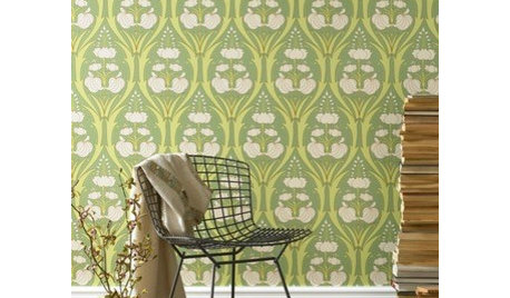
Guest Picks: Give Your Home a Helping of Spring Greens
Celebrate garden growth with this collection of housewares and gardening gear in the shades of budding plants
Full Story
COLORPaint-Picking Help and Secrets From a Color Expert
Advice for wall and trim colors, what to always do before committing and the one paint feature you should completely ignore
Full Story
COLORPick-a-Paint Help: How to Quit Procrastinating on Color Choice
If you're up to your ears in paint chips but no further to pinning down a hue, our new 3-part series is for you
Full Story
COLORPick-a-Paint Help: How to Create a Whole-House Color Palette
Don't be daunted. With these strategies, building a cohesive palette for your entire home is less difficult than it seems
Full Story
ARCHITECTUREHouse-Hunting Help: If You Could Pick Your Home Style ...
Love an open layout? Steer clear of Victorians. Hate stairs? Sidle up to a ranch. Whatever home you're looking for, this guide can help
Full Story
COLORPick-a-Paint Help: 11 Ways to Mine Your World for Colors
Color, color everywhere. Discover the paint palettes that are there for the taking in nature, shops and anywhere else you roam
Full Story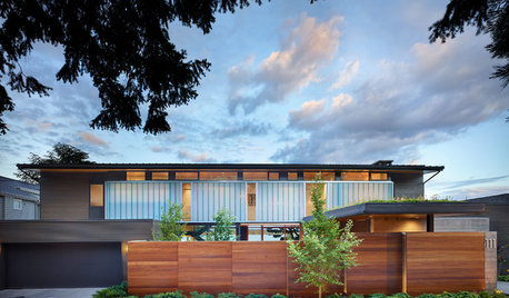
CURB APPEAL7 Questions to Help You Pick the Right Front-Yard Fence
Get over the hurdle of choosing a fence design by considering your needs, your home’s architecture and more
Full Story

redroze
nomorebluekitchenOriginal Author
Related Professionals
Fox Lake Kitchen & Bathroom Designers · Gainesville Kitchen & Bathroom Designers · Fairland Kitchen & Bathroom Remodelers · Fort Washington Kitchen & Bathroom Remodelers · Waukegan Kitchen & Bathroom Remodelers · Bonita Cabinets & Cabinetry · Eureka Cabinets & Cabinetry · Fort Lauderdale Cabinets & Cabinetry · Plymouth Cabinets & Cabinetry · Radnor Cabinets & Cabinetry · South Gate Cabinets & Cabinetry · South Riding Cabinets & Cabinetry · West Freehold Cabinets & Cabinetry · Whitney Cabinets & Cabinetry · Shady Hills Design-Build Firmsredroze
redroze
smilingjudy
nomorebluekitchenOriginal Author
rhome410
moonkat99
pbrisjar
bbstx
Circus Peanut
caryscott
ccoombs1
jessie21
rbsohio
nomorebluekitchenOriginal Author
nomorebluekitchenOriginal Author
charlikin
arleneb
crescent50
igloochic
positano
lascatx
nomorebluekitchenOriginal Author
redroze
redroze