


Cabinetmaker Gone! Finally Time to Talk BS!
motherof3sons
11 years ago


Sort by:Oldest
Comments (50)
Related Stories
WORKING WITH PROSWhat to Know About Working With a Custom Cabinetmaker
Learn the benefits of going custom, along with possible projects, cabinetmakers’ pricing structures and more
Full Story
KITCHEN CABINETSCabinets 101: How to Work With Cabinet Designers and Cabinetmakers
Understand your vision and ask the right questions to get your dream cabinets
Full Story
FUN HOUZZ31 True Tales of Remodeling Gone Wild
Drugs, sex, excess — the home design industry is rife with stories that will blow your mind, or at least leave you scratching your head
Full Story
LIFEIf You Could Talk to Your House, What Would You Say?
‘Pull yourself together’ or ‘thank you for transforming my life’? Notes to homes around the country hit us where we live
Full Story
KITCHEN DESIGNExpert Talk: 12 Ways to Get a Designer-Kitchen Look
Professional designer Ines Hanl reveals her thought processes on select kitchen remodels
Full Story
ARCHITECTUREGet a Perfectly Built Home the First Time Around
Yes, you can have a new build you’ll love right off the bat. Consider learning about yourself a bonus
Full Story
LANDSCAPE DESIGNIs It Time to Consider Fake Grass?
With more realistic-looking options than ever, synthetic turf can be a boon. Find the benefits and an installation how-to here
Full Story
STUDIOS AND WORKSHOPSA Stitch in Time: Creative Sewing Spaces
Sewing rooms have become popular again as people of all ages embrace simple crafts they can do at home
Full Story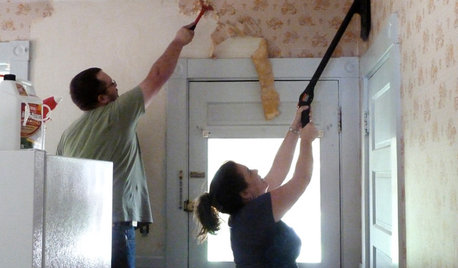
DECORATING GUIDESHow to Remove Wallpaper in 4 Steps
Learn the best way to remove wallpaper with only water (and elbow grease) so your next wall treatment will look great
Full Story
FALL GARDENINGWhy Fall Is the Best Time for Planting
Spring is overrated for planting. Starting plants in autumn has advantages for both garden and gardener
Full Story


Lake_Girl
poohpup
Related Professionals
College Park Kitchen & Bathroom Designers · Everett Kitchen & Bathroom Designers · Kalamazoo Kitchen & Bathroom Designers · Lockport Kitchen & Bathroom Designers · San Jose Kitchen & Bathroom Designers · Soledad Kitchen & Bathroom Designers · Wentzville Kitchen & Bathroom Designers · Minnetonka Mills Kitchen & Bathroom Remodelers · Bay Shore Kitchen & Bathroom Remodelers · Citrus Park Kitchen & Bathroom Remodelers · Panama City Kitchen & Bathroom Remodelers · Pinellas Park Kitchen & Bathroom Remodelers · Westchester Kitchen & Bathroom Remodelers · Hermosa Beach Tile and Stone Contractors · Rancho Cordova Tile and Stone Contractorsmsrose
lolauren
Susan
TxMarti
rhome410
justmakeit
williamsem
blackchamois
deedles
function_first
mermanmike
localeater
mpagmom (SW Ohio)
gr8daygw
Gracie
smiling
michelle16
home4all6
fouramblues
badgergal
labbie
jejvtr
User
lazy_gardens
motherof3sonsOriginal Author
drewem
chiefy
Cavimum
beekeeperswife
meganmca
motherof3sonsOriginal Author
pricklypearcactus
deedles
dilly_ny
phiwwy
deedles
deedles
kellienoelle
kellienoelle
motherof3sonsOriginal Author
a2gemini
deedles
motherof3sonsOriginal Author
rhome410
amykath
Kathy Rivera
debrak_2008
autumn.4