Shop Products
Houzz Logo Print
deedles_gw

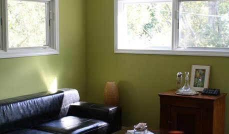
Color gurus! Wall color help needed please

deedles
10 years ago

Okay, this isn't exactly the kitchen but since the living room is wide open to the kitchen I thought I could ask here for some help.

This image shows the elements of our soon to be living room. Light knotty pine ceiling, cork floor, tin tiles for behind the stove and black granite tiles for under the woodstove. What I've got in this dreamboard are the exact items that we either have or are waiting to be delivered so these things are a done deal.

{{!gwi}}

I can't figure out a color for the wall, hence the white empty patch. DH wants the room to feel 'warm and cozy' but he doesn't know what color that is. Spent 2 hours with BM sample books and all he could say is "I don't know". Poor guy, he's burnt out but I really want him to be happy when it's all done.

Can anyone figure out a color? (There is a mint green stove visible from the living room if that matters, color-wise).

Please give me some suggestions and thanks!

Comments (34)

  • shanghaimom
    10 years ago

    Probably not what you're hoping to hear, but I would not do a "color" with those elements. Especially with your very special stove visible.

    I think you can still have a warm and cozy room with a deep (not yellowy) cream on the walls, like BM Navajo White. Your elements are all "look at me." (In a good way!) Knotty pine, the strong pattern of the tin tiles, the patterned floor...you need something neutral to let it all breathe.

  • homebuyer23
    10 years ago

    I'm not a color expert by any means and picking paint was one of my hardest decisions, but I'll still weigh in! I agree with shanghaimom that a deep cream would be best. Though I think if you found one that read a little bit gold or tiniest bit of a yellow undertone I think that'd be OK, and maybe feel a little warmer.

    I had Antique White by Sherwin Williams in a whole room, it was a very nice true cream that had yellow undertones. I loved it by itself but it looked awful next to the adjacent room where I had a gray/green. I think the Antique white could look nice w/ your warmer elements, or any of many many colors in that range. With that beautiful ceiling & stove theres no way it won't be warm & cozy!

    good luck!

  • Annie Deighnaugh
    10 years ago

    Ohh! Time for design seeds.

    I'm seeing that brownish/greenish tan as the predominant color. Let's see what inspirations that might create. Maybe one of these will strike your fancy. I'm kind of liking a number of them, but perhaps the last is best. But it shows that quite a number of colors could work really well.

  • lavender_lass
    10 years ago

    Nice color choices!

    I was just going to recommend a soft caramel color. Warm and toasty without being too dark...and a shade that would complement the other choices. Somewhere in between the ceiling and the tile. I think that would look good with the green and copper in the kitchen, too :)

  • Annie Deighnaugh
    10 years ago

    Just playing around a little more and love the look of asparagus or burgundy or even plum with those colors...just luscious.

  • deedles
    Original Author
    10 years ago

    Okay, I did up the room with Navajo white:
    {{!gwi}}
    and a medium caramel color, this is 'Golden Retriever', Benjamin Moore

    {{!gwi}}

    Between the two, I prefer the caramel color. It seems like white is too stark or something. Course, this is a monitor and not IRL...

    The floor pattern was not to scale so I shrunk it on these images.

  • deedles
    Original Author
    10 years ago

    Annie: grabbed a plum off one of the seeds pictures... actually looks pretty good... kinda 'regal'. Not sure I could get DH past the thought of purple, though.
    {{!gwi}}

  • deedles
    Original Author
    10 years ago

    This might work: BM Bar Harbor Beige

    {{!gwi}}

  • Annie Deighnaugh
    10 years ago

    The plum looks very william morris. In fact, you might want to look at wm morris wall papers for inspiration...they are so gorgeous.

    {{!gwi}}

  • Brandywine72
    10 years ago

    Your poor husband! I feel for him. What is working for me about deedles' eggplant sample is not so much the purple color but that it is a warm, deep, and saturated color. I think you need that here. And, you need to steer away from golds and yellows. It doesn't do much to compliment the golds and yellows that are already there. You need more contrast, more of a counterpoint.

    When selecting paint colors I often use the Farrow and Ball sample book, even if I am not going to use their paints. But their pigments are so saturated they are divine, and they have a limited number of choices so it isn't too overwhelming. It is nice to use as a tool to hone in on a basic idea and then jump to BM for the many variations that can drive you nuts!

    I would go for some shade of deep warm gray. I think it will bring all of these colors together, not compete or look too vacant with the copper, and will not clash with the mint green.

  • rosie
    10 years ago

    I don't have a perfect color suggestion. I did want to remind you that colors contrast in how they vary from light to dark, from dull to saturated (muted to crayon-bright), and then also in actual hue (red - green). Your issue here seems to be as much how much contrast or harmony you want as actual hue.

    White striking you as stark and being discarded immediately is definitely a light-dark contrast issue, rather than a color issue. It is very high contrast in that setting.

    When you try colors you like, maybe take them through ranges of light to dark? On my screen at least, the plum and caramel are showing as low contrast to the other elements (more harmonious), the beige is lighter and so higher contrast (more pop for the wall sections and the fireplace against each other) than those, and the white..."stark." :)

  • Annie Deighnaugh
    10 years ago

    I have to say I'm not liking the beige and brown tones at all....Love the plum! Don't ever call it purple, esp in front of DH...call it aubergine!

    I actually went with that color in my library behind the sofa, and liked it so much, used it in the coffers of the hall ceiling. It's a deep, rich, saturated color that doesn't scream purple...it just looks warm against the wood tones.

  • deedles
    Original Author
    10 years ago

    Brandy: I feel for him, too. He's so tired and he's been at this for 2 years. What he wants is the feel of the old orangey knotty pine of his youth. What we have is very light new pine with a clear finish that is never going to darken like the varnish used to. I think you may be on to something with the saturated color idea. A grey had occurred to me... I'll pursue that..

    Rosie: good points to ponder. Always appreciate you guys that can put into words what is going on. I just know that 'this doesn't feel good' or etc,. Personally, "a" white would probably work for me, but it's not what he is wanting and I'd really like for when this is all done that he can look around and be content with his surroundings.

    Annie: that is really pretty with your wood. Our wood is much lighter than that, though, but yeah, I'm starting to embrace the saturated color idea.

    As far as the 'calling it something else' trick, I've done that enough that he doesn't buy into it anymore, lol. He'll say, "I know six colors and that's purple." In our current living room I painted a lovely, mustard-y khaki-ish green-ish color on the walls. He declared it was 'baby poop'. Oy.

  • Bunny
    10 years ago

    I'm with homebuyer. I have SW Antique White in every room of my house (except the MBR and bath), including the kitchen. I even have it on my ceilings. Depending on the light, it ranges between luscious french vanilla to deep beige, but it always lets other elements in the room take center stage. In my kitchen it's one of several whites that layer and texture together. It has more of a gold than yellow influence. I haven't found any colors it doesn't like.

    Consider the light in the room! On paper the plum looks great, but it is so dark.

    I love the first pattern that AnnieD has shown. I'd want my walls to be more like that background.

  • deedles
    Original Author
    10 years ago

    linelle: I grabbed the color of the nut in that paper you suggested... good call on the paper... seem to be representative of what I've got. So anyway, here is the nut color... kinda think that looks nice.
    {{!gwi}}

  • mark_rachel
    10 years ago

    I would keep it very light. Over time the pine is going to darken, so I would keep the color on the walls light since everything else is dark in color. I would go with something like Pewter Revere BM.

  • lavender_lass
    10 years ago

    I think soft caramel means more of a tan to me (LOL) that seems too dark. Maybe coffee with a lot of cream? Caramel with more milk? Or just a nice tan color :)

    Anyway, I like the William Morris fabric, so what about something like this? {{!gwi}}From Snow White album

  • localeater
    10 years ago

    I like the color of the nut. In fact I love the nut wallpaper and want to find a place to use it, but I don't think that is going to happen.
    I think the color of the nut, is actually very close to the color that I painted my island and my sunroom. It is one of those mystery colors, a greeny grey with a hint of gold. It is called BM Providence Olive. You can see it hear in the sunroom

    From GW Photos

    And here on the island
    From GW Photos

    (why is there a bottle of wine on the island in every one of my pictures....)
    As you know I live in a house with a lot of wood, my beams are darker than your knotty pine. A GF who is a interior designer came over as I was thinking things through. Because she knows me and my love for clutter-free spaces, my need for calm environments, she counseled that the beams in my home are for me the primary design element. I needed to think about if I wanted to add color as a design element too or if that would push me over the edge. So I painted out several rooms from a very neutral muted goldy- beige(by the previous owners) to SW Alabaster White. It really does allow me more breathing room(for me).
    In the rooms that do have color, deep saturated hues work best. My sons' rooms are forest green and marine blue, they work.

  • Holly- Kay
    10 years ago

    Deedles, I love the nut color that you showed on the last pic. I love all of the William Morris papers that Annie posted.

  • susanlynn2012
    10 years ago

    I love the nut color and feel it would look great on your walls.

  • deedles
    Original Author
    10 years ago

    Hey local! I love your sunroom, it looks like such a nice place to sit. And your wood is so beautiful in that house. I'll check out the providence olive but I'm worried it might not work looking into the kitchen with the mint stove and tile.. maybe I'm getting closer, though! (Is there tile yet? Just making sure I'm not missing any tile thread while I'm consumed with this remodel :)

    Holly and Lynn: I'm pursuing the nut color and it may tend a bit more toward what Lavender posted (see comments above about the mint green stove/tile) Thanks for weighing in!

    Lav: thanks for continuing the great suggestions.

  • deedles
    Original Author
    10 years ago

    Here is providence olive (it looks a lot lighter and more green in your house, local. Course, this is just a computer image so...)

    (ha, just realized that this is really close to what is on the walls in my current living room..)

    {{!gwi}}

  • dilly_ny
    10 years ago

    I like the Bar Harbour beige or nut color.

  • localeater
    10 years ago

    Hey Deedles no tile yet, soon, it is on order....
    Linking an ideabook from Houzz that talks about paint colors and natural wood tones, in case you find it helpful

    Here is a link that might be useful: [Houzz Idea book[(https://www.houzz.com/magazine/11-terrific-paint-color-matches-for-wood-details-stsetivw-vs~9025200)

  • susanlynn2012
    10 years ago

    I now like the nut color, the Bar Harbor Beige, and the Providence Olive on my monitor. All three seems to work but I don't know what they look like in person so deedles is for you to decide but all three to me looks very nice.

  • susanlynn2012
    10 years ago

    I am also finding that Valspar, Grandma's Linen 6001-1C looks so nice in the picture on the Houzz Idea book. But this is on my monitor and it may be darker in person.

  • enduring
    10 years ago

    I'm liking the Navaho White.

  • deedles
    Original Author
    10 years ago

    Well, now there are several good options out of this thread, so probably the best thing to do is get the ceiling and the tiles up and start painting swatches. We have the plaster guy coming next Tuesday to do the walls and then the ceiling after that, so in the next couple weeks I should be able to start painting some samples.

    Thank you all for helping, it feels like there are some solid choices now. I'll post a call-out to the ' color gurus' when it's sample paint time!

  • enduring
    10 years ago

    Are you getting real plaster? I think there is a curing phase of...a long time. I am thinking it might be 4 weeks, but I could also be all wrong.

  • deedles
    Original Author
    10 years ago

    Uh, I don't know. I'd better ask the guy Tuesday. Gosh, I hope it isn't that long...

  • raee_gw zone 5b-6a Ohio
    10 years ago

    I do hope that you find a way to pull the salmon-y pink or red that has shown up in a few of the examples above into the room-- a few pillows, a vase, or whatever. I think it looks fab with your elements, but wouldn't want a whole wall of it (of course, you have to like pink/red!)

  • gnancyanne
    10 years ago

    Have you looked at Sherwin-Williams Chip It thing? It "instantly turns any image into a collection of up to 10 Sherwin-Williams paint colors." I modified your image a bit and tried it and got this:

    At the bottom of the chip, there's an edit tab. When you select it, some other colors appear. (I guess that makes "the up to 10 colors.) This one shows the chip after I clicked edit but before I did anything else:

    If I would have selected any of those colors to replace the original ones, you'd see the names of the paint colors. I think the aubergine idea and the two last colors at the bottom on my second picture would be good with your other colors, etc., but use a blue that's more green to agree with your stove.

    Here is a link that might be useful: Sherwin-Williams Chip It!⢠info

  • susanlynn2012
    10 years ago

    gnancy, I like the SW Belvedere Cream a lot. What a neat concept that I must save to my wall color profile.

  • deedles
    Original Author
    10 years ago

    Wow, what a neat idea! I'll have to check that out. Thank you for posting it.