


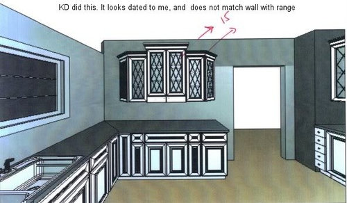
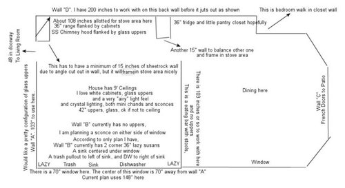
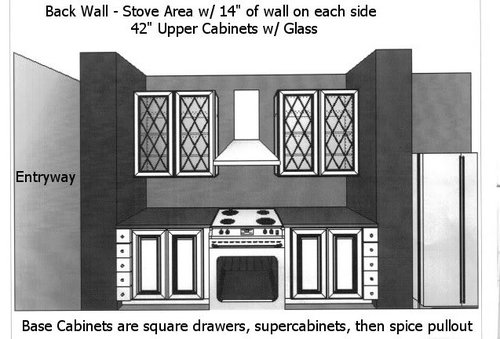
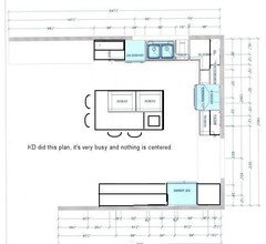
Kitchen Layout advice?
blondie859111
13 years ago

Featured Answer
Sort by:Oldest
Comments (21)

blondie859111
13 years agoRelated Professionals
College Park Kitchen & Bathroom Designers · Piedmont Kitchen & Bathroom Designers · Vineyard Kitchen & Bathroom Designers · South Farmingdale Kitchen & Bathroom Designers · Cloverly Kitchen & Bathroom Remodelers · Chicago Ridge Kitchen & Bathroom Remodelers · Mooresville Kitchen & Bathroom Remodelers · Phoenix Kitchen & Bathroom Remodelers · Vashon Kitchen & Bathroom Remodelers · Bon Air Cabinets & Cabinetry · Christiansburg Cabinets & Cabinetry · Kentwood Cabinets & Cabinetry · New Castle Cabinets & Cabinetry · Aspen Hill Design-Build Firms · Shady Hills Design-Build Firmsrhome410
13 years agoblondie859111
13 years agomonkeymo
13 years agorhome410
13 years agoblondie859111
13 years agoblondie859111
13 years agorhome410
13 years agoblondie859111
13 years agoformerlyflorantha
13 years agoblondie859111
13 years agoBuehl
13 years agochicagoans
13 years agoblondie859111
13 years agoBuehl
13 years agolavender_lass
13 years agolavender_lass
13 years agohomeagain
13 years agoblondie859111
13 years agobreezygirl
13 years ago


Related Stories
KITCHEN DESIGNSmart Investments in Kitchen Cabinetry — a Realtor's Advice
Get expert info on what cabinet features are worth the money, for both you and potential buyers of your home
Full Story
DECORATING GUIDES10 Design Tips Learned From the Worst Advice Ever
If these Houzzers’ tales don’t bolster the courage of your design convictions, nothing will
Full Story
LIFEEdit Your Photo Collection and Display It Best — a Designer's Advice
Learn why formal shots may make better album fodder, unexpected display spaces are sometimes spot-on and much more
Full Story
Straight-Up Advice for Corner Spaces
Neglected corners in the home waste valuable space. Here's how to put those overlooked spots to good use
Full Story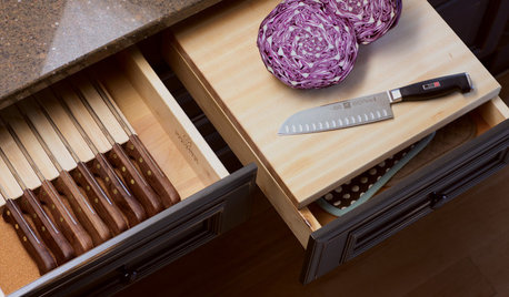
KITCHEN STORAGEKnife Shopping and Storage: Advice From a Kitchen Pro
Get your kitchen holiday ready by choosing the right knives and storing them safely and efficiently
Full Story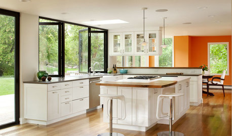
KITCHEN DESIGNDetermine the Right Appliance Layout for Your Kitchen
Kitchen work triangle got you running around in circles? Boiling over about where to put the range? This guide is for you
Full Story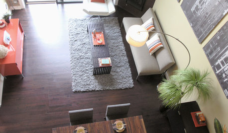
DECORATING GUIDESHow to Plan a Living Room Layout
Pathways too small? TV too big? With this pro arrangement advice, you can create a living room to enjoy happily ever after
Full Story
LIFEGet the Family to Pitch In: A Mom’s Advice on Chores
Foster teamwork and a sense of ownership about housekeeping to lighten your load and even boost togetherness
Full Story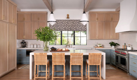
KITCHEN LAYOUTSThe Pros and Cons of 3 Popular Kitchen Layouts
U-shaped, L-shaped or galley? Find out which is best for you and why
Full Story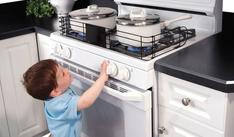
HEALTHY HOMEHow to Childproof Your Home: Expert Advice
Safety strategies, Part 1: Get the lowdown from the pros on which areas of the home need locks, lids, gates and more
Full Story

blondie859111Original Author