


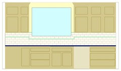
Border or no border with a ceramic subway tile back splash?
happy2learn
11 years ago


Featured Answer
Comments (33)

heidia
11 years agolast modified: 9 years agohappy2learn
11 years agolast modified: 9 years agoRelated Professionals
Federal Heights Kitchen & Bathroom Designers · La Verne Kitchen & Bathroom Designers · Leicester Kitchen & Bathroom Designers · Riviera Beach Kitchen & Bathroom Designers · Creve Coeur Kitchen & Bathroom Remodelers · Salinas Kitchen & Bathroom Remodelers · South Lake Tahoe Kitchen & Bathroom Remodelers · Vienna Kitchen & Bathroom Remodelers · Beaumont Cabinets & Cabinetry · Black Forest Cabinets & Cabinetry · Key Biscayne Cabinets & Cabinetry · Newcastle Cabinets & Cabinetry · Town 'n' Country Cabinets & Cabinetry · Lake Butler Design-Build Firms · Riverdale Design-Build Firmsangel411
11 years agolast modified: 9 years agoangie_diy
11 years agolast modified: 9 years ago
corgimum
11 years agolast modified: 9 years agopricklypearcactus
11 years agolast modified: 9 years agodrewem
11 years agolast modified: 9 years ago
a2gemini
11 years agolast modified: 9 years agoAnn Scheley
11 years agolast modified: 9 years agokellysar
11 years agolast modified: 9 years agobreezygirl
11 years agolast modified: 9 years agoellendi
11 years agolast modified: 9 years agobeekeeperswife
11 years agolast modified: 9 years agochiefy
11 years agolast modified: 9 years ago
localeater
11 years agolast modified: 9 years agoannettacm
11 years agolast modified: 9 years agokmmh
11 years agolast modified: 9 years ago
sprtphntc7a
11 years agolast modified: 9 years agoella_socal
11 years agolast modified: 9 years agogo_figure01
11 years agolast modified: 9 years ago
Gracie
11 years agolast modified: 9 years agohappy2learn
11 years agolast modified: 9 years agohappy2learn
11 years agolast modified: 9 years agobeekeeperswife
11 years agolast modified: 9 years agoClaudia77
11 years agolast modified: 9 years agoangie_diy
11 years agolast modified: 9 years agoellendi
11 years agolast modified: 9 years agophiwwy
11 years agolast modified: 9 years agobabushka_cat
11 years agolast modified: 9 years ago
Bunny
11 years agolast modified: 9 years agosprtphntc7a
11 years agolast modified: 9 years agoa2gemini
11 years agolast modified: 9 years ago


Related Stories
KITCHEN DESIGN10 Gorgeous Backsplash Alternatives to Subway Tile
Artistic installations, back-painted glass and pivoting windows prove there are backsplash possibilities beyond the platform
Full Story
BATHROOM DESIGNBathroom Surfaces: Ceramic Tile Pros and Cons
Learn the facts on this popular material for bathroom walls and floors, including costs and maintenance needs, before you commit
Full Story
BATHROOM DESIGNSubway Tile Wainscoting Puts Bathrooms on the Right Track
It repels water. It looks clean. It works with many architectural styles. Looks like bathrooms have a ticket to a no-brainer
Full Story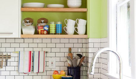
KITCHEN DESIGNSubway Tile Picks Up Gray Grout
Heading into darker territory, subway tile offers a graphic new look for kitchens, bathrooms and more
Full Story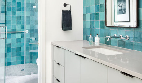
TILEPorcelain vs. Ceramic Tile: A Five-Scenario Showdown
Explore where and why one of these popular tile choices makes more sense than the other
Full Story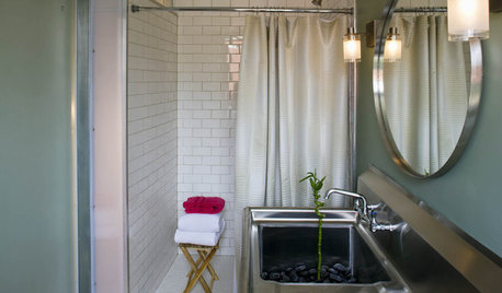
REMODELING GUIDESClassic Subway Tiles Go Uptown
Get a polished, high-end look from subway tiles old and new
Full Story
TILE5 Head-Turning Tile Styles for Backsplashes and More
If plain subway tile would derail your bold decorating vision, these dashing tiles can help you arrive at a brilliant solution
Full Story
KITCHEN DESIGNNew This Week: 4 Surprising Backsplash and Countertop Pairings
Make your kitchen workspace stand out with colored ceramic tile, back-painted glass, butcher block and more
Full Story
BATHROOM COLOR12 Gorgeous Black and White Bathrooms
Luxurious materials, vintage touches and thoughtful color splashes make these chic spaces worth borrowing ideas from
Full Story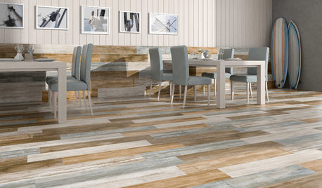
TILETop Tile Trends From the Coverings 2013 Show — the Wood Look
Get the beauty of wood while waving off potential splinters, rotting and long searches, thanks to eye-fooling ceramic and porcelain tiles
Full Story


Annie Deighnaugh