


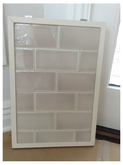
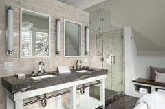
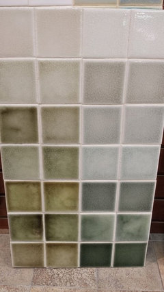
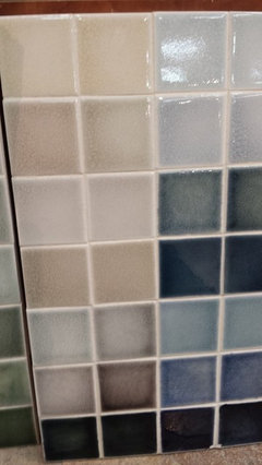
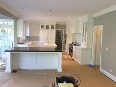
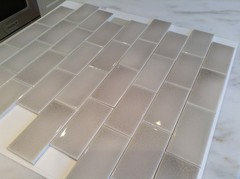
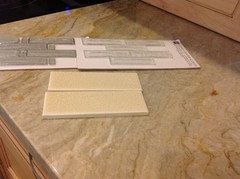
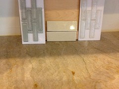
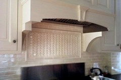
Backslash - Am I being unreasonable?
romy718
10 years ago
Featured Answer
Comments (66)

Vertise
10 years ago
ILoveRed
10 years agoRelated Professionals
Amherst Kitchen & Bathroom Designers · Fresno Kitchen & Bathroom Designers · Hillsboro Kitchen & Bathroom Designers · Ojus Kitchen & Bathroom Designers · Eagle Mountain Kitchen & Bathroom Remodelers · Avondale Kitchen & Bathroom Remodelers · Omaha Kitchen & Bathroom Remodelers · Billings Cabinets & Cabinetry · Land O Lakes Cabinets & Cabinetry · Plymouth Cabinets & Cabinetry · Prior Lake Cabinets & Cabinetry · Roanoke Cabinets & Cabinetry · Eastchester Tile and Stone Contractors · Farragut Tile and Stone Contractors · Oak Grove Design-Build Firms
romy718
10 years agoromy718
10 years agoromy718
10 years ago
rubyclaire
10 years agoromy718
10 years agoUser
10 years ago
msrose
10 years agoHammerMom
10 years agoVertise
10 years agoromy718
10 years agorubyclaire
10 years agojess1979
10 years agoILoveRed
10 years agodeedles
10 years agoVertise
10 years agoVertise
10 years agoromy718
10 years ago
GreenDesigns
10 years agoJbrig
10 years agonosoccermom
10 years agoILoveRed
10 years ago
Lisa
10 years agoromy718
10 years agojesshs
10 years agomlweaving_Marji
10 years agomichelle16
10 years ago
a2gemini
10 years agoromy718
10 years agomichelle16
10 years agowishiwasinoz
10 years agomarthastoo
10 years agoromy718
10 years agobookworm4321
10 years agorubyclaire
10 years agowishiwasinoz
10 years agosunsoleil
10 years agokam76
10 years agoromy718
10 years ago
Bunny
10 years agokksmama
10 years agobosma
10 years agobookworm4321
10 years agobookworm4321
10 years agoromy718
10 years agobookworm4321
10 years agoromy718
10 years ago
Kathy Spanski
9 years ago


Related Stories
MOST POPULARTrend Watch: 13 Kitchen Looks Expected to Be Big in 2015
3 designers share their thoughts on what looks, finishes and design elements will be on trend in the year ahead
Full Story
LIFE6 Tips for Teaching Your Kids to Be Good Neighbors
Everyone wins when your children learn to respect boundaries, get help when they need it and show others they care
Full Story
THE ART OF ARCHITECTUREDesign Practice: Why Saying No Can Be Good for Business
When talking with potential clients, ask yourself these questions to determine whether you should accept — or pass on — the job
Full Story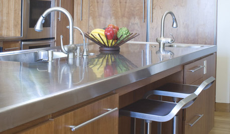
KITCHEN DESIGNDesign an Easy-Clean Kitchen
"You cook and I'll clean" might no longer be a fair trade with these ideas for low-maintenance kitchen countertops, cabinets and floors
Full Story
WORKING WITH PROS6 Reasons to Hire a Home Design Professional
Doing a construction project without an architect, a designer or a design-build pro can be a missed opportunity
Full Story
GREEN BUILDINGThe Passive House: What It Is and Why You Should Care
If you don’t understand passive design, you could be throwing money out the window
Full Story
SMALL HOMESCan You Live a Full Life in 220 Square Feet?
Adjusting mind-sets along with furniture may be the key to happiness for tiny-home dwellers
Full Story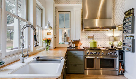
DECORATING GUIDES25 Design Trends Coming to Homes Near You in 2016
From black stainless steel appliances to outdoor fabrics used indoors, these design ideas will be gaining steam in the new year
Full Story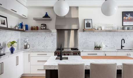
KITCHEN BACKSPLASHESWhy You Should Embrace a Solid Slab Backsplash
The effect is stunning, and yet the cost can be minimal. Here’s what to know about using full slabs of stone in your kitchen
Full Story
BATHROOM TILEBathroom Backsplashes Make a Style Statement
Be inspired to turn this small bathroom detail into a big design feature
Full StorySponsored
Columbus Area's Luxury Design Build Firm | 17x Best of Houzz Winner!
More Discussions


romy718Original Author