Shop Products
Houzz Logo Print
beekeeperswife_gw

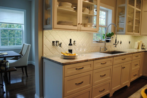
Need opinions on styling the kitchen for mag

beekeeperswife
11 years ago

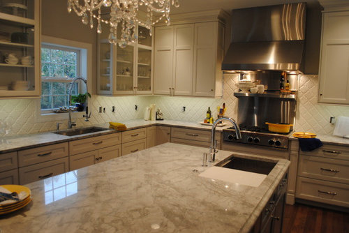
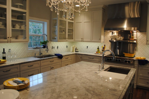
As some of you know the kitchen is being photographed on Tuesday for a regional magazine. I am in charge of the styling. The magazine comes out in January, so think "winter". I will have veggies on the island on a cutting board, loaves of bread in a big silver bowl/tray thing.

But here are the questions:

QUESTION 1:

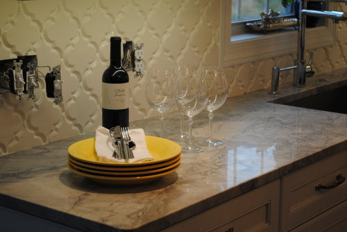
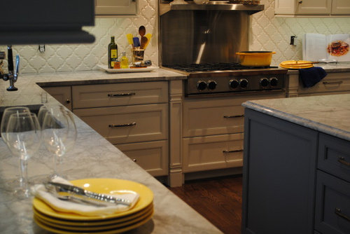
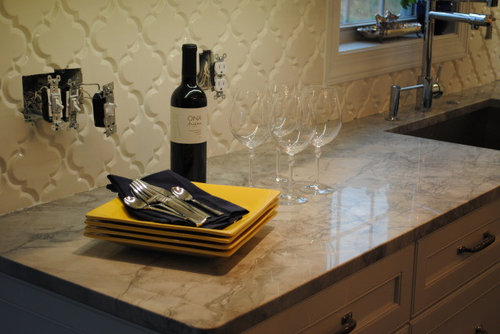
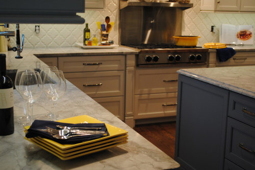
Dishes. Yellow or White? If yellow, round or square? Blue or white napkins?

white, yellow napkins

white dishes, blue napkins

round yellow

yellow with white napkins

square yellow with blue napkins

(you can vote for yellow square plate with white napkins, no photos)

QUESTION 2.

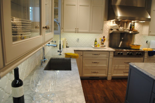
Next to sink under window... dishtowel. Yellow or Blue?

yes there a lot piled up, they are still packaged while auditioning.

QUESTION 3

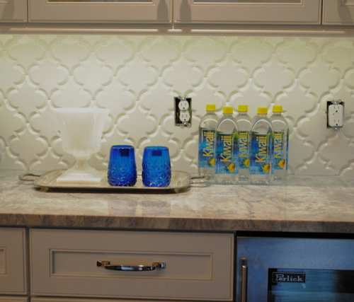
Which glasses with these waters? There will be 4, but I didn't unwrap all of them for the audition. The white thing will probably have lemons in it.

stemless:

with stem

Oh, here is a quick pic of what I'm thinking about the kitchen table. Not sure about the topiaries. Do they scream "fake"? I think I'd prefer a vase of white hydrangeas, or even blue there.

Comments (56)

  • fouramblues
    11 years ago
    last modified: 9 years ago

    Here are my votes:
    - white plates (can't decide between yellow and blue napkins)
    - blue sink cloth
    - stemless blue glasses
    - hydrangeas
    - blue water bottles, tynant brand or the like (even though you didn't ask)

  • localeater
    11 years ago
    last modified: 9 years ago

    Hmmm, I love the square yellow plates, because they pop colorwise as does the squareness, but I don't think I would use that color plate at a dinner party in January, it seems too, I don't know, beachy? You did say the theme was prepping for a dinner party in a previous post, right? Can you do something with the shade of yellow?
    I like the stemless, more chunky blue glasses, and the blue dishcloth near the sink.
    I do not care for the topiaries. Hydrangeas would be lovely, but January gets me starting to think about the earth. What about silver pots of forced narcissus or a longish tray of twisted blue-green eucalyptus with lemons, pinecones(or tuck some hydrangeas here) and chunky candles or if you want the height that the topiaries brought delicate tapers in tall silver holders.

  • writersblock (9b/10a)
    11 years ago
    last modified: 9 years ago

    The tall blue bottles at the back are better than the blue/yellow bottles, IMHO.

  • herbflavor
    11 years ago
    last modified: 9 years ago

    round white plates with yellow napkings/blue towels by sink/stems on glasses.

  • Debbi Branka
    11 years ago
    last modified: 9 years ago

    Same as ellendi's opinion:

    White plates, yellow napkins, no-stem blue glasses, blue hydrangeas on the table. While I like the yellow in the bottled water, the plastic cheapens the look. What are the tall blue glass bottles in back - it looks like there is some yellow in the label. Maybe that will work.

  • decorhippie25
    11 years ago
    last modified: 9 years ago

    I adore this style! I think you should definitely use the white, round dishes with the navy napkins. I also agree with the centerpieces. I would prefer white hydrangas, they are my absolute favorite. I cannot get enough of white in the winter, so I think you hit the nail on the head with this design scheme. What magazine is this for? I would love to pick up a copy.

    Here is a link that might be useful: White Wonderland

  • Bunny
    11 years ago
    last modified: 9 years ago

    I like the white plates (any shape) with yellow napkins. I know it's January, but by January I've had enough of winter and crave the sun, so the yellow is a welcome reminder.

    Do not care for topiaries anywhere, anytime. White hydrangeas are divine.

    Love the stemless glasses, but don't care for the plastic bottles.

  • michoumonster
    11 years ago
    last modified: 9 years ago

    how neat! my vote is for the stem glasses, white plates, yellow napkins.
    if you like yellow on your bottles, how about those orangina bottles? they are nicely shaped, though maybe not as elegant as water..

  • bumble_doodle
    11 years ago
    last modified: 9 years ago

    I live in New England so to me winter means cool colors - blue, gray, white, silver. Elegant. My vote: round white plates, blue napkins, stemless blue glass, blue water bottles (I prefer the taller bottles but either work), white hydrangeas.

    Save the yellow for Easter/daffodil season. :)

  • Lyban zone 4
    11 years ago
    last modified: 9 years ago

    Oh this is fun.
    Here are my choices:
    White plates
    Blue glasses without stems
    Tall blue bottles in back row
    I would go with blue tea towel and blue napkins but I am finding the ones in your photos look a little too navy dark with the cobalt blue of other items.
    Could you get a piece of fabric that matches the other blues and just fold into looking like a napkin for the shoot and also for the towel.
    I am not crazy about toparies but am also not sure of hydrangeas, even though my favorite flower I find too many in magazine shoots now. I will have to think about that one.

  • caminnc
    11 years ago
    last modified: 9 years ago

    Could you try round yellow plates topped with both blue and white napkins using three or four napkins then top with some silverware. I like the clear wine glasses. I like the blue glasses too but something looks a tinsy bit off. I also agree with what ellendi said about the yellow and blue water bottles not being elegant enough. I love white plates but I think for a photo shoot the yellow would be more interesting.

  • kaysd
    11 years ago
    last modified: 9 years ago

    I vote for white plates -- the yellow ones just look "off" to me, especially for a winter shoot. I do like the yellow napkins, but the blue also looks nice. I love the yellow pot! I prefer the tall blue water bottles and blue towels. Your kitchen really turned out great.

  • User
    11 years ago
    last modified: 9 years ago

    No water and no blue glasses. The shots from your last kitch were to highlight the tile, overall kitchen shots will not need a bunch of scenes. Stick to more natural items and less of a contrived set up and your kitchen will speak for itself, it is beautiful.

  • motherof3sons
    11 years ago
    last modified: 9 years ago

    I think the decision for the place setting is also dependent on the "virtual food" that will be prepared with the veggies on display. Are the veggies for a hearty stew? Steak? Appetizers?

    The solid yellow may be too overpowering. White can be paired with so much. Consider adding a print to the napkins - a blue and mustard print would be beautiful. Do you have a Hancock or Joann Fabrics close by? Get some "inexpensive" fabric and cut out some napkins. No one will ever know!

    I like the topiaries, but think the white hydrangeas would be beautiful. They also bring another dimension to the room because they are more free form.

    Congratulations on being selected for another magazine!

  • hsw_sc
    11 years ago
    last modified: 9 years ago

    I like the white plates, yellow napkins, blue towels, stemless glasses and maybe the Orangina bottle idea instead of more blue bottles. The yellow plates just seem a tad to jarring to me for some reason.

  • chicagoans
    11 years ago
    last modified: 9 years ago

    Exciting! I love how the yellow plates, yellow towel, and yellow Le Creuset pot all relate to each other, and I like the blue napkins. Like athomeinva, I'd skip the water bottles and glasses. Like the thought of fresh produce, especially anything that's locally grown or a local specialty.

    If you keep the glasses, I like the stemless because of the more vivid hue and the blue glass bottles, and I'd skip the white vase or goblet thing as it gets lost in front of the tiles.

    So pretty! Everything looks lovely.

  • beekeeperswife
    Original Author
    11 years ago
    last modified: 9 years ago

    Since that area where the bottles are now located is really a "beverage center" and this is a dinner party theme, how about a setup for a bar? That would look nice. The prep person could be having a glass of water though on the island whilst chopping the color coordinated veggies...

    I hope you are having fun with this. It's so...what's the word....not-as-important as grout selection! Lol!

    I am not buying any fabric. Sorry. Everything I bought is going BACK!!!! hah

    Love it!

    Bee

  • deedles
    11 years ago
    last modified: 9 years ago

    Can you work some bittersweet into the mix? It's so pretty.

  • deedles
    11 years ago
    last modified: 9 years ago

    And how about a giant blue bottle of Skyy vodka?

    :)

  • liriodendron
    11 years ago
    last modified: 9 years ago

    I think the color accents are scaled too small. They seem like "dots" in a sea of white and pales. Can you get some bigger splashes of color on the counters/island top/ glass cupboards or walls to tie in with the casserole, plates, spatulas, etc.?

    Your kitchen is gorgeous but needs a more generous dash of color for its "magazine styling" adventure.

    The space around the table needs something more- the room looks unfinished. Maybe a bigger centerpiece? The plants on the windowsill don't look right, too much of an after thought-looking. The yellow cloche felt hat reminds me of the 60's and looks too-coyly posed with purse and scarf.

    The use of brand-name products to add in colors is problematic and may run afoul of editorial policy - need to check.

    The design of the stove pic with the open yellow casserole and white turreen above on a shelf is unbalanced, colorwise. You have the tan/yellowish thingies on the same side as the casserole (which should have it's lid on for max visual impact).

    Can you borrow from friends or vendors some additional items to add to the scene (need to check w/editorial on this too, but it's common to loan stuff in return for credit)?

    At one time part of my job was styling TV sets for in-studio kitchen cooking productions and it took me awhile to learn to scale things up enough. Fewer large items are more powerful than more small accents. This is different than it looks in person, of course. Start with what looks a little too big, and then subtract (often ruthlessly) back to what seems a teensy bit much in person and you're just about right for pics.

    Blue and yellow are OK for January, and a welcome break from red and green and tinsel. If the issue is the Jan. one it may be on stands in December, though. You could ask what colors the editors are thinking of. January stories are often keyed for the refreshed, New Year's Resolution atmosphere around the start of the year and for wintery colors. Yellow is OK, though I think of it more for July, but combining it with cobalt blue (though I personally like that) may be a bit strong and primary-ish for January. How about yellow with fresh greens? Or yellow with stone colors, i.e certain slightly bluish greys? Or a paler scrambled egg yellow with creams and maybe a tomato red accent? Or an even milder yellow that can combine with other pales for a Scandinavian look? I'm not sure what color your cabs are besides white, in some pics they look blue?

    One other thing: the arabesques and the marble need to make a truce, and one or the other has to be allowed to dominate. Not that they aren't both very pretty and can play nice with each other. But right now they have sort of competitive visual weight -one has to take a step back in order to balance the picture. Use accessories to make one of them the (temporary) ruler of your kitchen's design.

    HTH

    L.

  • lala girl
    11 years ago
    last modified: 9 years ago

    Wow - the space looks gorgeous! I think liriodendron has the right idea to ask the editors what they are thinking about color-wise. I am not one for orchestrated "pops of color" - so I would lean more toward a white plates and chunky white napkins (or if the space had to include some specific colors I would go to Anthropologie for patterned linens).

    I agree with the others about the water bottles and I also agree that Perrier has been done to death - what about Fine from Japan or Antipodes Spring Water - not sure how hard they would be to find, but would be something different and a more neutral look. Definitely see a fresher and looser and more natural arrangement on the DR table. It is exciting your kitchen will be featured!

  • Specific ibex
    11 years ago
    last modified: 9 years ago

    I think Saratoga Spring water bottles would be perfect. They are a rich blue.

    I vote for the white plates. If you use yellow at all I think you should keep it to fabrics - the napkins, dishtowel, etc.

    Here is a link that might be useful: Saratoga Spring Water bottles

  • KBSpider
    11 years ago
    last modified: 9 years ago

    Okay, don't let any guilt over making me cry by not using the gray grout influence you at all when reading my choices... ;):

    - Yellow or white plates with blue napkins
    - Yellow dishtowel at sink
    - The two blue stemmed glasses on the windowsill with the plant in the middle
    - Stemless blue glasses on tray
    - No bottled water; to promote "green" environment, a nice shaped pitcher of water with lemon slices (and/or lime slices for splash of green?)
    - Or, as you mentioned, maybe small bar setup with interesting liquor bottles, a nice ice bucket and a few cocktail making tools
    - No topiary; perhaps the bittersweet sprigs (or whatever it's called that someone showed above) laid out on a runner or in a vase; they look pretty interesting...

  • nini804
    11 years ago
    last modified: 9 years ago

    In the November Southern Living Phoebe Howard has a little piece on setting up a lovely bar...check it out, I think that would be great for the beverage center. It basically involved getting a tray (silver, bamboo, wood) and arranging nice bottles and pretty glasses in a pleasing way.

    Your kitchen is simply lovely! And I actually love topiaries, but usually tend to go with really big ones. Would hydrangeas look off-season in January? I mean, I know you can get them at the florist whenever...but if you are going for that "plucked from the yard" look it would be off. For January I would use something like orchids. I don't know...obviously I know nothing about styling, I a m just speaking off the top of my head!

  • beekeeperswife
    Original Author
    11 years ago
    last modified: 9 years ago

    I might place the wine glasses & dishes stacked on the table instead of the counter and use that area for the dessert.

    The plants on the windowsill are just my orchids that aren't blooming, they weren't meant to be part of the photo. The shades will be completely gone. I asked and they said not to worry about window treatments. Has anyone noticed all the naked windows in magazines lately? I guess we have the view, so why not?

    I'm not committed to the tureen on the shelf, but I thought it was a welcome change to the usual collection of oils, etc., especially paired with the bowls.

    liriodendron, I'm not sure what you mean about the bs and the counters competing. I would have no idea how to fix what you are seeing. If you have any suggestions, please feel free to give them.

    deedles, those look too Autumnal for me. But I agree, they are pretty.

    KBSpider, hadn't thought about the water w/lemons. And isn't that stupid since I put that out for dinner parties?

    Again, the reason for the blue and yellow is this: Benjamin Moore just announced that their color of the year for 2013 is a yellow. And Pantone is expected to pick a dark blue. (How many blue velvet couches are we seeing lately?). Not that Central PA even has a clue about this sort of thing. It has also been suggested to me by a color expert that by January people are thinking about Spring, and doesn't yellow make you think a little about Spring? And besides all that, I love yellow with the gray.

    The white plates are a go. ... Which makes me happy because all my dishes ARE white. The yellow ones are wrapped and ready to go back. The topiaries are ready to go back too. Fresh hydrangeas are due in tomorrow, I checked and I'll be getting them and plumping them up.

    Here is the WSJ cover from yesterday. It made me chuckle:

  • lalithar
    11 years ago
    last modified: 9 years ago

    1. White dishes with yellow napkins.. Love the clean palate with a pop of soft color with yellow
    2. Blue dish towel or something with some texture or print showing .. like grossgrain stripes etc. Not the same yellow fabric as the napkins
    3. Stem glasses. The other ones are too blue. I would prefer plain water bottle with no labels.. kind of like


    4. Hate the topiary. I would vote for something architectural and ikebena-ish like gnarly pussy willow branches or something seasonal like forced bulbs of hyacinths or paperwhites.

  • peonybush
    11 years ago
    last modified: 9 years ago

    Just a thought....what do you think about grey cloth napkins on the white plates? The yellow seems a bit matchy-matchy. Catching a glimpse of the chandelier near the plates, I think it needs to be a bit more ahhhh and the yellow napkins seem kind of casual.

    For the bottles...have you seen the glass ones with the metal thingy on top?
    http://www.google.com/shopping/product/904677108019658463?client=safari&rls=en&q=glass+water+bottle+with+stopper&ie=UTF-8&oe=UTF-8&sa=X&ei=B_KBUPuZD8TiyAHOlIDwDA&ved=0CIYBEMwD

    Definitely yes on the hydrangeas.

  • angela12345
    11 years ago
    last modified: 9 years ago

    White dishes blue napkins
    Blue dishtowel
    Stemless glasses, lemons in the bowl, pitcher with lemon slices in it. Maybe water bottles also with it. I like the short darker blue bottles with the stemless glasses.

  • sixtyohno
    11 years ago
    last modified: 9 years ago

    I think the yellow pops too much. My eye jumps from yellow to yellow in the very calm and serene kitchen. Perhaps a pale yellow, or napkins with blue and yellow. I do love the blues and hydrangeas would be lovely.

  • allison0704
    11 years ago
    last modified: 9 years ago

    First, congratulations. But second, why does it need to be "staged?" In your pictures, all the color is on the counter. There isn't any color in the glass door cabinets, floor, etc. I don't care for the wine bottle and glasses (glasses disappear) or the bottled water. Looks to fake to me. I'd much rather see a kitchen that looks like someone lives there rather than staged... and I don't mean a messy kitchen. ;D Just one that looks "real" instead.

    Also, the colors are so strong that the eyes are drawn to them instead of the kitchen.

    You have the softness of the dining area, and at first glance I thought the topiaries were Photoshopped - so glad you aren't using them. I think blue hydrangeas would be beautiful.

    I'm not an interior designer, but I do have a good eye for this - I don't like to toot my own horn, but have been told this by many. I've taken several set design classes as well. Lastly, I agree with everything liriodendron said.

  • motherof3sons
    11 years ago
    last modified: 9 years ago

    Oh, I am all in for the blue vodka bottle! And, I have the most beautiful cobalt blue velvet coat that belonged to my mother in the 1950s/60s. She always looked smashing in her kitten pumps, gloves, cocktail dresses and that gorgeous coat.

    Bee - Go back to what YOU do when entertaining. We know you have a gorgeous home/kitchen and know style. Just be yourself!

  • carp123
    11 years ago
    last modified: 9 years ago

    looking great!!

    1. white round plates.
    2. white napkins.
    3. white dish towel with small yellow detail (stripes if you can find).
    4. stem glasses.
    5. definitely fresh flower arrangement on table-long and narrow. blue hydrangea would lovely.
    6. if you really love the yellow...then yellow tulips on your island.
    7. make sure your veggies have lots and lots off green showing.

  • liriodendron
    11 years ago
    last modified: 9 years ago

    The big white tureen looks out of scale to be placed so high on that shelf. It's got a bigger presence than the yellow casserole below it. Although I'm sure it's not going to fall off the shelf, it violates a principle of ascending height = descending size. (Ex.: the visual harmony of bookshelves with big books on lower or waist-high shelves, and smaller volumes on shelves that are closer together as you go up.)

    My suggestion to regulate the bs/counter tension is to reduce the visual strength of one or the other. The easiest way is by masking one or the other somewhat with stuff.

    Ex: diminish amount of bs curlicue-ishness by setting something in front of it, perhaps a tray leaning against it, or a small framed art piece or a KA mixer (borrow a yellow one?) or a set of warm yellow canisters, or a cookbook out on a stand or something else that can stand up in front of the big plane of tightly-regulated swirls in at least one area. Or....

    To mellow the counters' competing pattern of free-form swoops and eddies, something on the island that takes up some real estate and reduces the size of the area seen. A big, low, wooden trug of vegetables and fruit on the island might do this.

    This might also be done by changing the camera angle and so you see less of a view that combines the loose twirls with the harder-edged arabesques in such near-equal strengths.

    As I reread this what strikes me is that I am suggesting something vertical against the plane of the bs, or something horizontal on the counter top. In both cases (or in either case since I'm not sure you want to whack both of them down simultaneously) the point is to use accents to subordinate them. It's a matter of making them appear a little weaker by making them peek out around a visual interruption. Does that make sense? Think of the attraction of the tantalizing glimpse of a vista seen through a narrow window. Right now you've got two stars standing out on center stage in their full glory. Too much of a good thing in a picture (though likely not in real life) where the eye has no relief from the framing.

    I think your kitchen is really lovely, but for the purposes of photographing it I think you need to enlarge the visual strength of the accent color (more yellow in larger pieces, not more instances of small-scale yellow items) and to decide which of the two very strong architectural elements you want to focus on: bs or counter pattern. Only one of those should be the prima ballerina in a pic.

    You have wonderful taste and an excellent eye for kitchen beauty, otherwise I wouldn't risk saying something like this for fear you might think I was criticising your beautiful room. But photostyling is a whole 'nother thing and I hope you may find some bit of usefulness in my well-meant comments. I was so excited to buy a copy of your last kitchen's photospread. I stood right there in my supermarket and oggled the pictures along with the checkout ladies. (I think my personal stock went up with them since they probably couldn't imagine from my normal presentation that I had any connection to such elegance. I was likely standing there in my normal Carhardt-and-barn-boots get-up.)

    Really HTH,

    L.

  • debrak_2008
    11 years ago
    last modified: 9 years ago

    As sixtyohno said I think the yellow pops too much. I just can't get into the yellow for your kitchen. Real yellow flowers would be different.

    Also agree that some of the "color" should be bigger pieces.

    That being said I think you are doing a great job putting this together. Hope you are having fun with it.

  • CEFreeman
    11 years ago
    last modified: 9 years ago

    I agree.
    The yellow isn't anywhere else in the kitchen other than on the counters. The blue and white accessories look gorgeous and tie into your island. It looks very cool and elegant. That picture caused my emotion to quickly relax. I actually noticed, although I was just casually glancing.

    Yellow lemons would be enough for me. Some of the other accents are too primary, too OH! there's more yellow. Makes my eye jump.

    Scale is a big deal and if you're doing yellow, take some of those things you've got wrapped to go back and put them in your lovely glass cabinets.

    Glad the topiary are going. Fake plants don't do it for me. Have you considered some real rosemary plants found often that time of year?

    How very fun for you. You do such beautiful work!

  • AnnaA
    11 years ago
    last modified: 9 years ago

    This is fun visualizing everyone's ideas. Thank you beekeeperswife for inviting us to play.

    I love the soft blues to grey with white of your kitchen. And I like the images conjured by those suggesting a play with those colors in honor of winter. The yellow gives me images of the hot of summer.

    Winter speaks of art made of wooden vines - the varying browns, with pops of red berries, the winter birds that often mimick the colors of bark, with tufts of white. The color pops might be wooden bowls? A spray of vines? Napkin rings in these color elements, I.e., silver or pewter, w/ wood tones?

    I'm having fun imagining.
    Thanks Bee

  • taggie
    11 years ago
    last modified: 9 years ago

    Looks like I'm in the minority but I like the round yellow dishes with black napkins by FAR the best. Blue dishtowel. Blue stemless glasses with the blue/yellow water bottles.

    And the black topiaries look nice. Thumbs up from me. :)

  • Bunny
    11 years ago
    last modified: 9 years ago

    As someone else said, after Christmas I need something other than red and green. In fact, after Christmas, I have no further use for winter. All the January magazines are thin after the holiday binges. I'm thinking, please tell me spring will show up. A bit of yellow, or a lot, in January is just what the doctor ordered, so I don't slash my wrists from acute SADD. :)

  • marthavila
    11 years ago
    last modified: 9 years ago

    Great kitchen, Bee! (Although, given your record, I would expect nothing less) :-)

    As for general ideas, I would ditto just about everything Liriodendron has said. I find her advice, based on real life staging experience, to be simply awesome! About the only place I guess I would depart from her comments is on the use of color. That is, I'm tending to agree with those who think that yellow is just the wrong color to bring in as an accent for this kitchen. Sorry, Bee. You've made it clear that you really want to use yellow. However, given all the other material/choices you've already made in this rather elegant kitchen, it's the introduction of the "country yellow" that looks a tad out of place to me. Therefore, my vote would be to jettison the yellow altogether and replace it with blues, whites, grays suggested by AnnaA, or even blacks. I would then style "up" for the dinner party with use of silver serving bowls and trays, crystal, etc. Then introduce one or two truly dramatic pops of color by way of a standing floral arrangement or spray, framed artwork, etc. (BTW, and as I'm sure you know, this advice on color comes from an avowed color junkie whose own white/red/yellow kitchen is hardly color conservative) lol

    Whatever you decide, though, I know it will be a knockout and I can't wait to see the final, published spread, Bee. You go!

  • amck2
    11 years ago
    last modified: 9 years ago

    I read all the posts before commenting and the last one, marthavila's, sums up everything I was thinking. I kept wanting to love the yellow but I just couldn't, especially in the context of the season.

    What a beautiful kitchen and dining area! Thanks for sharing and inviting our suggestions.

  • mtnrdredux_gw
    11 years ago
    last modified: 9 years ago

    Sorry I don't have time to read others' replies.

    I don't think yellow is the right color for your space. Weren't you using orange? I know it's over done to those of us who are into this stuff, but take a look at the regional mag you are talking about. I bet you most of the kitchens in the area are still wood cabs and granite. If you show them greys with pops of orange, I bet they will be novel to most.

    I think you should try to use the colors you personally found pleasing in the space, which would also go with my favorite water bottle.

    I also am not likeing square plates with your kitchen. I would like a classic simple white plate with some nice linens (eg dwell, or playing up the Moroccan thing)

    It might also help to know what the writer's spin is on your kitchen, eg how he or she plans to describe it.

    I would also keep a few options so you can see how it looks when they have their lighting and take a few test shots; these photos arent indicative.

    Lastly, Whatever you do you need to do it very big. A bigger bowl of lemons. And oversized centerpiece. And I would be inspired by flowers, fruits, and veggies. They should take center stage.

  • beekeeperswife
    Original Author
    11 years ago
    last modified: 9 years ago

    To the yellow haters: What about the yellow pot? Should it go? I've got blue (as seen in other photos), there's a dark green one in the stable, and also an orange one. I could do stainless, but is that just too cold?

    I can happily ditch the tureen on the shelf. Should I use it on the counter somewhere?

    I have no new pics, but I did try a gray napkin and my silver bee napkin rings. Fabulous. I also just happened to be wandering through the Target and found some retro inspired glassware. The wine glasses have silver and black bands running around them. I'll get you a picture soon.

    I also did a little glitzy bar set-up instead of the waters. Looks nice.

    I did get my white hydrangeas, they are hydrating and plumping up.

    I'm not too worried about the island. I do have a plan involving a chunky cutting board and lots of pretty veggies. I also have a silver oval shaped bowl that is about 2+ feet long that I'll fill with breads.

    Maybe there will be no color theme, but I can keep the blue towels (and of course I already had the white/blue ones that didn't make the audition footage but they do look nice. I'll post photos later.) Currently the kitchen is in a state of chaos. My dh is putting the outlets back together, and going to caulk. He cleaned all the tile for me, as you may or may not know my right hand didn't fare too well during the grouting procedure. :(

    I will try to snap some photos so we can discuss. Maybe not until Sunday night or Monday am.

    And I know some of you want me to put some of the colored stuff in the glass cabinets. I can't. I know, that's crazy. But it visually disturbs me. I tried with some orange things. I like the calmness of the white/clear/silver.

    (crazy lady)

    Thanks for all the feedback I'm trying to figure this out.

  • lolauren
    11 years ago
    last modified: 9 years ago

    I haven't commented, because I didn't like any of the yellow. Since you're asking, I wouldn't keep any of the yellow at all. It looks too staged and obvious. It also looks fiesta, tuscan, etc.... which is NOT what your kitchen is.

    I think anything you accessorize with should be muted and elegant. It will then match your kitchen's style and not be obvious. I'd probably go with cool toned colors.

    Is your island blue or a dark grey? It looks blue on my monitor, but I'm guessing it is not... I think blue tones would coordinate well with your greys, either way.

  • chris11895
    11 years ago
    last modified: 9 years ago

    I haven't read all of the comments but am glad you're not doing yellow. I have Le Creuset in the color Caribbean. Have you seen that in person before? In the link below it's the color chip in the middle that's greenish blue. I like that it's not a flat color and also has gray tones in it. It could look nice in your kitchen too!

    Here is a link that might be useful: Le Creuset

  • smiling
    11 years ago
    last modified: 9 years ago

    Maybe the tureen on the DR table nestled with the hydrangeas?

  • a2gemini
    11 years ago
    last modified: 9 years ago

    On the computer vs. iphone - this is so exciting!
    I can't wait to see your next set of pictures.

    I am fine with the pot on the stove.

    I vote to ditch the water bottles unless they are glass. Maybe just a nice decorative pitcher instead.

  • kateskouros
    11 years ago
    last modified: 9 years ago

    I can't wait to see, and the BS turned out great. I have to say though, i really find the yellow a little harsh. Your kitchen is more elegant ...the same goes for the blue. I would prefer to see more organic color, rather than the pops of bright -almost "plastic" color.

    Whatever you choose i'm sure will be great, though. The photographers they use are pretty good stylists in their own right. They'll move things around or delete objects depending on how they set up the shots. GL!

  • AboutToGetDusty
    11 years ago
    last modified: 9 years ago

    I agree with some other posters - too much bright yellow. It may be the new "it" color, but it's not elegant enough for your soothing beauty of a kitchen. If you use a brand name water bottle, it will look like an ad for the company. Do you have any antique stores nearby that you could grab some cool old milk bottles? Not sure if they're too big though? Or what about oil and vinegar in glass cruets? Love hydrangea - my favorite! I found this cool vase at Target on clearance two weeks ago. DH brought home these gorgeous white tall hydrangea. They're starting to droop after 10 days (wow!) but they still look pretty. Cousin brought me the other vase (it's from West Elm) and stuck lemons in them (speaking of yellow!) Can't wait to see the final pictures - your kitchen already looks gorgeous!

  • rosie
    11 years ago
    last modified: 9 years ago

    If only someone wanted to show my kitchen. But then I don't have to freak either. :)

    I agree with Liriodendron and all who agreed with her in general. Also Mtnrdredux and the "bittersweet" person.

    I love yellow with blue; but if you use it, for winter maybe a less summer-picnic version--rather a richer, more sophisticated blend, adding some of the bleached-out color you might see outside, even a little muted orange to round it out? Ir does seem that people's tastes in color tend to change in winter to reflect the season, more subtle, even mysterious.

    My other thought was hydrangeas? No. They're summer flowers and I'm afraid would strike a rather odd note in a winter magazine. If flowers at all, either winter bloomers, including forced bulbs, or harking forward to very early spring bloom. Branches of early flowering shrubs and trees forced into bloom work well because people expect them to be exquisitely austere on their own, without accompanying lush green foliage (very unlike hydrangeas).

  • Cavimum
    11 years ago
    last modified: 9 years ago

    JMO, be careful with yellow. It draws the eye right to it. That is one of the characteristics about yellow. I found I was looking at the caps of the water bottles, and not the elements around them.

    The stronger the yellow, like the 'chrome' yellow in the photos, makes my eye go right to that item. I can tell you what the hat and plaid satchel handbag look like, but I cannot tell you much about the furniture or the architectural details of the window. So, what I guess I am trying to say is that the yellow will become the focus of any photo, instead of an accent. One has to be very careful with yellows, no matter what the media and WSJ have to say. ;-) The pale, softer yellows do not dominate as much.

    The funny thing about color is that it often takes on a life of its own in photographs. It shows us things the naked eye does not see, IMHO. I have a quilt I made that I absolutely adore, but the solid red (fabric) patches in it literally jump off any photograph of that quilt. Yikes.

    P.S. I agree with the other suggestions to try something besides the topiaries. They are okay, but the forced bulbs would be more seasonal and lovely.