


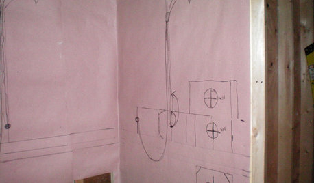
ABB, lots of pics & amateur mockups, please help me decide!
homebuyer23
10 years ago


Sort by:Oldest
Comments (90)
Related Stories

REMODELING GUIDESMust-See Mock-ups for Your Remodel
Avoid 'oops' and 'oh, no' with real-life tryouts of any design elements in question
Full Story
GARDENING GUIDESGreat Design Plant: Silphium Perfoliatum Pleases Wildlife
Cup plant provides structure, cover, food and water to help attract and sustain wildlife in the eastern North American garden
Full Story
SELLING YOUR HOUSEHelp for Selling Your Home Faster — and Maybe for More
Prep your home properly before you put it on the market. Learn what tasks are worth the money and the best pros for the jobs
Full Story
ORGANIZING4 Questions to Help You Organize Your Favorite Photos
Organize your keeper photos with a system that's just right for you, whether it's in the cloud or you can hold it in your hand
Full Story
SUMMER GARDENINGHouzz Call: Please Show Us Your Summer Garden!
Share pictures of your home and yard this summer — we’d love to feature them in an upcoming story
Full Story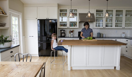
ORGANIZINGDo It for the Kids! A Few Routines Help a Home Run More Smoothly
Not a Naturally Organized person? These tips can help you tackle the onslaught of papers, meals, laundry — and even help you find your keys
Full Story
LIFEDecluttering — How to Get the Help You Need
Don't worry if you can't shed stuff and organize alone; help is at your disposal
Full Story
DECLUTTERINGDownsizing Help: Choosing What Furniture to Leave Behind
What to take, what to buy, how to make your favorite furniture fit ... get some answers from a homeowner who scaled way down
Full Story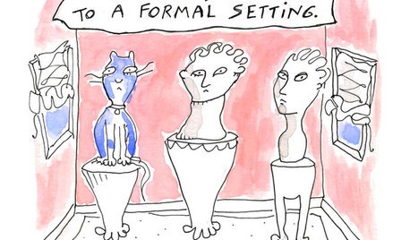
MOST POPULAR7 Ways Cats Help You Decorate
Furry felines add to our decor in so many ways. These just scratch the surface
Full StoryMore Discussions


jess1979
homebuyer23Original Author
Related Professionals
Baltimore Kitchen & Bathroom Designers · Ramsey Kitchen & Bathroom Designers · Schenectady Kitchen & Bathroom Designers · Vineyard Kitchen & Bathroom Designers · Citrus Park Kitchen & Bathroom Remodelers · Athens Kitchen & Bathroom Remodelers · Chicago Ridge Kitchen & Bathroom Remodelers · Durham Kitchen & Bathroom Remodelers · Walnut Creek Kitchen & Bathroom Remodelers · Beaumont Cabinets & Cabinetry · Parsippany Cabinets & Cabinetry · Tacoma Cabinets & Cabinetry · Watauga Cabinets & Cabinetry · Whitehall Cabinets & Cabinetry · Bloomingdale Design-Build Firmshomebuyer23Original Author
homebuyer23Original Author
Bunny
Gracie
Vertise
homebuyer23Original Author
mpagmom (SW Ohio)
Bunny
mpagmom (SW Ohio)
cawaps
romy718
amykath
mpagmom (SW Ohio)
homebuyer23Original Author
homebuyer23Original Author
enduring
Gracie
Gracie
mpagmom (SW Ohio)
mae.nov
blackchamois
blackchamois
Vertise
writersblock (9b/10a)
romy718
romy718
romy718
romy718
romy718
romy718
romy718
homebuyer23Original Author
homebuyer23Original Author
homebuyer23Original Author
enduring
homebuyer23Original Author
enduring
homebuyer23Original Author
enduring
PugetSoundjj
homebuyer23Original Author
romy718
bicyclegirl1
mpagmom (SW Ohio)
marthastoo
blackchamois
herbflavor
homebuyer23Original Author