


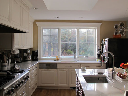
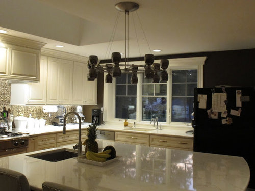
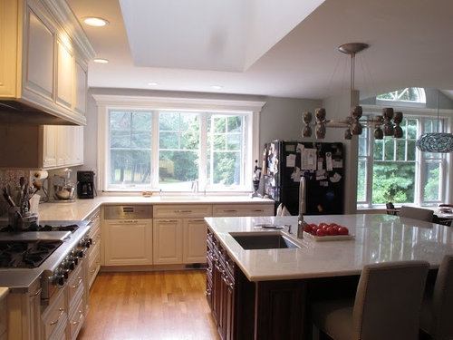
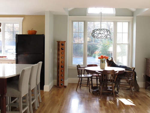
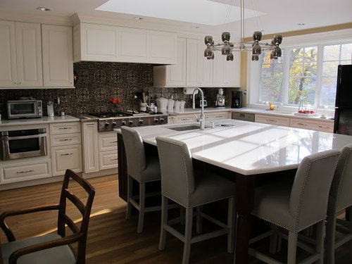
Paint color, tile, trim to go with bold tile and white cabinets
oldbat2be
11 years ago

Sort by:Oldest
Comments (19)
Related Stories
COLOR5 Ways to Go Bold With (Almost) All White
Take away color to gain focus on textures and interesting details and create a purely relaxing mood
Full Story
DECORATING GUIDESGo Bold (and Green) with Eco-Friendly Carpet Tiles
Get Ideas For Your Own Recyclable Rug Made of Colorful Carpet Squares
Full Story
COLORGoing Bold With Just Enough Color
Using color with restraint inside and outside can be far more effective than a less subtle approach
Full Story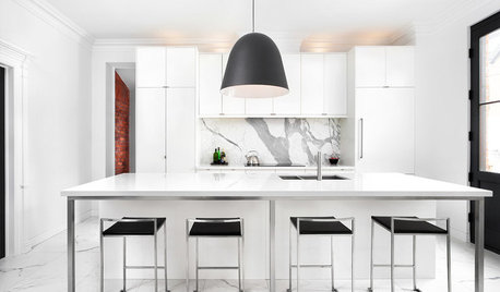
KITCHEN DESIGNKitchen Confidential: Go Bold on a Budget
Discover 5 ways this black and white beauty broke the mold but not the bank
Full Story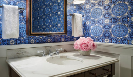
BATHROOM DESIGNYes, You Can Go Bold With Wallpaper in a Powder Room
The smallest room in the house can make the biggest design impact. Here are 10 of our favorite papered powder rooms
Full Story
BATHROOM DESIGNHex Tiles: Big and Bold in the Bath
Six-sided tiles are huge now and popping up in increasingly creative bathroom installations. What will designers do with them next?
Full Story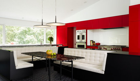
COLORFUL KITCHENSKitchen of the Week: Bold Color-Blocking and a Central Banquette
Glossy red cabinets contrast with black surfaces and white seating in this cooking-dining space designed for entertaining
Full Story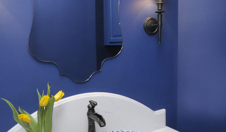
BATHROOM DESIGN8 Bold Paint Colors for Your Powder Room
Turn your powder room into a exclamation point with a bold shot of red, raspberry, hyacinth, rich brown or stormy blue
Full Story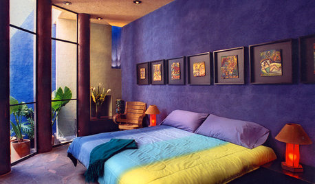
BLUEHead Into Bold Southwest Color Country
Break free from the land of blah with vivid paints and tiles that bring the look of Southwest mountains, gems and sky to your home
Full Story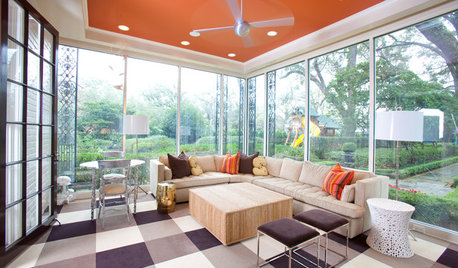
MOST POPULARHeads-Up Hues: 10 Bold Ceiling Colors
Visually raise or lower a ceiling, or just add an eyeful of interest, with paint from splashy to soothing
Full Story

ellendi
onedogedie
Related Professionals
Beavercreek Kitchen & Bathroom Designers · El Dorado Hills Kitchen & Bathroom Designers · Hillsboro Kitchen & Bathroom Designers · Piedmont Kitchen & Bathroom Designers · Springfield Kitchen & Bathroom Designers · Channahon Kitchen & Bathroom Remodelers · Panama City Kitchen & Bathroom Remodelers · Sicklerville Kitchen & Bathroom Remodelers · Upper Saint Clair Kitchen & Bathroom Remodelers · Lockport Cabinets & Cabinetry · Ardmore Tile and Stone Contractors · Channahon Tile and Stone Contractors · Chattanooga Tile and Stone Contractors · La Canada Flintridge Tile and Stone Contractors · Rancho Cordova Tile and Stone Contractorsoldbat2beOriginal Author
enduring
beekeeperswife
likewhatyoudo
springroz
function_first
cawaps
angel411
phiwwy
localeater
oldbat2beOriginal Author
a2gemini
dretutz
colorfast
michoumonster
oldbat2beOriginal Author
a2gemini