


Grey counters and SS appliances
tony_james
11 years ago
Sort by:Oldest
Comments (7)
Related Stories
GRAYColor Guide: How to Work With Light Gray
The hottest new neutral can be cool or warm, formal or casual, and feminine or masculine. Talk about versatile
Full StoryBEFORE AND AFTERSGray Cabinets Update a Texas Kitchen
Julie Shannon spent 3 years planning her kitchen update, choosing a gray palette and finding the materials for a transitional style
Full Story
KITCHEN COUNTERTOPSElephants of the Kitchen? What to Know About Concrete Counters
Concrete countertops are beautiful, heavy and cool — and have their own peculiarities. And a lot in common with certain gray pachyderms
Full Story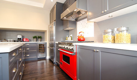
COLORCooking With Color: When to Use Gray in the Kitchen
Try out Trout or shake up some Martini Shaker gray for a neutral-based kitchen that whispers of sophistication
Full Story
DECORATING GUIDESColor of the Week: Decorating With Warm Gray
Tired of tan? Getting gloomy from cool gray? Make warm gray your new go-to neutral
Full Story
DINING ROOMSColor Feast: When to Use Gray in the Dining Room
The right shade of gray pairs nicely with whites and woods to serve up elegance and sophistication
Full Story
DECORATING GUIDESColor Guide: How to Work With Charcoal Gray
The most modern neutral, charcoal gray looks great in dining rooms, living rooms and even nurseries. Here's how to use it best
Full Story
COLOR10 Pretty Ways to Refresh a Gray Palette
Energize your favorite gray shades with pick-me-up accents as fresh as a spring day
Full Story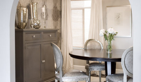
GRAYChoosing Color: Give Me More Gray Days
Layer On the Grays for a Sophisticated Look in Any Room
Full Story
GRAYChoosing Paint: How To Pick the Right Gray
Which Version of Today's 'It' Neutral Is For You?
Full Story


eam44
tony_jamesOriginal Author
Related Professionals
Carson Kitchen & Bathroom Designers · La Verne Kitchen & Bathroom Designers · Ridgefield Kitchen & Bathroom Designers · Roselle Kitchen & Bathroom Designers · South Farmingdale Kitchen & Bathroom Designers · South Farmingdale Kitchen & Bathroom Designers · Bay Shore Kitchen & Bathroom Remodelers · Athens Kitchen & Bathroom Remodelers · Spokane Kitchen & Bathroom Remodelers · Tulsa Kitchen & Bathroom Remodelers · Turlock Kitchen & Bathroom Remodelers · White Oak Cabinets & Cabinetry · Wyckoff Cabinets & Cabinetry · Eastchester Tile and Stone Contractors · Bloomingdale Design-Build Firmstony_jamesOriginal Author
cawaps
tony_jamesOriginal Author
eam44
tony_jamesOriginal Author