


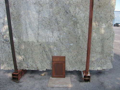
This is the Artus that came in today and also posting Giallo
Sarina
10 years ago
Sort by:Oldest
Comments (28)
Related Stories
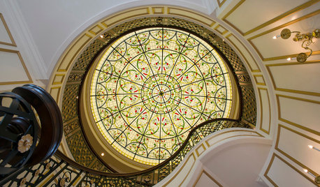
WINDOWSFlying Colors: Stained Glass Through the Ages to Today
Ancient palaces sported it. Monks were distracted by it. But today's stained glass designs may be more glorious than ever
Full Story
DECORATING GUIDESTaupe: A Sophisticated Backdrop for Today
See Why Versatile, Stylish 'Greige' Continues to Warm Our Walls
Full Story
DECLUTTERING10 Types of Clutter to Toss Today
Clear the decks and give the heave-ho to these unneeded items
Full Story
DECORATING GUIDES1970s Style Finds Groove Today
The bright colors and unmistakable patterns of the '70s are swinging back into homes, but with modern flair for today's interior designs
Full Story
DECORATING GUIDESPaper Chase: Wallpaper Through the Ages to Today
Get on a decorating roll with a wall covering that's been around for centuries but comes in more exciting designs than ever
Full Story
BATHROOM DESIGN15 Elements of Today's Vintage-Inspired Baths
See How to Design a Classic Bathroom That Never Goes Out of Style
Full Story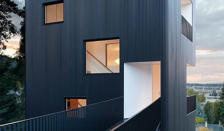
ARCHITECTURE6 Tower Houses Rise to the Tastes of Today
No medieval turrets here, just materials like sleek metal and glass — and, of course, spectacular views
Full Story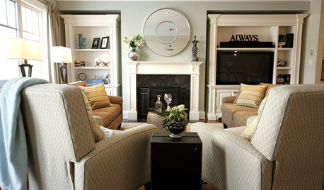
FURNITUREToday's Recliners Let You Kick Back in Style
Give your design a leg up with comfy recliners that look great, too
Full Story
GREEN BUILDINGChampioning the Solar House, From the 1930s to Today
Homes throughout history that have used the sun offer ideas for net-zero and passive homes of the present, in a new book by Anthony Denzer
Full Story
GREEN BUILDINGGreen Grows Up: The Many Faces of Today's LEED Homes
While LEED-certified homes have some common characteristics, the rest is up to your imagination
Full StoryMore Discussions


SarinaOriginal Author
SarinaOriginal Author
Related Professionals
Beavercreek Kitchen & Bathroom Designers · New Castle Kitchen & Bathroom Designers · Queen Creek Kitchen & Bathroom Designers · St. Louis Kitchen & Bathroom Designers · Fairland Kitchen & Bathroom Remodelers · Overland Park Kitchen & Bathroom Remodelers · Phoenix Kitchen & Bathroom Remodelers · Superior Kitchen & Bathroom Remodelers · Warren Kitchen & Bathroom Remodelers · Sharonville Kitchen & Bathroom Remodelers · Casas Adobes Cabinets & Cabinetry · North Massapequa Cabinets & Cabinetry · Prospect Heights Cabinets & Cabinetry · Radnor Cabinets & Cabinetry · Santa Rosa Tile and Stone Contractorsbookworm4321
rantontoo
herbflavor
SarinaOriginal Author
SarinaOriginal Author
natebear zone 10B
SarinaOriginal Author
herbflavor
Caya26
Gracie
SarinaOriginal Author
amykath
kksmama
CallMeJane
RoRo67
Gracie
Frazestart
likewhatyoudo
SarinaOriginal Author
mark_rachel
rkb21
kylady7
SarinaOriginal Author
SarinaOriginal Author
ginny20
SarinaOriginal Author