


Trendy Discussion, Trois.
palimpsest
12 years ago


Sort by:Oldest
Comments (87)
Related Stories
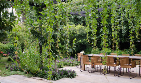
LANDSCAPE DESIGNGarden Designer Chooses the Timeless Over the Trendy
This lush and restful garden provides a place for a family to retreat from their busy lives
Full Story
EVENTSExplore L.A.’s Creative Side at Los Angeles Design Festival 2015
L.A.’s flourishing design scene is being celebrated during more than two weeks of events starting May 28
Full Story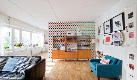
HOUZZ TOURSHouzz Tour: Sweetness and Light in a Swedish Family Home
Generous doses of white make a bright background for energetic wallpaper patterns, splashes of bright color and playful accessories
Full Story
DECORATING GUIDES5 Decor Trends to Try — and 5 to Rethink
Some style trends are worth jumping onboard. Others you may want to let fade from your memory
Full Story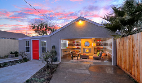
MORE ROOMSBehind a Garage Door, a Family Fun Room
Designer Kerrie Kelly's secrets to this low-budget garage makeover: a soothing palette, horizontal stripes and dashes of color
Full Story
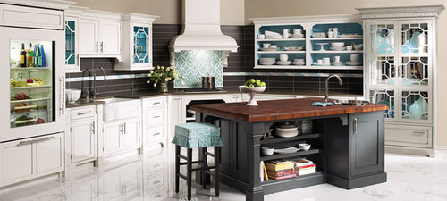
HOMES AROUND THE WORLDThe Kitchen of Tomorrow Is Already Here
A new Houzz survey reveals global kitchen trends with staying power
Full Story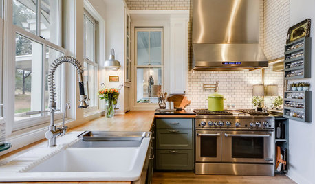
DECORATING GUIDES25 Design Trends Coming to Homes Near You in 2016
From black stainless steel appliances to outdoor fabrics used indoors, these design ideas will be gaining steam in the new year
Full Story
FUN HOUZZ10 Things People Really Don’t Want in Their Homes
No love lost over fluorescent lights? No shocker there. But some of these other hated items may surprise you
Full Story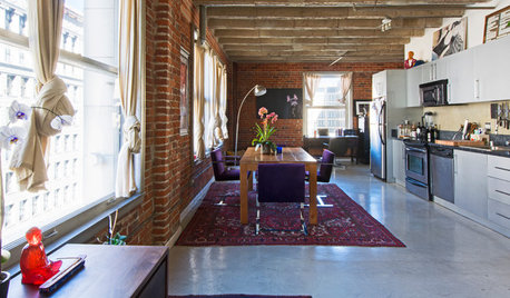
LOFTSHouzz TV: Love and Loft Life in Downtown L.A.
Skyscraper views, exposed brick and the buzz of city life create a rich environment for a creative couple and their French bulldog, Oliver
Full StorySponsored
Columbus Area's Luxury Design Build Firm | 17x Best of Houzz Winner!
More Discussions


plllog
chicagoans
Related Professionals
Arlington Kitchen & Bathroom Designers · Henderson Kitchen & Bathroom Designers · Midvale Kitchen & Bathroom Designers · Southbridge Kitchen & Bathroom Designers · Sun City Kitchen & Bathroom Designers · Athens Kitchen & Bathroom Remodelers · Fair Oaks Kitchen & Bathroom Remodelers · Hickory Kitchen & Bathroom Remodelers · Niles Kitchen & Bathroom Remodelers · Oxon Hill Kitchen & Bathroom Remodelers · Spokane Kitchen & Bathroom Remodelers · Land O Lakes Cabinets & Cabinetry · Oakland Park Cabinets & Cabinetry · Wadsworth Cabinets & Cabinetry · Green Valley Tile and Stone Contractorsmarcolo
palimpsestOriginal Author
writersblock (9b/10a)
marcolo
gregincal
harrimann
mtnrdredux_gw
mtnrdredux_gw
palimpsestOriginal Author
lavender_lass
plllog
palimpsestOriginal Author
plllog
harrimann
blfenton
cawaps
plllog
palimpsestOriginal Author
palimpsestOriginal Author
juliekcmo
Circus Peanut
gregincal
palimpsestOriginal Author
cawaps
blfenton
kitchendetective
palimpsestOriginal Author
lavender_lass
plllog
sallysue_2010
palimpsestOriginal Author
nancybee_2010
kitchendetective
plllog
palimpsestOriginal Author
plllog
kitchendetective
plllog
palimpsestOriginal Author
uroboros5
kimiko232
plllog
palimpsestOriginal Author
sallysue_2010
plllog
palimpsestOriginal Author
plllog
palimpsestOriginal Author