


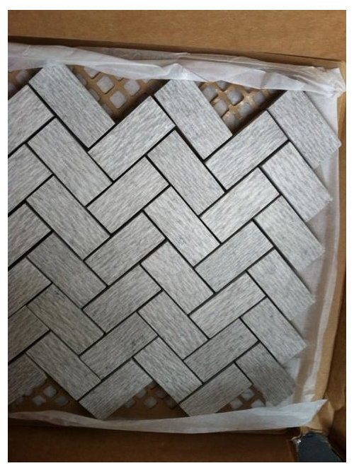
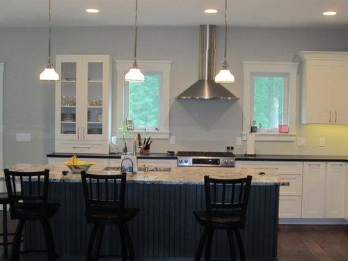
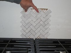
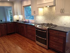
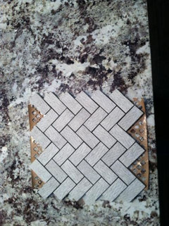
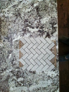
More than ABB Kitchen - textured herringbone tile work for this s
autumn.4
9 years ago


Featured Answer
Sort by:Oldest
Comments (30)

Lisa
9 years ago
sjhockeyfan325
9 years agoRelated Professionals
Corcoran Kitchen & Bathroom Designers · Rancho Mirage Kitchen & Bathroom Designers · North Druid Hills Kitchen & Bathroom Remodelers · Gilbert Kitchen & Bathroom Remodelers · Glen Carbon Kitchen & Bathroom Remodelers · Omaha Kitchen & Bathroom Remodelers · Saint Augustine Kitchen & Bathroom Remodelers · Vienna Kitchen & Bathroom Remodelers · Winchester Kitchen & Bathroom Remodelers · North Chicago Kitchen & Bathroom Remodelers · Brea Cabinets & Cabinetry · Richardson Cabinets & Cabinetry · Sunrise Manor Cabinets & Cabinetry · Brookline Tile and Stone Contractors · Rancho Mirage Tile and Stone Contractors
autumn.4
9 years ago
a2gemini
9 years agoLisa
9 years agoautumn.4
9 years agoLisa
9 years agorightdi_gw
9 years agojdez
9 years agoautumn.4
9 years agojess1979
9 years ago
ainelane
9 years ago
Gracie
9 years agokcorn
9 years agoautumn.4
9 years ago
gr8daygw
9 years agoGracie
9 years agoautumn.4
9 years agoGracie
9 years agoautumn.4
9 years ago
romy718
9 years agoGracie
9 years agokcorn
9 years agoautumn.4
9 years agoautumn.4
9 years agokksmama
9 years agokcorn
9 years agoautumn.4
9 years ago
susanlynn2012
9 years ago


Related Stories
KITCHEN DESIGNRelocated Colonial Kitchen More Than Doubles in Size
Putting the kitchen in a central location allows for a big boost in square footage and helps better connect it with other living spaces
Full Story
COLORWhy You Should Paint Your Walls More Than One Color
Using multiple colors can define zones, highlight features or just add that special something
Full Story
DIY PROJECTSDIY Backsplash Makeover: Get a New Tile Look for Less Than $50
Give old tile a painted faux-stone facade for a brand-new look at a superaffordable price
Full Story
TILE5 Head-Turning Tile Styles for Backsplashes and More
If plain subway tile would derail your bold decorating vision, these dashing tiles can help you arrive at a brilliant solution
Full Story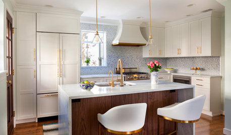
KITCHEN DESIGNCouple Renovates to Spend More Time in the Kitchen
Artistic mosaic tile, custom cabinetry and a thoughtful layout make the most of this modest-size room
Full Story
HOMES AROUND THE WORLDHouzz Tour: When Two Houses Are Better Than One
Subdividing a Melbourne backyard opens up space to build a second home on this family's property
Full Story
BUDGET DECORATING9 Tricks to Boost Your Home’s Appeal for Less Than $400
Whether you’re redecorating or just doing a quick update, check out these ways to enhance your home on a budget
Full Story
REMODELING GUIDESHerringbone-Patterned Firebrick Takes Style to Hearth
Fireplaces cross over into craftsmanship territory when the brick inside is laid in this graphic pattern
Full Story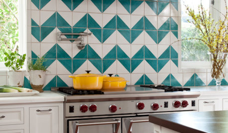
DECORATING GUIDESChevron, Herringbone, Flame Stitch: What’s the Difference?
Make the right point by learning the differences among these 3 popular zigzag patterns
Full Story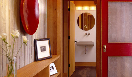
REMODELING GUIDES10 Tile Patterns to Showcase Your Floor
There's more to a tile floor than the tile itself; how you lay out your tile can change the look and feel of the room
Full Story

Mags438