


Messed up backsplash...re-doing it! Help!
renorman
12 years ago
Sort by:Oldest
Comments (54)
Related Stories
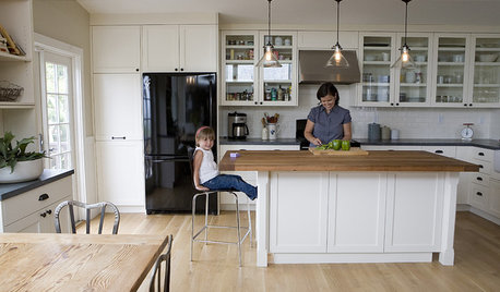
ORGANIZINGDo It for the Kids! A Few Routines Help a Home Run More Smoothly
Not a Naturally Organized person? These tips can help you tackle the onslaught of papers, meals, laundry — and even help you find your keys
Full Story
LIFESo You're Moving In Together: 3 Things to Do First
Before you pick a new place with your honey, plan and prepare to make the experience sweet
Full Story
REMODELING GUIDESWisdom to Help Your Relationship Survive a Remodel
Spend less time patching up partnerships and more time spackling and sanding with this insight from a Houzz remodeling survey
Full Story
ARCHITECTUREHouse-Hunting Help: If You Could Pick Your Home Style ...
Love an open layout? Steer clear of Victorians. Hate stairs? Sidle up to a ranch. Whatever home you're looking for, this guide can help
Full Story
HOUSEKEEPINGHow to Relax and Put Housework in Its Place
If household disarray is making you stressed and unhappy, try approaching it with a different point of view
Full Story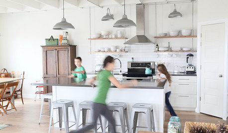
MOST POPULARA Fine Mess: How to Have a Clean-Enough Home Over Summer Break
Don't have an 'I'd rather be cleaning' bumper sticker? To keep your home bearably tidy when the kids are around more, try these strategies
Full Story
HOUSEKEEPINGTackle Big Messes Better With a Sparkling-Clean Dishwasher
You might think it’s self-cleaning, but your dishwasher needs regular upkeep to keep it working hard for you
Full Story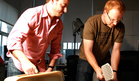
TASTEMAKERSModko Litter Boxes Address the Mess
A design duo has reinvented the much-maligned cat box, with an award-winning result
Full Story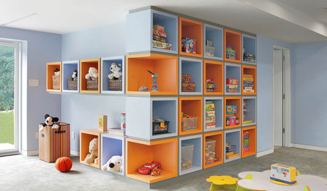
KIDS’ SPACESCreative Ways to Tame the Mess in Kids’ Bedrooms
These cool storage features will keep your children’s rooms tidier — no threats or bribes required
Full Story
LIFEAnatomy of a Family-Size Mess
Study your home’s dumping grounds to figure out what organizational systems will work — then let yourself experiment
Full Story


uroboros5
ptamom
Related Professionals
Amherst Kitchen & Bathroom Designers · Riviera Beach Kitchen & Bathroom Designers · Southampton Kitchen & Bathroom Designers · Normal Kitchen & Bathroom Remodelers · Franconia Kitchen & Bathroom Remodelers · Glen Allen Kitchen & Bathroom Remodelers · Las Vegas Kitchen & Bathroom Remodelers · Olney Kitchen & Bathroom Remodelers · Forest Hills Kitchen & Bathroom Remodelers · Norfolk Cabinets & Cabinetry · Tacoma Cabinets & Cabinetry · Universal City Cabinets & Cabinetry · Wyckoff Cabinets & Cabinetry · South Holland Tile and Stone Contractors · Shady Hills Design-Build FirmsMadeline616
kimiko232
Madeline616
jlcorp
gr8daygw
erinct
renormanOriginal Author
erinct
Madeline616
Madeline616
renormanOriginal Author
breezygirl
breezygirl
erinct
enduring
Madeline616
Madeline616
breezygirl
enduring
erinct
renormanOriginal Author
erinct
breezygirl
erinct
renormanOriginal Author
Madeline616
Madeline616
renormanOriginal Author
enduring
Madeline616
Madeline616
Madeline616
Madeline616
function_first
jejvtr
erinct
Madeline616
renormanOriginal Author
uroboros5
Madeline616
Madeline616
impatience_7
Madeline616
erinct
renormanOriginal Author
thrilledtobuild
renormanOriginal Author
renormanOriginal Author