


A Quick Vote, or Long Discussion, Anyone?
steph2000
10 years ago


Sort by:Oldest
Comments (50)
Related Stories
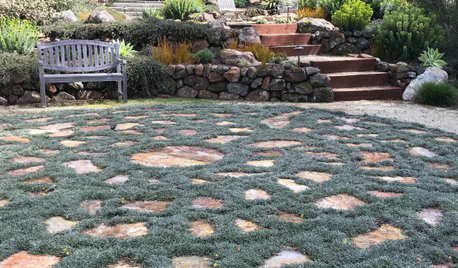
LANDSCAPE DESIGNSo Long, Lawn: 6 Walkable Ground Covers to Consider
These trample-proof, low-water plants can lower your water bill while greening up your garden
Full Story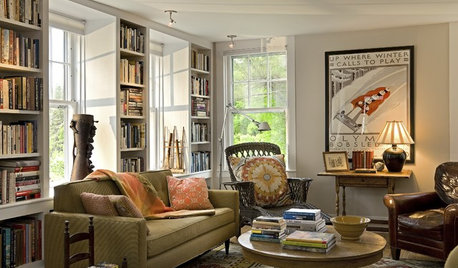
BUDGET DECORATINGThe Cure for Houzz Envy: Living Room Touches Anyone Can Do
Spiff up your living room with very little effort or expense, using ideas borrowed from covetable ones
Full Story
CONTRACTOR TIPS10 Things to Discuss With Your Contractor Before Work Starts
Have a meeting a week before hammers and shovels fly to make sure everyone’s on the same page
Full Story
MONTHLY HOME CHECKLISTSYour Checklist for Quick Houseguest Prep
Follow these steps to get your home ready in a hurry for overnight visitors
Full Story
MOVINGRelocating Help: 8 Tips for a Happier Long-Distance Move
Trash bags, houseplants and a good cry all have their role when it comes to this major life change
Full Story
INSIDE HOUZZHow Much Does a Remodel Cost, and How Long Does It Take?
The 2016 Houzz & Home survey asked 120,000 Houzzers about their renovation projects. Here’s what they said
Full Story
LIVING ROOMSRoom of the Day: Curiosities Bring Quick Intrigue to a Living Room
From blank box to captivating, exotic concoction, this room goes for the wow factor — and the whole house took just 4 days
Full Story
GARDENING FOR BUTTERFLIESA Quick-Start Guide to Bird-Watching for Fun and Learning
Set out some seed and grab your field guide. Bird-watching is an easy, entertaining and educational activity for the whole family
Full Story
BATHROOM DESIGNThe Cure for Houzz Envy: Bathroom Touches Anyone Can Do
Take your bath from blah to ‘ahhhh’ with just a few easy and inexpensive moves
Full Story
HOUSEKEEPINGThe Quick and Easy Way to Clean a Microwave
All you need is water and a couple of other natural ingredients to get your appliance sparkling and smelling fresh again
Full StoryMore Discussions


mark_rachel
lavender_lass
Related Professionals
East Tulare County Kitchen & Bathroom Remodelers · Glade Hill Kitchen & Bathroom Remodelers · Charlottesville Kitchen & Bathroom Remodelers · Cleveland Kitchen & Bathroom Remodelers · Gilbert Kitchen & Bathroom Remodelers · Honolulu Kitchen & Bathroom Remodelers · Lomita Kitchen & Bathroom Remodelers · Joppatowne Kitchen & Bathroom Remodelers · Crestview Cabinets & Cabinetry · East Moline Cabinets & Cabinetry · Indian Creek Cabinets & Cabinetry · Oakland Park Cabinets & Cabinetry · Plymouth Cabinets & Cabinetry · Wells Branch Cabinets & Cabinetry · Des Moines Tile and Stone Contractorspalimpsest
Holly- Kay
raee_gw zone 5b-6a Ohio
jellytoast
kam76
rococogurl
cottagewithroses
Fori
badgergal
herbflavor
Bunny
khinmn92
taggie
oldbat2be
palimpsest
XochitlFilms
palimpsest
palimpsest
deedles
Mgoblue85
rkb21
sleevendog (5a NY 6aNYC NL CA)
kam76
LE
Majra
remodelfla
rococogurl
kaysd
steph2000Original Author
RoRo67
lavender_lass
vdinli
steph2000Original Author
Majra
steph2000Original Author
rococogurl
mark_rachel
steph2000Original Author
deedles
rococogurl
Bunny
pricklypearcactus
steph2000Original Author
steph2000Original Author
rococogurl
sleevendog (5a NY 6aNYC NL CA)
steph2000Original Author
rosie