


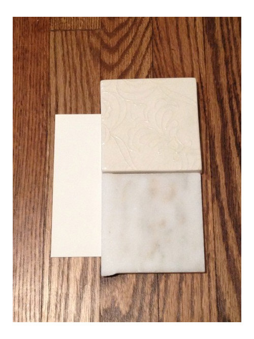
Should I Match Backsplash Tile to Marble or Cabinet Color?
2LittleFishies
11 years ago

Related Stories

KITCHEN DESIGNCountertop and Backsplash: Making the Perfect Match
Zero in on a kitchen combo you'll love with these strategies and great countertop-backsplash mixes for inspiration
Full Story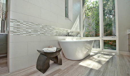
BATHROOM DESIGNHow to Match Tile Heights for a Perfect Installation
Irregular tile heights can mar the look of your bathroom. Here's how to counter the differences
Full Story
COLOR11 Terrific Paint Color Matches for Wood Details
Pair your wood trim and cabinets with the right shade of wall paint to bring out the beauty in both
Full Story
KITCHEN CABINETSKitchen Confidential: 7 Ways to Mix and Match Cabinet Colors
Can't decide on a specific color or stain for your kitchen cabinets? You don't have to choose just one
Full Story
HOUSEKEEPINGHow to Clean Marble Countertops and Tile
Acidic solutions can damage your marble surfaces. Here’s how to keep marble looking clean and amazing
Full Story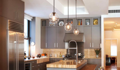
KITCHEN DESIGNMix and Match Kitchen Materials for a Knockout Design
Give your kitchen unexpected flavor by combining wood, stone, glass and more. Here’s how to get the mix right
Full Story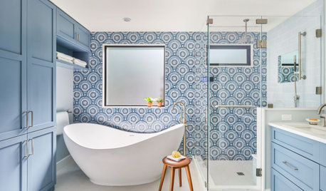
BATHROOM DESIGN9 Tips for Mixing and Matching Tile Styles
Get acquainted with the basics of combining shapes, colors and finishes for a symphony of tiles
Full Story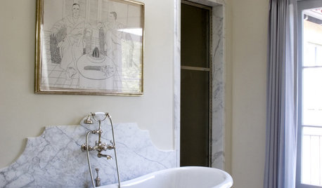
MATERIALS10 Modern Marble Looks
Marble has broken free of the standard kitchen countertop slab and is showing up on bathtub backsplashes, modern dining tables and more
Full Story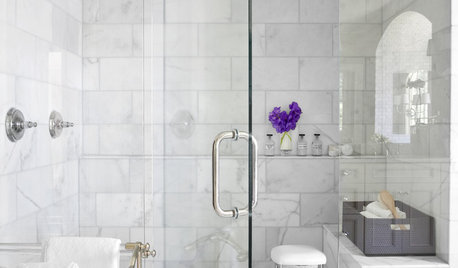
REMODELING GUIDESWhy Marble Might Be Wrong for Your Bathroom
You love its beauty and instant high-quality appeal, but bathroom marble has its drawbacks. Here's what to know before you buy
Full Story
KITCHEN DESIGNKitchen Flooring 101: Find Your Material Match
From cork to concrete, our guide will help you pick the perfect surface for your kitchen floor
Full Story


berardmr
marcolo
Related Professionals
Verona Kitchen & Bathroom Designers · Cherry Hill Kitchen & Bathroom Designers · Bellevue Kitchen & Bathroom Remodelers · Bloomingdale Kitchen & Bathroom Remodelers · Las Vegas Kitchen & Bathroom Remodelers · Lincoln Kitchen & Bathroom Remodelers · Lisle Kitchen & Bathroom Remodelers · Overland Park Kitchen & Bathroom Remodelers · Patterson Kitchen & Bathroom Remodelers · Saint Helens Kitchen & Bathroom Remodelers · Billings Cabinets & Cabinetry · Brea Cabinets & Cabinetry · Marco Island Cabinets & Cabinetry · Wyckoff Cabinets & Cabinetry · Bell Design-Build Firmsblfenton
starinasgarden
2LittleFishiesOriginal Author
marcolo
2LittleFishiesOriginal Author
marcolo
2LittleFishiesOriginal Author
marcolo
blfenton
blfenton
2LittleFishiesOriginal Author
2LittleFishiesOriginal Author
blfenton
a2gemini
2LittleFishiesOriginal Author
babushka_cat
2LittleFishiesOriginal Author
lalithar
2LittleFishiesOriginal Author
corgimum
2LittleFishiesOriginal Author
cawaps
2LittleFishiesOriginal Author
petra66_gw