


Please tell me about 'white'
sayde
15 years ago
Sort by:Oldest
Comments (10)
Related Stories

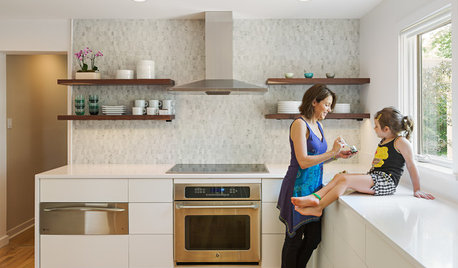
KITCHEN DESIGNHouzz Call: Tell Us About Your First Kitchen
Great or godforsaken? Ragtag or refined? We want to hear about your younger self’s cooking space
Full Story
FUN HOUZZHouzz Call: Tell Us About Your Dream House
Let your home fantasy loose — the sky's the limit, and we want to hear all about it
Full Story
FEEL-GOOD HOMEGuys Tell Us About Their Favorite Places at Home
For Father’s Day, Houzz men show us the places in their homes where they like to hang out
Full Story
ARCHITECTUREDesign Workshop: Materials That Tell a Story
See how wood, concrete and stone convey ideas about history, personal taste and much more
Full Story
COFFEE WITH AN ARCHITECTWhat My Kids Have Taught Me About Working From Home
Candy and Legos aren't the only things certain small people have brought to my architecture business
Full Story
INSIDE HOUZZTell Us Your Houzz Success Story
Have you used the site to connect with professionals, browse photos and more to make your project run smoother? We want to hear your story
Full Story
ARCHITECTURETell a Story With Design for a More Meaningful Home
Go beyond a home's bones to find the narrative at its heart, for a more rewarding experience
Full Story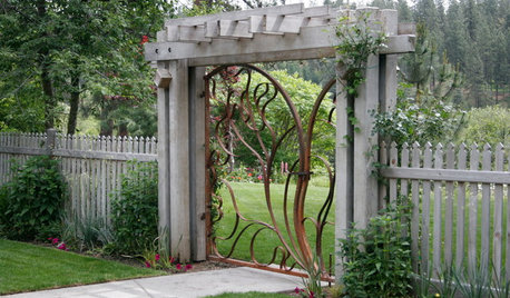
LANDSCAPE DESIGNThe Garden Gate: A Preface to the Story Your Garden Wants to Tell
Setting the tone for your garden starts with the right entry
Full Story
HOUZZ TOURSMy Houzz: Curiosities Tell a Story
An interiors stylist uses her house as a 3D timeline of her tales and travels
Full Story


smilingjudy
igloochic
Related Professionals
Highland Park Kitchen & Bathroom Designers · Covington Kitchen & Bathroom Designers · North Druid Hills Kitchen & Bathroom Remodelers · Jefferson Hills Kitchen & Bathroom Remodelers · Oxon Hill Kitchen & Bathroom Remodelers · Santa Fe Kitchen & Bathroom Remodelers · Forest Hills Kitchen & Bathroom Remodelers · Hawthorne Kitchen & Bathroom Remodelers · Mountain Top Kitchen & Bathroom Remodelers · Ham Lake Cabinets & Cabinetry · Kaneohe Cabinets & Cabinetry · Middletown Cabinets & Cabinetry · Plymouth Cabinets & Cabinetry · Prospect Heights Cabinets & Cabinetry · Oak Hills Design-Build Firmsamck2
fullpass
erikanh
saydeOriginal Author
erikanh
beccamj
arlosmom
izzyce