


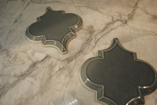
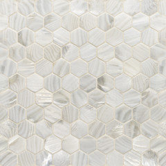
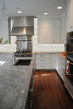
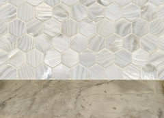
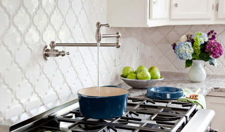
Gray Arabesques + Super White = ?
beekeeperswife
11 years ago

Featured Answer
Comments (115)

mommyatlaw
11 years ago
oldbat2be
11 years agoRelated Professionals
Carlisle Kitchen & Bathroom Designers · Riviera Beach Kitchen & Bathroom Designers · Southampton Kitchen & Bathroom Designers · Beach Park Kitchen & Bathroom Remodelers · Auburn Kitchen & Bathroom Remodelers · Garden Grove Kitchen & Bathroom Remodelers · Hoffman Estates Kitchen & Bathroom Remodelers · Lynn Haven Kitchen & Bathroom Remodelers · Park Ridge Kitchen & Bathroom Remodelers · Pearl City Kitchen & Bathroom Remodelers · Tempe Kitchen & Bathroom Remodelers · Casas Adobes Cabinets & Cabinetry · Billings Cabinets & Cabinetry · Santa Paula Tile and Stone Contractors · Lake Butler Design-Build Firmsoldbat2be
11 years agohobokenkitchen
11 years ago1929Spanish
11 years agofrancoise47
11 years agofrancoise47
11 years agolascatx
11 years ago
AboutToGetDusty
11 years agofrancoise47
11 years agogardenamy
11 years agochiefy
11 years agoJody
11 years agoJody
11 years agoJody
11 years agobeekeeperswife
11 years agoislanddevil
11 years agobeekeeperswife
11 years agopricklypearcactus
11 years agoislanddevil
11 years agofrancoise47
11 years agofrancoise47
11 years agop.ball2
11 years agoslush1422
11 years agooldbat2be
11 years agoellaf
11 years ago
a2gemini
11 years agowritersblock (9b/10a)
11 years agocaminnc
11 years agobeekeeperswife
11 years ago
gsciencechick
11 years agotaggie
11 years agopricklypearcactus
11 years agowritersblock (9b/10a)
11 years agogsciencechick
11 years agofinestra
11 years agospringroz
11 years agobeekeeperswife
11 years agolyfia
11 years ago
corgimum
11 years agocorgimum
11 years agoMIssyV
11 years agoJody
11 years agopricklypearcactus
11 years agokitchendetective
11 years agobreezygirl
11 years agoMIssyV
11 years agoMIssyV
11 years agobeekeeperswife
11 years agodrewem
11 years ago


Related Stories
SHOP HOUZZShop Houzz: The Arabesque Tile Sourcebook
Arabesque tile in a range of sizes, materials and colors from the Houzz Shop
Full Story0
PRODUCT PICKSGuest Picks: 20 Gray and White Bedroom Finds for Both Sexes
Rest assured that these soft shades will create a relaxing feel, while textures and patterns ensure a bedroom that's no snoozefest
Full Story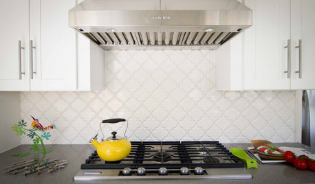
REMODELING GUIDESRenovation Detail: Arabesque Tile
An exotic shape and beautiful detailing make arabesque tiles the new darling of the surfaces market
Full Story
DINING ROOMSColor Feast: When to Use Gray in the Dining Room
The right shade of gray pairs nicely with whites and woods to serve up elegance and sophistication
Full Story
GRAYChoosing Paint: How To Pick the Right Gray
Which Version of Today's 'It' Neutral Is For You?
Full Story
COLORDreaming in Color: 8 Gorgeous Gray Bedrooms
With this versatile hue, you can go dark and bold or slip into something more soothing
Full Story
DECORATING GUIDESColor of the Week: Decorating With Warm Gray
Tired of tan? Getting gloomy from cool gray? Make warm gray your new go-to neutral
Full Story
MOST POPULAR50 Shades of Gray
Gray is hotter than ever, thanks to a hit novel full of risks and dark secrets. Tell us: Which paint shade possesses you?
Full Story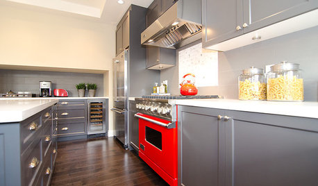
COLORCooking With Color: When to Use Gray in the Kitchen
Try out Trout or shake up some Martini Shaker gray for a neutral-based kitchen that whispers of sophistication
Full Story
GRAYChoosing Color: Give Me More Gray Days
Layer On the Grays for a Sophisticated Look in Any Room
Full StoryMore Discussions


beekeeperswifeOriginal Author