


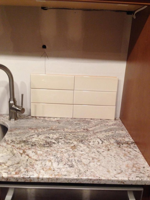
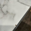
Found my backsplash-accent it or not?
vdinli
9 years ago
Related Stories
RUSTIC STYLEKitchen of the Week: Found Objects and Old Italian Farmhouse Charm
A homeowner and her cabinetmaker create a personal version of European-inspired comfort and simplicity
Full Story
COLORBlack and White and Found All Over: Zebra Print
Don't Forget, Zebra Pattern is Made With Neutrals — Add it Anywhere!
Full Story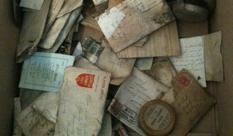
REMODELING GUIDESYou Won't Believe What These Homeowners Found in Their Walls
From the banal to the downright bizarre, these uncovered artifacts may get you wondering what may be hidden in your own home
Full Story
ACCESSORIESFound Objects: The Most Natural Decor of All
They're beautiful, plentiful and best of all, free. See how to turn surprise finds into uniquely personal displays
Full Story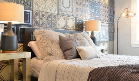
WALL TREATMENTSIdea of the Day: Tin Tiles Create a Striking Accent Wall
A bachelor's bedroom has the industrial style he loves but also is warm and comfortable
Full Story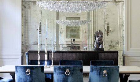
DECORATING GUIDESGreat Home Accents: Antiqued Mirrors
Add a little Old-World refinement to your surroundings with a mirror that wears its patina proudly
Full Story
COLORHow to Pick the Perfect Accent Color
Not sure what colors go together in a room? Here are suggested combinations for different moods and effects
Full Story
DECORATING GUIDES8 High-Impact Places for Accent Colors
If supersaturation feels all wet to you, try smaller splashes of color on accessories, architectural details and more
Full Story
KITCHEN BACKSPLASHESKitchen Confidential: 8 Options for Your Range Backsplash
Find the perfect style and material for your backsplash focal point
Full Story
DIY PROJECTSDIY Backsplash Makeover: Get a New Tile Look for Less Than $50
Give old tile a painted faux-stone facade for a brand-new look at a superaffordable price
Full StoryMore Discussions


debrak2008
romy718
Related Professionals
Clute Kitchen & Bathroom Designers · Philadelphia Kitchen & Bathroom Designers · Wesley Chapel Kitchen & Bathroom Designers · Allouez Kitchen & Bathroom Remodelers · Avondale Kitchen & Bathroom Remodelers · Martha Lake Kitchen & Bathroom Remodelers · Sun Valley Kitchen & Bathroom Remodelers · Vista Kitchen & Bathroom Remodelers · Hawthorne Kitchen & Bathroom Remodelers · Sharonville Kitchen & Bathroom Remodelers · Wadsworth Cabinets & Cabinetry · Turlock Tile and Stone Contractors · Gardere Design-Build Firms · Lake Butler Design-Build Firms · Oak Hills Design-Build Firmssprtphntc7a
palimpsest
mark_rachel
ChristineTse
Bunny
palimpsest
Gracie
breezygirl
lizbeth-gardener
vdinliOriginal Author
dcward89
lazy_gardens
desertsteph
isabel98
romy718
gr8daygw
breezygirl
greenhaven
tinker1121
vdinliOriginal Author
Jillius
redheadk
jellytoast
greenhaven
lam702
Gracie
slontine
blondelle
crcollins1_gw