Shop Products
Houzz Logo Print
lalithar

Color- pulling it all together with two toned cabinetry.

lalithar
11 years ago

The decision I have been dreading the most is upon me. I have to decide on the color of the cabinets. I have several people who have a good eye for color who have provided input but I am hesitating to pull the trigger. Would love some GW honest feedback - please take a look and comment..

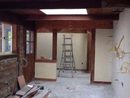
Long galley kitchen open at both ends. This view is looking to the landing. The paint color in the landing will be BM barley in matte finish

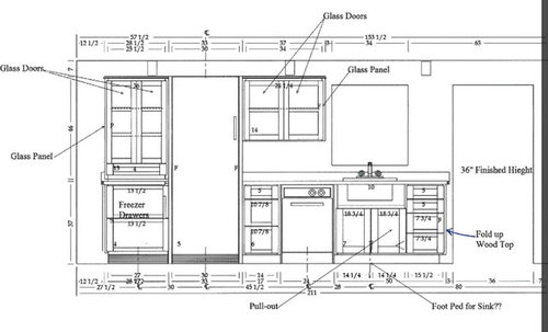
Cabinets on the sheetrock wall to the right

The other wall is adobe but most of the brick will be covered by cabinetry and backsplash except for a tiny bit to the right of the window

The cabinets on this wall

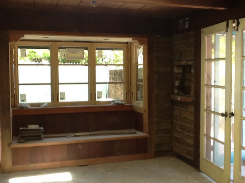
The window seat banquette at the other end. The brick here will be left as is. The seat itself will have seat cushions and back cushions.

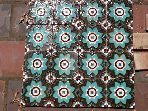
The vintage tile I am planning to reuse as a panel behind the cooktop and some tales here and there. I am thinking to use a 4in off-white tile as a field tile laid out diagonally.. But not decided yet

The hood will be a massive 57" barrel hood (modernaire PS26)with polished stainless lip and bands. The color will be a kind of a dark burgundy to pick up the burgundy color in the vintage tile. I have a 36in induction and a 12in gas wok top under it.

The countertop is belvedere soapstone.

The main sink is 30in Rohl farmhouse in white.


Now the colors.. We are considering lighter green for the uppers and the darker green for the base cabinets.

Upper kitchen cabinets in #2144-30 Rosemary Sprig (low gloss/eggshell finish)

Lower kitchen cabinets in #2144-20 Eucalyptus Leaf (low gloss/eggshell finish) Refrigerator panel to match #2144-30

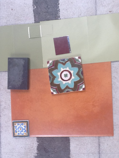
The floor is a Saltillo clay tile look alike reddish porcelain. The small deco tiles are in the same line. I liked it but a decorator acquaintance said it looks busy and will clash with the vintage tile. I like it but now am doubtful. The same tile continues in the landing and to the family room beyond.

Do you think it will looks too dark? My ceiling is wood paneled but I have 2 new skylights that are massive 3x3 structures. This is besides the banquette window with eastern light, and the French doors and the window and the Dutch doors which face south.

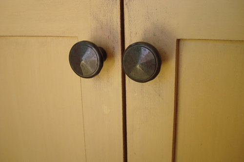
Here is the look of the rustic iron look hardware I am planning:


The lights will be classic school house lights hiding CA code compliant GU24 low voltage lights. The shades are a pale custard color and seem to make the color a bit warmer.. We shall see..

Finally, our Sweeby Test:

My kitchen feels cool and is a well-lit place for 2-3 people to work together. It is efficiently organized to cut down time for everyday tasks of prepping, cooking, cleanup, breakfasts, and lunch packing, as well as easy to work in, to make meals for a crowd. It looks timeless with clean lines and a simple palette that belongs with the simple, strong earthen look of my adobe brick ranch house. My backsplash is simple and blends with the adobe brick walls. My countertops have a well loved gleam and easy to see cleanliness. My equipment is accessible, looks clean and well used. There are interesting and useful items that add character and have a story to share. Fruits and vegetables add color. My family and friends find it welcoming for casual visits, hanging out, lending a hand and cooking together for impromptu get-togethers, special occasions, making jams, etc. We love lazy Sunday mornings in our sunny kitchen table with the paper, eating pancakes/eggs and looking out the window at the redwood trees and flowers. My kitchen has an easy flow to the courtyard for enjoying picnic dinners on summer evenings, or a quiet early morning cup of coffee, and to the veggie garden for fresh herbs and vegetables.

As many people have read thus far will recognize, my kitchen owes it's bones and soul to GW. A lot of material choices are ones I discovered and fell in love with here. Now to pull it all together.
Comments (64)

  • localeater
    11 years ago
    last modified: 9 years ago

    Lalitha, hang in there sometimes the feedback here can be more than you anticipated. Everyone is trying to help and everyone's opinions are their own, but your opinions count most in your kitchen. So listen, absorb, but go with you gut.
    So now for my two cents worth: I think the two colors are too similar. They are right next to each other on the color strip. I think successful two color kitchens work when there is a lot of contrast; black and white, espresso and cream, barn red and white. I would go two shades deeper on the lowers, more olive, with more black in it. I would go much much lighter on the uppers- basically white with a hint of your green. Probably the green base color at a 10-20% dilution in a white base. I think you should just focus on finding the perfect color for the base cabinets, and then find the right color for the uppers.
    You almost don't want the uppers to have a color because the burgundy hood is the star on the right wall. And I like the burgundy hood, I can see where you are going with it, people do black hoods and stained dark wood hoods, and copper hoods, all the time and nobody worries about there visual weight. Just acknowledge it is the star. (you know about only one clown, right?)
    It is too bad those lowers don't align though. I suppose it is too late for that? I did also wonder about removing the upper to the left of the hood and creating more of a niche- like feel in the cooktop area by using the vintage tile in that area to really sell that this whole area is a cohesive unit and it the star. That's what I would do and then put one of those Le Creuset round countertop racks in that space for visual height.
    Also, I did wonder about painting the freezer drawer base and uppers on the opposite wall a burgundy actually a distressed burgundy with green and black rubbed through. Probably crazy but I just wondered.
    About the floor, can you please reconsider authentic Saltillo. It looks so much nicer. I have both in my house. Authentic in my sunroom, and a porcelain reproduction in the entry. I love the sunroom, everyone comments on it, I hate the entry and I am ripping it out as soon as I can. Authentic has a warmer look. It reflects the sun so much better(think of your lovely skylights!). It is softer to stand on. The unevenness makes it a better surface for standing and working on because you feet are not on a flat hard surface rather your feet move and flex to the changing surface of the tile(of course this may only be true if you cook barefoot or in thin soles(ie, ballet shoes) as I do). Particularly since you are doing it throughout the kitchen, entry and living room I cannot understate the dimensional beauty and character the authentic saltillo will add, where the porcelain may actually detract from the beauty of your home. Of course the imitation tile in my entry is not your exact tile and I could be wrong, but just want you to reconsider as it is a big space and it's not likely you will ever rip out the tile and get a re-do.
    I do have one general floorplan question, it looks like your prep space is around the prep sink to the right of the cooktop. Did you give any thought to switching the main sink and prep sink areas? I only ask because I spend more time prepping than washing dishes and so I would want the window where I prep. That is a personal choice. Lot's of people feel the kitchen sink must be under a window.
    Good luck, don't get stressed out or feeling down. You are getting close to the end and that is why this is feeling like so much right now. You'll be fine, you clearly have great instincts all we have are opinions based on pictures on a monitor you have a true feel for the space.

  • live_wire_oak
    11 years ago
    last modified: 9 years ago

    Don't get me wrong, I LOVE everything you're pulling together here. The idea of the burgundy hood is wonderful! I just think that this is a pretty small kitchen to pull something like that off. With low ceilings. That's the killer. Usually when you see a black hood, or other large dark hood, the kitchen it's in is also large. And high ceilinged. ANd bright.

    So what about doing the body of the hood in stainless and use the burgundy for the banding? That would give you a visually lighter reflective surface and that hit of color, but not be so weighty.

    Or, what could be really spectacular would be using the tiles as a deco band around a plaster/adobe hood.

  • Yvonne B
    11 years ago
    last modified: 9 years ago

    Oh my goodness, Lalitha, I'm swooning! I love your tile choice, and I'm looking forward to seeing it all put together. I like your choice of green in both the lower and the uppers. I think they'll complement each other, and won't clash with the floor or backsplash tiles.

  • sas95
    11 years ago
    last modified: 9 years ago

    To me, the two greens of the cabinets are so close in color that I don't see the point of doing two colors. I would probably go with the lighter shade of green for the whole thing, and try to select a green that draws from the lightest green shade in the tile.

  • pricklypearcactus
    11 years ago
    last modified: 9 years ago

    I don't have any suggestions really. But I wanted to pop in and say I like the idea of the cabinets in the same color but two different tones. I've mostly seen painted and stained combos or two totally different colors. I really like your idea. Best of luck. I look forward to seeing your progress.

  • bmorepanic
    11 years ago
    last modified: 9 years ago

    I've only got two thoughts. The color values of the uppers and lowers are not different enough from each other to "read". If one is a little more olive, you might try moving the other towards blue or towards yellow - instead of paler olive, maybe try pale mint or washed out lime. Or do those sorts of colors on the bottom and do antique on top.

    Think about whether you liked orange 5 years ago and then 5 years before that. The floor tile is a big screamin' jolt of color - enough so I'd be afraid of falling out of love with it in a few years. It goes with stuff very well but its intensity is going to make that floor pretty loud.

    And that's ok if that's your vision and you have always liked that color. I know I change my thinking and my colors every few years - so I'm not brave enough to do something like the orange floor.

    The adobe is so pretty - glad to see your progress.

  • lalithar
    Original Author
    11 years ago
    last modified: 9 years ago

    I tried to take a bit of break over the weekend to see if the sub conscious mind will resolve the dilemma. Not so..

    If we use the vintage tile, what cabinet colors would you suggest.. This really is the starting point for the entire color scheme for the kitchen.. I need to play with more color samples. One comment on the my current cabinet color choices being too close to each other to "read".. I thought again about what I wanted with the two tones.. Here is my thinking process.. My kitchen is long with low wood ceilings with beams. Sitting at the window seat/ banquette, you are seeing a 25 feet long space that is 10 feet wide. With the cabinets, you have 5 feet of aisle.. I wished to avoid a tunnel effect.. I also did not want two train tracks with completely different uppers and lowers. I wanted a darker shade to anchor the base cabinets down with the soapstone counters and seamlessly lighten the uppers to make it look a little more elevated and draw the eye up but still work with the burgundy hood. I specifically did not want to much contrast between the hood and the cabinets.. With all this colors, it thought, the color has to flow and I thought that would work with colors are in the same potency level.. I don't know if that came across or not. Does this even make sense?

    Re: floor tiles.. It looks way more orange in the pictures than it does in real life.. It is a pretty reddish orange.. Just not as hot as the picture.. I will try to see if a better camera will help capture the color better. We really really wanted to do Saltillo. The issues we ran into are uneven tiles under the cabs will be a problem. The tile floor transitions to engineered floated wood floor in a couple of places and other bathroom tiles and we wanted the height variation to be minimized and not have to deal with transitions. Also I have heated floors.. And it was unclear if the Saltillo would crack with the heat.. The maintenance did not seem realistic.. As the floors need to be sealed every year.. My stain test with oil, chilli, vinegar and turmeric and spinach did not go well... But I really love the texture.. The porcelain tile is a compromise. We had looked to go with porcelain tiles from porcelanosa that was softer color but they discontinued the tiles and our order kind of got lost in the system.. So the marazzi tile is a replacement.. Am I completely in love.. No but current sentiment is I can live with it..but with all the feedback, I am going to do a mock layout in a larger expanse to double check with my instincts. I am still in 2 minds about the deco tiles..

    Lalitha

  • senator13
    11 years ago
    last modified: 9 years ago

    For me, I think I would like to see a lighter version of the greens you picked. I think those might be a little dark for your space. I think the hood in the space and the tile will really bring some beautiful elements to the kitchen, but I think the green is going to really darken your space and change the mood considerably. I am also not a matchy/matchy person. So I think it is great to tie in the color of the tile to the hood, but I would find other colors that compliment for the cabs, not match it exactly. I think the Soft Fern would be amazing on your cabs. Enough green to set the tone and tie into the overall plan, but not so dark.

  • CEFreeman
    11 years ago
    last modified: 9 years ago

    I'm thinking, but don't know nuttin', and based on what I envision from feedback here, that the burgundy hood (pretty!) might be just fine if there were a bit more contrast with the greens?

    There's burgundy in the tiles (on my monitor), which I think is also beautiful.

    One thing wonderful is that not a single person here has tried to turn your kitchen into a OTK based upon their own tastes. I think these are some of the most well considered, out of the box suggestions I've seen here.

    I'm really looking forward to what you're doing and pics of it. BTW. If the burgundy hood speaks to you, make it work! :)

  • localeater
    11 years ago
    last modified: 9 years ago

    I love what you are doing with your kitchen. I love the vintage tile and I love the burgundy hood. However, you are making me concerned with the "if we use the vintage tile". Do you love it? Because if you are using it as the starting point for the kitchen color scheme as you say you are, I think you should love it.
    For example, I love walnut. I love clean lines. My starting point for my kitchen was walnut slab front cabinets with minimal uppers. That is my immutable point- my design evolves around that. What is the one(or 2) things in your kitchen design that you will not budge on?
    On the paint colors, your post is titled 'two tone cabinetry" and you got a lot of feedback about the paint colors picked out not being dissimilar enough to give a true two tone look. That doesn't mean the colors are a poor choice. Maybe you don't really want a two tone cabinetry look? Using your train track analogy I think your original two choice do work and would be lovely. I just don't think you will get a two tone look because they are so close. It might not be worth the trouble of using two different paints both colors look great so why not just pick one.
    Going back to your original post though, the question you ultimately seemed to ask was "will it look too dark?" I don't think you got alot of answers on that question. Honestly, it might be a little, just a little, dark. Is the ceiling between the beams being whitewashed? I know you have the big skylights, what are you doing about other lighting? Is the hood, sort of across from the window, or in front of the skylights, because that does alot for the lightness issue as well.

  • pricklypearcactus
    11 years ago
    last modified: 9 years ago

    Others have pointed out that perhaps your cabinet colors aren't different enough to be noticed. I don't think that's necessarily a bad thing, but perhaps you could go a couple of more shades lighter than what you've selected now for the upper cabinets.

  • lalithar
    Original Author
    11 years ago
    last modified: 9 years ago

    Some questions:
    1) Keeping within the green family, what direction should I move to get some more contrast in the kitchen. Should I make the base cabs a darker green or lighten the uppers a shade or two..

    Senator: Interestingly enough, the small bits of sheetrocked wall are painted in BM Soft Fern. I considered it for uppers and thought the contrast was too much.. I guess I am also trying to get the monster hood to not stand out so much and dominate the room.

    CEFreeman: thank you for noting that there have been no OTK suggestions but DH still can't understand why I don't just pick off white cabinets :)

    Local eater: I absolutely love the vintage tile. I picked the burgundy for the hood from it (as CEFreeman noted.. There is a bit of burgundy in the tile). The hood is in front of the little window and the right under the skylight.. There is a ton of light in the cooking zone. And the hood has polished stainless bands and lip. However, I am still not sure if the cabinet colors I am picking will work with the tile or even what field tile to use..

    For lighting, as we have to deal with Title 24 in CA and I refused to cut holes for cans in the ceiling, we are doing LED under cab lights that are dimmable, and I have picked out 2 schoolhouse lights which have custard color shades. As the skylight wells are quite big, we were able to do LED tape lights for uplighting ..thought that would look pretty at night.

    I still have to pick the light above the table near the banquette as well as lighting near the sink.. Any suggestions?

  • eam44
    11 years ago
    last modified: 9 years ago

    I use colors differently than most people, who opt for neutrals color to highlight strong bs tiles, like you're doing with your greens.

    If that's what you want to do, hue is really important. The greens you're looking at, as they appear in the images, may be the wrong hue. Also, the burgundy you show as it appears in the images is not a great match for the tile, and it's possibly skewing your choices a bit. I use Ralph Lauren paints, and Claret looks like a good match for you.

    Instead of keeping things neutral I would pull out the strong colors of the tile and bring them center stage. I have a bunch of boards for you. I hope they're helpful in getting you to see that you have dozens of options, even if none of these gives you the look you are hoping for.

    I'll start with the greens you are partial to.

  • eam44
    11 years ago
    last modified: 9 years ago

    The next option - wildly different - plays up the turquoise in your tile.

  • eam44
    11 years ago
    last modified: 9 years ago

    Here is your dark green on the lowers, and a grayer version on the uppers that looks great with the Claret.

  • eam44
    11 years ago
    last modified: 9 years ago

    Here is the turquoise on the lowers with a much lighter shade of the same blue on the uppers.

  • eam44
    11 years ago
    last modified: 9 years ago

    The lowers would get a lighter version of the grey greens, with a cream gray upper that speaks to the cream in the tile.

  • eam44
    11 years ago
    last modified: 9 years ago

    You can have your lowers pull color from your floor tile, as long as a lighter version of that color matches the cream in your tile.

  • eam44
    11 years ago
    last modified: 9 years ago

    These are Atlantic Winter upper, and Soft Earth lower. Neither color is in your tile, but they are the same hues in different depths, as the green and the cream in the tile, are neutral colors that go well with Claret, and are meant to show that you can do different colors upper and lower, just as well as different depths of the same color.

    Whatever colors you ultimately choose, try them out in your space in your own light. You really have as many options as you can think of. I hope you find something you like!

  • eam44
    11 years ago
    last modified: 9 years ago

    One last combo - Cove Point upper, with the turquoise lower. This may be my favorite.

  • eam44
    11 years ago
    last modified: 9 years ago

    So by now you may be pretty overwhelmed. If I'm adding to the din, and confusing you even more with my colorful boards, feel free to disregard.

    You responded to localeater that you love your tile, and really want a burgundy hood. I'm not trying to change your mind, but I think one reason this cabinet paint color is difficult might be that your bs tile and floor tile don't relate to each other at all.

    I took a look around for tiles that use burgundy, but also incorporate the color of your floor tiles - a strategy I would use if I were picking tile form scratch. Here are some I wanted to show you. They're all from Tierra y Fuego.

    Malibu 4 Santa Barbara


    Santa Monica 2 Santa Barbara

    Visalia Santa Barbara

    Mira Monte 4 Santa Barbara

    This one has no burgundy, but would be beautiful with your floor.
    Melrose 2 Santa Barbara

    Marazzi Saltillo

    Anyway, I'm not trying to exhaust you, I just wanted to give you an idea of what's out there with all of your colors that would speak to the floor tile as well.

  • lalithar
    Original Author
    11 years ago
    last modified: 9 years ago

    My gosh! EAM44 .. I must have accidentally clicked the new 'click here' to no longer receive notifications button as I missed all of your posts.. I was feeling a bit despondent that I was not making headway and not getting critical input and even feeling a tad bid jealous with all the great input that others were getting for their seating choices etc.. Thank you so much for all the posts.. I have a lot to consider now...

    I think your last post nailed the crux of my problem.. I already have my vintage tile and am ornery enough to insist on using it.. The floor tile decision .. I got backed into as the quieter tile I had chosen was discontinued and there was prospect of the tile guy not having dates unless the tiles showed up by "next week" ..net net I jumped and the floor tiles have been paid for and need to be used. So a lot of the handwringing is to figure out how to marry the two choices via the cabinetry "green color" that will work with the BS tile as well as the floor..

    The burgundy I showed is not the correct color match.. I received the newer color chips.. The accurate color match for the bit of burgundy in the vintage tile is �PC RAL 3005 which incidentally is the color of the ILVE Burgandy for their freestanding range.. If you wanted to see the color..

    Of the options you have mocked up..the ones that play up the turquoise and the blue tones are too brave for me.. I plan to pick up some of the color chips to or row to mock up in my space/ my light.. I am thinking the ones I will try are Bleeker and Covepoint and Spring and Bleeker..I am also planning to lay down a larger section with the problematic floor tiles see if it pushes me to jump off the roof :)..

  • bmorepanic
    11 years ago
    last modified: 9 years ago

    @EAM44 - Wow, those are all lovely.

    I feel like I learned my lesson on finely graded colors - by the time they are illuminated, they might as well be the same. All colors shift with lighting - the direction of the light as well as the color of the light and the color of the shadows. Close neighbors really don't read in big expanses. I also have a little bit of trim still painted the original green, but it has the same value as the new color of light gray and no one actually sees that they are different.

    My ceilings now appear to be whiter than the walls, but they are mostly painted with the same paint. The kitchen is the one place that is different (and on chips, they look fairly different with the ceiling color being much whiter), but I guarantee you'd swear they were the same paint.

    I don't think your kitchen will read like a tunnel - the tall doors and windows will break that up any tunnelly feelings. The outside wall run will contrast nicely with the longer run on the other side. I think your kitchen is going to appear well balanced and big.

    Following uses EAM44's post Thu, Sep 6, 12 at 23:09

    My personal taste would be something like Visalia Santa Barbara tile as a pattern with the gold-tan color for the uppers and the green-blue for the lowers.

    Malibu 4 Santa Barbara would be my alternate lowers selections - with the true blue or the green-teal.

    I think your kitchen elevations are interesting enough not to bother with two colors on the outside. I'd be tempted to pick just one for the outsides and finish the interior back walls of the glass fronted cabinets in something else. Maybe a light wood tone or one of the lighter teals?

    Keep thinking about it (like you need anyone else telling you to obsess about this, right?). I can't wait to see how it turns out.

  • live_wire_oak
    11 years ago
    last modified: 9 years ago

    Oh come on! Anyone brave enough to use that tile and that floor is brave enough to use the turquoise cabinets! :) I really do find them the best color to unify what you have planned.

    Did you ever do the mockup with the BIG expanse of burgundy overhead? Besides the tiles you want to use not really having any terracotta elements in them to tie in the orange floor, the BIG expanse of burgundy overhead is the thing that I don't think you're really taking into account here. All of your mockups use a small snip of the burgundy, while it will actually be THE major player in the room, maybe even more so than the tiles and flooring. To use the GardenWeb metaphor, that's 3 clowns right there you've got, and then adding two toned cabinetry adds another. In a small galley kitchen with a low ceiling and poor artificial lighting.

    Here's what you are proposing in the space. Yes, I know it's the wrong orientation, but the heaviness of the beamed and low ceiling need to be taken into account here.
    You see that what dominates the kitchen is the large hood, the shout of turquoise from the tile, and the orange floor. The color difference between the cabinetry doesn't really visually exist at all because the other elements are shouting for center stage. And the white field tile looks lost, as if it wandered in from another house. Even with a white ceiling, I'm afraid it would still look that way.

  • new.bee
    11 years ago
    last modified: 9 years ago

    These mock-ups are just amazing. However, on my monitor, they all seem to suggest that the floor tile really doesn't go with your vintage tile. Is it too late to switch the floor tile?

  • live_wire_oak
    11 years ago
    last modified: 9 years ago

    And while I am still uncomfortable with having so much dark overhead, just changing out the burgundy of the hood to a black and inserting deco tiles with some strong turquoise to echo the backsplash calms the whole thing down, and unifies the color scheme. You still notice each element, but the whole matters more here than the strength of the elements. Repeating the black of the counters, and the tuquoise of the tiles in other elements lets you notice the tiles more as individual tiles, and it also lets you see clearer about the difference in color between the uppers. I still think that the uppers should be lighter, but this change at least allows the two tone effect to be noticed.

  • live_wire_oak
    11 years ago
    last modified: 9 years ago

    Here is keeping the burgundy hood, but substituting an aged brick paver floor to echo that burgundy. I also did the uppers in a slightly lighter and bluer tone to tie into the backsplash a bit better.

  • live_wire_oak
    11 years ago
    last modified: 9 years ago

    Stainless hood, turquoise field tile, turquoise based accent tile in the floor.

  • live_wire_oak
    11 years ago
    last modified: 9 years ago

    Terra cotta colored hood, light turquoise field tile.

  • live_wire_oak
    11 years ago
    last modified: 9 years ago

    I gotta say that I think that changing out the floor to the brick would really work to make the burgundy hood tie in better with the rest of the tones in the kitchen. The amount of burgundy in the tile is so small that using a large swath of it feels "wrong" unless it has additional companions in that color tone. Here it is with the burgundy lowers and a very pale turquoise for the field tiles.

  • live_wire_oak
    11 years ago
    last modified: 9 years ago

    I really don't personally like the orange and burgundy together without a different tile that has both colors in it to tie them together, so here's eliminating the orange floor, keeping the burgundy hood and burgundy lowers.

  • live_wire_oak
    11 years ago
    last modified: 9 years ago

    Burgundy lowers, blue-gray slate floor.

  • live_wire_oak
    11 years ago
    last modified: 9 years ago

    Using the Santa Barbara tile that has a more prominent burgundy presence with the already purchased floor and pulling out a stronger but more grayed down blue green for the lowers.

  • live_wire_oak
    11 years ago
    last modified: 9 years ago

    Using a turquoise pulled out of the tile just on the cabinets under the cooking zone, a very light turquoise field tile, and a floor accent tile with strong burgundies.

    I'm done playing for the day and have to get back to work, but I hope that what you get from those quick and dirty pastes is that repetition of the colors is what allows the room to "pull together". I'm still not sold on the burgundy hood in a small dark kitchen, but I tried to mostly work with it, as it's something you seem really drawn to. I'd talk to an expert lighting consultant if you do choose it, and make sure it at least has accent lighting focused directly on it at all times.

  • GreenDesigns
    11 years ago
    last modified: 9 years ago

    I really like the suggestion to use a brick paver floor! That ties the burgundy in down below better. And I also like the idea of using the stronger turquoise just on the cabinets below the cooking area. That keeps the turquoise tile from being such an "in your face" strong color. When you repeat a color, but gray it down a bit (as with both the brick and the greyed turquoise cabinets), it helps to make the original color seem a bit calmer, and the element of repeating the color helps to make it into a WHOLE design.

  • eam44
    11 years ago
    last modified: 9 years ago

    If this is helpful, I'm glad.

    live wire oak brings up another option - to introduce accent tiles to your Saltillo tiles that speak to your bs. The way to do that, instead of using your bs tiles in a floor field where they don't match, and still use the tile you've bought, would be to pick a floor accent tile with burgundy and the terra cotta color in it, like the one below. It's a 12" x 12" Rosario Santa Barbara hand painted floor tile from Tierra y Fuego. FYI - it's important that any tile you choose for the floor is identified as floor tile.

    Based on the actual burgundy color, here's what that floor tile would look like with revised greens, Soft Earth uppers, King Henry lowers (again, Ralph Lauren paints, but you can get these colors in other brands). I've made the hood larger per lwo) as well.

    The other option would be to use your bs tile somewhere else in the house, keep the burgundy hood, but choose a bs tile with burgundy and floor tile colors in it.

  • eam44
    11 years ago
    last modified: 9 years ago

    I really like lwo's top image in the 12:58 post w/Santa Barbara tile! I think it would look great with the Santa Barbara floor tile accent. But if you want to use your bs, I get it.

    I did this one in cream for your husband. Ralph Lauren paints again, with Fireclay field tile and Tierra y Fuego accent floor tile.

  • lalithar
    Original Author
    11 years ago
    last modified: 9 years ago

    EAM44, live wire oak, - I spent 2-3 hours this week pondering the paint colors from your suggestions.. I like the soft earth/ king Henry lowers.. Well primarily because they seem to "shout" less than the others. Not sure if it was clear in the photos but there is a sort of olive green in the vintage tile, should I consider that hue for the base cabs? And a lighter tone of that for the upper?

    Your quick mockups really helped see the size in perspective. I don't plan to use all of the vintage tile in the framed in section under the hood. I was thinking more like 36in wideX24tall. The tiles are 8in tiles. I also was planning to include a burgundy liner or molding color matched to the hood to sort of picture frame this. I could continue the burgundy liner in some way on rest of the backsplash. The vintage tile can be repeated occasionally as a single accent tile.

    Live wire oak - the hood has a substantial polished stainless lip and bands which will hopefully tone it down.

    As I continue to mess with this, DH asks.. Why don't you just give up on the vintage tile here and find something else for the backsplash.. Honestly, should I consider this?

  • eam44
    11 years ago
    last modified: 9 years ago

    Oh yes, absolutely consider using another bs tile, if only to be certain you've considered everything! It is a pretty tile - is there another room you can use it in? I like the King Henry/Soft Earth combo as well, but I'd be lying if I said it's the best you can do in your beautiful space. Changing the bs tile to one that contains even just a little of your floor tile color will make the room gorgeous.

    Are open to changing the hood color as well or is that a done deal?

  • dilly_ny
    11 years ago
    last modified: 9 years ago

    I am fascinated by the visuals on this thread. Maybe I need to pick my backsplash before the paint color (but DH has no patience and wants to paint asap).

    Lalitha - I am terrible with color, but I did notice your mission statement starts off with "My kitchen feels cool ..." and your backsplash tile is going to make your kitchen really cool / unique, but I don't see alot of "cool" color tones. But again, color is my weakness, so not sure. Just thought I'd point it out incase you want cooler tones as opposed to cool vibe.

  • eam44
    11 years ago
    last modified: 9 years ago

    So.... I've had some time to play. Here's what I would choose for your space. This is just me - when you have a better idea of what tile you want, post it. But I would take a sample of your floor tile with you when you shop. The floor is your tile with one of the Marazzi deco tiles. The bs and field tile are Talavera Mexican tiles. The hood is your style in gunmetal and stainless. I show your bm barley paint and some of your adobe on the side, with your beams above.

    Santander bs tile


    Jaral border tile
    {{gwi:1945084}}
    Mexican White field tile

    Ralph Lauren Paint again, this time in Calypso for lower cabs, 60% Calypso for the uppers, and Calla Lily for the walls.

  • deedles
    11 years ago
    last modified: 9 years ago

    I'm really late to the party but my 2 cents agrees that the cab colors may as well be the same. I can hardly see a difference.

    If you keep the burgundy hood, it seems that will drive the rest of the kitchen color choices. Not feeling the orange floor and in reading your kitchen statement, you used the word 'cool' almost first thing. Everything in your choices read cool to me except that orange floor tile.

    Who wrote about "too many clowns in the kitchen?" I wish I could find that post, it was so helpful in explaining about this type of dilemma, IMO.

    I also love the brick. My first thought was that the brick is as wonderful as any of the tile options and it's already there. AND would look great with a burgundy hood, too!

    If you can find the clowns in the kitchen post, it may be helpful to you.

  • lalithar
    Original Author
    11 years ago
    last modified: 9 years ago

    Folks,

    This may be one of those situations where images on a website cannot do justice to the physical tone of being in the room. I recognize that looking at the pictures on the website make all of my choices look like a motley collection of clowns. And then there is my sweeby mission statement about "cool" kitchens that I still stand by. To explain this in the context of my kitchen, let me share how it feels to be in the kitchen. Our home is in northern California near San Francisco which is quite a bit different from general image of sunny LA or San Diego. It is said that Mark Twain once said that "the coldest winter I have ever spent was a summer in San Francisco". The marine influence here means that it is common to have 70 to 75 degrees in middle of summer. When the east coast was broiling this summer, we had 68-72 degree days. Then there is my house which is adobe.. This means the super thick bricks have to warm up first before the air inside the house begins to warm up.. It is usually a good 10 degrees cooler inside than outside. We in fact put in heated floors just for this reason. Then there is quality of light.. The banquette on the end of the galley is east facing but quite heavily shaded and the light is filtered and cool. The side of the galley with the doors and windows that opens to the courtyard is south facing but has a very deep eaves (around 7 ft) so the light here is very filtered as well. The only bright light source is the two new skylights. It is hard to show the quality of light with photos taken with my iPad.

    Then my "clown" choices... If I use light colors in the room, they do not actually lighten the room.. They just seem pale and flat. But stronger, brighter colors almost seem to glow and IMHO do not look garish or loud but rather brighten the space. If look at colors used in regions of the world where brick and clay is used for construction, they also use stronger hues and multiple colors..like encaustic moorish tiles and bright colorful Mexican kitchens..

    I feel that if the stage is cleared for one prima donna clown (a la the hood) and the rest sort of disappears in a forgettable background chorus.. the. end resut is very lopsided. Having a few strong elements I think balances and makes the end result better.. The trick here is whether they are harmonious or competing. I am striving for harmony but with stronger colors..

    I know color is a very very personal choice and I am not defending my choices but rather I felt I should contribute to this dialogue on color in the context of my darker kitchen with very filtered light. Many of the lovely kitchens here are blessed with lovely counter height windows and bright sunlight.. But a kitchen like mine is different and brighter colors may be an appropriate palette.. Anyways.. Just want to share my thinking ..

  • deedles
    11 years ago
    last modified: 9 years ago

    Lalitha: I hope I didn't offend by the clown in the kitchen post suggestion. I wasn't calling your choices clownish at all. Just suggesting something to read that helped me thin about things differently. If I could only find the dang post.

    I guess when we put out calls for honest feedback we get it on this site, lol.

    But as you said, color is a personal choice. I really try to listen to layout feedback on here because that is mostly objective and I'm no expert but the final touches have to appeal to me in my kitchen and you in yours.

    Anyway, no offense intended and I hope none taken.

    I'm sure whatever you choose will beautifully reflect your personal taste.

  • lalithar
    Original Author
    11 years ago
    last modified: 9 years ago

    Deedles.. None taken at all.. Others have been commenting on the strong cast of characters before you.. I recall the clown post and recall the infamous clown vomit comment on your plans :) it is all useful feedback.. Just want to add more context to help filter the right colors here..

  • eam44
    11 years ago
    last modified: 9 years ago

    "But stronger, brighter colors almost seem to glow and IMHO do not look garish or loud but rather brighten the space."

    I agree, which is the reason I gave you so many strong color boards, including the one I did for you today, none of which you liked I'm afraid. You have a dark kitchen and you only seem to like pale green cabinets. "Pulling it all together" in this case is not going to be easy, but then it's not supposed to be. Having the opportunity to design your kitchen studs out is a privilege, and the end result depends on how much effort you are willing to put into it.

    I think receiving input from people whose tastes you don't share can be counterproductive so I'm signing off, but I wish you the best of luck in making your choices. In the end it's a kitchen, not a cure for Parkinson's disease. It'll be fine even if you get some of the details wrong.

  • cottonpenny
    11 years ago
    last modified: 9 years ago

    Lalitha - have you ever heard the phrase "too many cooks in the kitchen"?

    I recently made a choice that was directly against 100% of the advice I received here...and I am very happy. I have also received some great advice here that undoubtedly improved my kitchen. You are the only one standing in your space with the materials in front of you, though.

  • lyfia
    11 years ago
    last modified: 9 years ago

    I love your choices. I think not using accent tiles in the floor in the kitchen would be best as they compete with the other tile otherwise.

    I tend to think of Saltillo type tiles as a neutral similar to a wood floor so don't think your floor needs to match anything in the kitchen colors. Just needs to work with those colors. Ie not clash. On my screen it looks like it works to me.

    I do think going 2 Shades apart on the cabinets would make it clearer they are different.

  • lalithar
    Original Author
    11 years ago
    last modified: 9 years ago

    Sigh! I really really did not mean to give offense and sound ungrateful. Every time I login to the forum, I am amazed at the creative and useful input here. This forum is so much more than what any KD can offer. a big part of the process here is also to go around the cart, look at all the aspects and clarify one's own preferences, likes, and priorities. My post earlier was mainly to add more context about my space to others who might be reading this thread.. I am sorry if I came across as being defensive.

    EAM44- I emailed you offline. Thank you so much for your help in helping me understand hues and balance them in with other elements.