


Do any of these slabs work or am I going the wrong direction?
TxMarti
11 years ago
Sort by:Oldest
Comments (69)
Related Stories
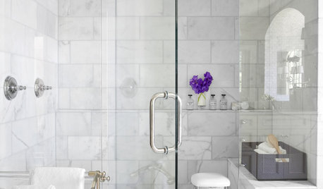
REMODELING GUIDESWhy Marble Might Be Wrong for Your Bathroom
You love its beauty and instant high-quality appeal, but bathroom marble has its drawbacks. Here's what to know before you buy
Full Story
KITCHEN COUNTERTOPSKitchen Counters: Granite, Still a Go-to Surface Choice
Every slab of this natural stone is one of a kind — but there are things to watch for while you're admiring its unique beauty
Full Story
COLOR8 Color Palettes You Can't Get Wrong
Can't decide on a color scheme? Choose one of these foolproof palettes for a room that feels both timeless and fresh
Full Story
LIFEYou Said It: ‘Every Room Should Have the Right Wrong Thing’ and More
This week on Houzz we were inspired to break out of catalog styling ruts and let our design freak flags fly
Full Story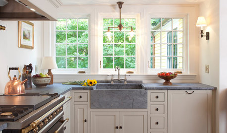
LIFEYou Said It: ‘The Wrong Sink Can Make You Hate Your Kitchen’
Design advice, inspiration and observations that struck a chord this week
Full Story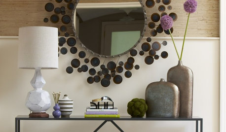
DECORATING GUIDESA Designer’s 8 Go-to Decor Pieces
Classic designs such as a Saarinen table and a Chinese garden stool will lift just about any room
Full Story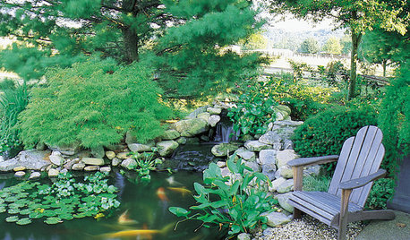
GARDENING AND LANDSCAPINGHow to Make a Pond
You can make an outdoor fish paradise of your own, for less than you might think. But you'll need this expert design wisdom
Full Story
REMODELING GUIDESFrom the Pros: 8 Reasons Kitchen Renovations Go Over Budget
We asked kitchen designers to tell us the most common budget-busters they see
Full Story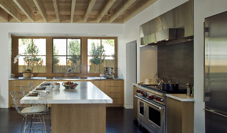
MATERIALSAn Architect Shares His Go-To Materials
Aluminum doors, porcelain tiles, polished concrete. Here are the features and finishes this professional returns to time and again
Full Story
ENTRYWAYSPorte Cocheres Steer Driveway Style in the Right Direction
More than a carport, these covered structures attached to a home provide protection beautifully
Full StoryMore Discussions


Bunny
palimpsest
Related Professionals
Frankfort Kitchen & Bathroom Designers · Ocala Kitchen & Bathroom Designers · Yorba Linda Kitchen & Bathroom Designers · Cloverly Kitchen & Bathroom Remodelers · Andover Kitchen & Bathroom Remodelers · Fair Oaks Kitchen & Bathroom Remodelers · Folsom Kitchen & Bathroom Remodelers · Franconia Kitchen & Bathroom Remodelers · Glen Allen Kitchen & Bathroom Remodelers · Princeton Kitchen & Bathroom Remodelers · Langley Park Cabinets & Cabinetry · Cranford Cabinets & Cabinetry · Hanover Park Cabinets & Cabinetry · Niceville Tile and Stone Contractors · Suamico Design-Build Firmsmelissastar
susanlynn2012
susanlynn2012
sprtphntc7a
mpagmom (SW Ohio)
ellendi
Laurie
ww340
berardmr
TxMartiOriginal Author
desertsteph
aricomamma
Laurie
biochem101
blackchamois
pricklypearcactus
TxMartiOriginal Author
thirdkitchenremodel
ww340
lavender_lass
sprtphntc7a
pawa
TxMartiOriginal Author
sanjuangirl
mydreamhome
TxMartiOriginal Author
TxMartiOriginal Author
desertsteph
debrak_2008
christine40
gr8daygw
TxMartiOriginal Author
pawa
debrak_2008
kaysd
desertsteph
TxMartiOriginal Author
debrak_2008
GreenDesigns
mjocean
TxMartiOriginal Author
loves2read
TxMartiOriginal Author
loves2read
TxMartiOriginal Author
loves2read
TxMartiOriginal Author
loves2read