


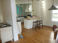
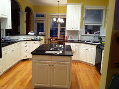
Color to go with Chantilly Lace Cabinets
Kimmy0227
11 years ago
Featured Answer
Sort by:Oldest
Comments (13)

breezygirl
11 years agoRelated Professionals
Knoxville Kitchen & Bathroom Designers · La Verne Kitchen & Bathroom Designers · Martinsburg Kitchen & Bathroom Designers · Rancho Mirage Kitchen & Bathroom Designers · White House Kitchen & Bathroom Designers · Town 'n' Country Kitchen & Bathroom Designers · University City Kitchen & Bathroom Remodelers · Crestline Kitchen & Bathroom Remodelers · Dearborn Kitchen & Bathroom Remodelers · Oxon Hill Kitchen & Bathroom Remodelers · Pueblo Kitchen & Bathroom Remodelers · Westchester Kitchen & Bathroom Remodelers · Alafaya Cabinets & Cabinetry · Lakeside Cabinets & Cabinetry · Bellwood Cabinets & Cabinetry
cawaps
11 years agohonorbiltkit
11 years agoKimmy0227
11 years agoKimmy0227
11 years agoKimmy0227
11 years agoKimmy0227
11 years agocawaps
11 years ago
susanlynn2012
11 years agoCavimum
11 years agoKimmy0227
11 years agocawaps
11 years ago
Related Stories
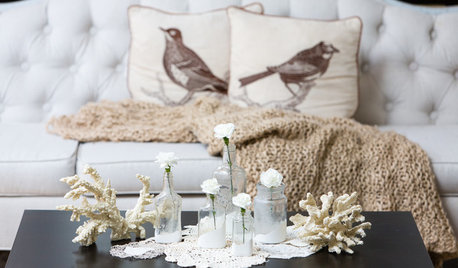
DECORATING GUIDESBudget Decorator: Let’s Go Thrifting
Dip into the treasure trove of secondhand pieces for decor that shows your resourcefulness as much as your personality
Full Story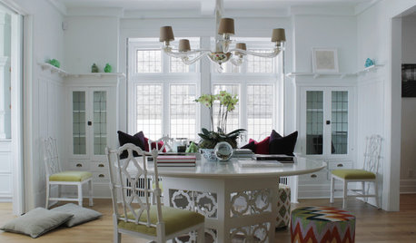
HOUZZ TOURSMy Houzz: Going White and Bright in Montreal
White lacquer and wider doorways help create an airer backdrop for colorful contemporary art in a 1910 Arts and Crafts home
Full Story
COLORGoing Bold With Just Enough Color
Using color with restraint inside and outside can be far more effective than a less subtle approach
Full Story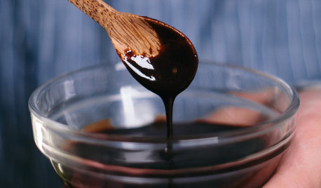
VALENTINE’S DAYBar Cart 101: A Hot Chocolatey Cocktail for Your Valentine
Create a bar cart with your favorite ingredients, then whip up this bourbon-laced hot cocoa to share on Valentine’s Day
Full Story
KITCHEN DESIGNThe 4 Things Home Buyers Really Want in Kitchen Cabinetry
For the biggest return on your kitchen investment, you've got to know these key ingredients for cabinetry with wide appeal
Full Story
KITCHEN DESIGNEcofriendly Kitchen: Healthier Kitchen Cabinets
Earth-friendly kitchen cabinet materials and finishes offer a host of health benefits for you and the planet. Here's a rundown
Full Story
KITCHEN DESIGN9 Kitchen Color Ideas With Staying Power
Stick to these classic color combinations for a kitchen that will never go out of style
Full Story
TRIMTrim Color Tips: Get Your White Trim Right
Set off wood tones, highlight architectural features, go minimalist ... white trim is anything but standard when you know how to use it
Full Story
MOST POPULARMust-Try Color Combo: White With Warm Off-White
Avoid going too traditional and too clean by introducing an off-white palette that brings a touch of warmth and elegance
Full Story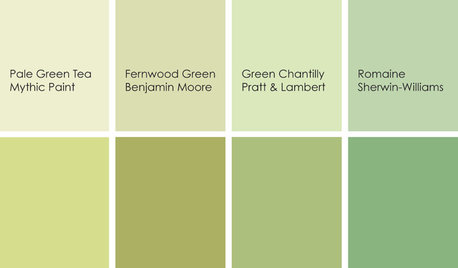
KITCHEN DESIGNCooking With Color: When to Use Green in the Kitchen
Consider a taste of Romaine or Pale Green Tea to make your kitchen walls or cabinets the freshest ones around
Full StoryMore Discussions


positano